

Lesson 5: Public Health Surveillance
 ShareCompartir
Section 5: Analyzing and Interpreting Data
After morbidity, mortality, and other relevant data about a health problem have been gathered and compiled, the data should be analyzed bytime, place, and person. Different types of data are used for surveillance, and different types of analyses might be needed for each. For example, data on individual cases of disease are analyzed differently than data aggregated from multiple records; data received as text must be sorted, categorized, and coded for statistical analysis; and data from surveys might need to be weighted to produce valid estimates for sampled populations.
For analysis of the majority of surveillance data, descriptive methods are usually appropriate. The display of frequencies (counts) or rates of the health problem in simple tables and graphs, as discussed in Lesson 5, is the most common method of analyzing data for surveillance. Rates are useful — and frequently preferred — for comparing occurrence of disease for different geographic areas or periods because they take into account the size of the population from which the cases arose. One critical step before calculating a rate is constructing a denominator from appropriate population data. For state- or countywide rates, general population data are used. These data are available from the U.S. Census Bureau or from a state planning agency. For other calculations, the population at risk can dictate an alternative denominator. For example, an infant mortality rate uses the number of live-born infants; rates of surgical wound infections in a hospital requires the number of such procedures performed. In addition to calculating frequencies and rates, more sophisticated methods (e.g., space-time cluster analysis, time series analysis, or computer mapping) can be applied.
To determine whether the incidence or prevalence of a health problem has increased, data must be compared either over time or across areas. The selection of data for comparison depends on the health problem under surveillance and what is known about its typical temporal and geographic patterns of occurrence.
For example, data for diseases that indicate a seasonal pattern (e.g., influenza and mosquito-borne diseases) are usually compared with data for the corresponding season from past years. Data for diseases without a seasonal pattern are commonly compared with data for previous weeks, months, or years, depending on the nature of the disease. Surveillance for chronic diseases typically requires data covering multiple years. Data for acute infectious diseases might only require data covering weeks or months, although data extending over multiple years can also be helpful in the analysis of the natural history of disease. Data from one geographic area are sometimes compared with data from another area. For example, data from a county might be compared with data from adjacent counties or with data from the state. We now describe common methods for, and provide examples of, the analysis of data by time, place, and person.
Analyzing by time
Basic analysis of surveillance data by time is usually conducted to characterize trends and detect changes in disease incidence. For notifiable diseases, the first analysis is usually a comparison of the number of case reports received for the current week with the number received in the preceding weeks. These data can be organized into a table, a graph, or both (Table 5.5 and Figures 5.2 and 5.3). An abrupt increase or a gradual buildup in the number of cases can be detected by looking at the table or graph. For example, health officials reviewing the data for Clark County in Table 5.5 and Figures 5.2 and 5.3 will have noticed that the number of cases of hepatitis A reported during week 4 exceeded the numbers in the previous weeks. This method works well when new cases are reported promptly.
Table 5.5 Reported Cases of Hepatitis A, by County and Week of Report, 1991
| Week of report | |||||||||
|---|---|---|---|---|---|---|---|---|---|
| County | 1 | 2 | 3 | 4 | 5 | 6 | 7 | 8 | 9 |
| Adams | — | — | — | 1 | — | — | 1 | — | — |
| Asotin | — | — | — | — | — | — | — | — | — |
| Benton | — | — | — | 2 | 1 | — | 2 | — | 3 |
| Chelen | — | — | 1 | 3 | 1 | 1 | — | — | 1 |
| Clallam | — | — | 1 | — | — | — | — | 2 | — |
| Clark | — | — | 3 | 8 | 14 | 13 | 11 | 6 | — |
| Columbia | — | — | — | — | — | — | — | — | — |
| Cowlitz | 2 | — | 3 | — | — | 6 | 4 | 9 | — |
| Douglas | — | — | — | — | — | — | — | — | — |
| Ferry | — | — | — | — | — | — | — | — | — |
| Franklin | — | — | 3 | 2 | 3 | — | 5 | — | 4 |
| Garfield | — | — | — | — | — | — | — | 1 | — |
| Etc. | |||||||||
Another common analysis is a comparison of the number of cases during the current period to the number reported during the same period for the last 2–10 years (Table 5.6). For example, health officials will have noted that the 11 cases reported for Clark County during weeks 1–4 during 1991 exceeded the numbers reported during the same 4-week period during the previous 3 years. A related method involves comparing the cumulative number of cases reported to date during the current year (or during the previous 52 weeks) to the cumulative number reported to the same date during previous years.
Table 5.5 Reported Cases of Hepatitis A, by County and Year of Report, 1991
| Year | ||||
|---|---|---|---|---|
| County | 1988 | 1989 | 1990 | 1991 |
| Adams | — | — | — | 1 |
| Asotin | — | — | — | — |
| Benton | — | — | 3 | 2 |
| Chelen | — | 1 | 2 | 4 |
| Clallam | — | 1 | 1 | 1 |
| Clark | 6 | 3 | — | 11 |
| Columbia | — | — | — | — |
| Cowlitz | — | 5 | — | 5 |
| Douglas | — | — | 2 | — |
| Ferry | 1 | — | — | — |
| Franklin | — | 2 | 3 | 5 |
| Garfield | — | — | — | — |
| Etc. | ||||
Figure 5.1 Rate (per 100,000 Persons) of Reported Cases of Malaria, By Year — United States, 1932–2003
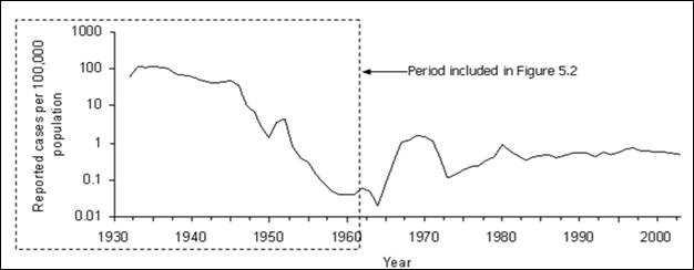
Adapted from: Centers for Disease Control and Prevention. Summary of notifiable diseases, United States, 1993b. MMWR 1993; 42(53):38, and Langmuir AD. The surveillance of communicable diseases of national importance. N Engl J Med 1963;268:182–92.
Figure 5.2 Reported Malaria Morbidity — United States, 1932–1962
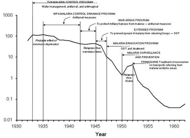
Adapted from: Centers for Disease Control and Prevention. Summary of notifiable diseases, United States, 1993b. MMWR 1993;42(53):38, and National Notifiable Diseases Surveillance System [Internet]. Atlanta: CDC [updated 2005 Oct 14; cited 2005 Nov 16]. Available from: http://www.cdc.gov/ncphi/disss/nndss/nndsshis.htm, Langmuir AD. The surveillance of communicable diseases of national importance. N Engl J Med 1963;268:184.
Statistical methods can be used to detect changes in disease occurrence. The Early Aberration Detection System (EARS) is a package of statistical analysis programs for detecting aberrations or deviations from the baseline, by using either long- (3–5 years) or short-term (as short as 1–6 days) baselines.(16)
Analyzing by place
The analysis of cases by place is usually displayed in a table or a map. State and local health departments usually analyze surveillance data by neighborhood or by county. CDC routinely analyzes surveillance data by state. Rates are often calculated by adjusting for differences in the size of the population of different counties, states, or other geographic areas. Figure 5.3 illustrates lung cancer mortality rates for white males for all U.S. counties for 1998–2002. To deal with county-to-county variations in population size and age distribution, age-adjusted rates are displayed.
Figure 5.3 Age-Adjusted Lung and Bronchus Cancer Mortality Rates (per 100,000 Population) By State — United States, 1998–2002
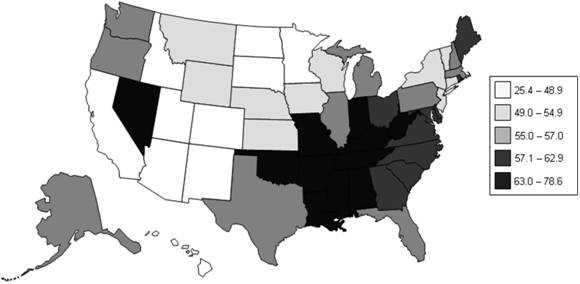
Data Source: National Cancer Institute [Internet] Bethesda: NCI [cited 2006 Mar 22] Surveillance Epidemiology and End Results (SEER). Available from: http://seer.cancer.gov/faststats/.
The advent of geographic information systems (GIS) allows more robust analysis of data by place and has moved spot and shaded, or choropleth, maps to much more sophisticated applications.(17) Using GIS is particularly effective when different types of information about place are combined to identify or clarify geographic relationships. For example, in Figure 5.4, the absence or presence of the tick that transmits Lyme disease, Ixodes scapularis, are illustrated superimposed over habitat suitability.(18) Such software packages as SatScan™(Martin Kulldorff, Harvard University and Information Management System, Inc., Silver Spring, Maryland), EpiInfo™ (CDC, Atlanta, Georgia), and Health Mapper (World Health Organization, Geneva, Switzerland) provide GIS functionality and can be useful when analyzing surveillance data.(19–21)
Figure 5.4 Predictive Risk Map of Habitat Suitability for Ixodes scapularis in Wisconsin and Illinois
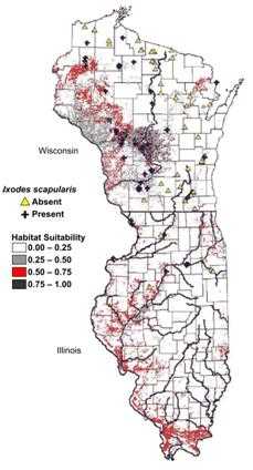
Source: Guerra M, Walker E, Jones C, Paskewitz S, Cortinas MR, Stancil A, Beck L, Bobo M, Kitron U. Predicting the risk of Lyme disease: habitat suitability for Ixodes scapularis in the north central United States. Emerg Infect Dis. 2002;8:289–97.
Analyzing by time and place
As a practical matter, disease occurrence is often analyzed by time and place simultaneously. An analysis by time and place can be organized and presented in a table or in a series of maps highlighting different periods or populations (Figures 5.5 and 5.6).
Figure 5.5 Age-Adjusted Colon Cancer Mortality Rates* for White Females by State — United States, 1950–1954, 1970–1974, and 1990–1994
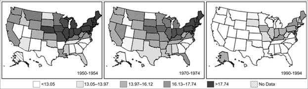
Data Source: Customizable Mortality Maps [Internet] Bethesda: National Cancer Institute [cited 2006 Mar 22]. Available from: http://cancercontrolplanet.cancer.gov/atlas/index.jsp.
Figure 5.6 Age-Adjusted Colon Cancer Mortality Rates* for White Males by State — United States, 1950–1954, 1970–1974, and 1990–1994
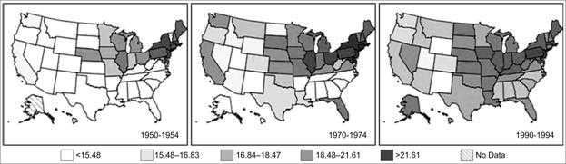
Data Source: Customizable Mortality Maps [Internet] Bethesda: National Cancer Institute [cited 2006 Mar 22]. Available from: http://cancercontrolplanet.cancer.gov/atlas/index.jsp.
Analyzing by person
The most commonly collected and analyzed person characteristics are age and sex. Data regarding race and ethnicity are less consistently available for analysis. Other characteristics (e.g., school or workplace, recent hospitalization, and the presence of such risk factors for specific diseases as recent travel or history of cigarette smoking) might also be available and useful for analysis, depending on the health problem.
Age
Meaningful age categories for analysis depend on the disease of interest. Categories should be mutually exclusive and all-inclusive. Mutually exclusive means the end of one category cannot overlap with the beginning of the next category (e.g., 1–4 years and 5–9 years rather than 1–5 and 5–9). All-inclusive means that the categories should include all possibilities, including the extremes of age (e.g., <1 year and ≥84 years) and unknowns.
Standard age categories for childhood illnesses are usually <1 year and ages 1–4, 5–9, 10–14, 15–19, and ≥20 years. For pneumonia and influenza mortality, which usually disproportionally affects older persons, the standard categories are <1 year and 1–24, 25–44, 45–64, and ≥65 years. Because two-thirds of all deaths in the United States occur among persons aged ≥65 years, researchers often divide the last category into ages 65–74, 75–84, and ≥85 years.
The characteristic age distribution of a disease should be used in deciding the age categories — multiple narrow categories for the peak ages, broader categories for the remainder. If the age distribution changes over time or differs geographically, the categories can be modified to accommodate those differences.
To use data in the calculation of rates, the age categories must be consistent with the age categories available for the population at risk. For example, census data are usually published as <5 years, 5–9, 10–14, and so on in 5-year age groups. These denominators could not be used if the surveillance data had been categorized in different 5-year age groups (e.g., 1–5 years, 6–10, 11–15, and so forth).
Other Person- or Disease-Related Risk Factor
For certain diseases, information on other specific risk factors (e.g., race, ethnicity, and occupation) are routinely collected and regularly analyzed. For example, have any of the reported cases of hepatitis A occurred among food-handlers who might expose (or might have exposed) unsuspecting patrons? For hepatitis B case reports, have two or more reports listed the same dentist as a potential source? For a varicella (chickenpox) case report, had the patient been vaccinated? Analysis of risk-factor data can provide information useful for disease control and prevention. Unfortunately, data regarding risk factors are often not available for analysis, particularly if a generic form (i.e., one report form for all diseases) or a secondary data source is used.
Interpreting results of analyses
When the incidence of a disease increases or its pattern among a specific population at a particular time and place varies from its expected pattern, further investigation or increased emphasis on prevention or control measures is usually indicated. The amount of increase or variation required for action is usually determined locally and reflects the priorities assigned to different diseases, the local health department's capabilities and resources, and sometimes, public, political, or media attention or pressure.
For certain diseases (e.g., botulism), a single case of an illness of public health importance or suspicion of a common source of infection for two or more cases is often sufficient reason for initiating an investigation. Suspicion might also be aroused from finding that patients have something in common (e.g., place of residence, school, occupation, racial/ethnic background, or time of onset of illness). Or a physician or other knowledgeable person might report that multiple current or recent cases of the same disease have been observed and are suspected of being related (e.g., a report of multiple cases of hepatitis A within the past 2 weeks from one county).
Observed increases or decreases in incidence or prevalence might, however, be the result of an aspect of the way in which surveillance was conducted rather than a true change in disease occurrence. Common causes of such artifactual changes are:
- Changes in local reporting procedures or policies (e.g., a change from passive to active surveillance).
- Changes in case definition (e.g., AIDS in 1993).
- Increased health-seeking behavior (e.g., media publicity prompts persons with symptoms to seek medical care).
- Increase in diagnosis.
- New laboratory test or diagnostic procedure.
- Increased physician awareness of the condition, or a new physician is in town.
- Increase in reporting (i.e., improved awareness of requirement to report).
- Outbreak of similar disease, misdiagnosed as disease of interest.
- Laboratory error.
- Batch reporting in which reports from previous periods are held and reported all at once during another reporting period (e.g., reporting all cases received during December and the first week of January during the second week of January).
Artifactual changes include an increase in population size, improved diagnostic procedures, enhanced reporting, and duplicate reporting. Compare the sharp increases in disease incidence illustrated in Figures 5.7 and 5.8. Although they appear similar, the increase displayed in Figure 5.7 represents a true increase in incidence, whereas the increase displayed in Figure 5.8 resulted from a change in the case definition.(22, 23) Nonetheless, because a health department's primary responsibility is to protect the health of the public, public health officials usually consider an apparent increase real, and respond accordingly, until proven otherwise.
Figure 5.7 Reported Cases of Salmonellosis per 100,000 Population, By Year — United States, 1972–2002
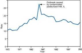
Source: Centers for Disease Control and Prevention. Summary of notifiable diseases–United States, 2002. Published April 30, 2004, for MMWR 2002;51(No. 53): p. 59.
Figure 5.8 Reported Cases of AIDS, by Year — United States* and U.S. Territories, 1982–2002
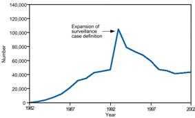
* Total number of AIDS cases includes all cases reported to CDC as of December 31, 2002. Total includes cases among residents in the U.S. territories and 94 cases among persons with unknown state of residence.
Source: Centers for Disease Control and Prevention. Summary of notifiable diseases–United States, 2002. Published April 30, 2004, for MMWR 2002;51(No. 53): p. 59.
 Exercise 5.4
During the previous 6 years, one to three cases per year of tuberculosis had been reported to a state health department. During the past 3 months, 17 cases have been reported. All but two of these cases have been reported from one county. The local newspaper published an article about one of the first reported cases, which occurred in a girl aged 3 years. Describe the possible causes of the increase in reported cases.
References (This Section)
- Langmuir AD. The surveillance of communicable diseases of national importance. N Engl J Med 1963;268:182–92.
- Hutwagner L, Thompson W, Seeman GM, Treadwell T. The bioterrorism preparedness and response Early Aberration Reporting System (EARS). J Urban Health 2003;80:89–96.
- Croner CM. Public health GIS and the Internet. Annu Rev Public Health 2003;24:57–82.
- Guerra M, Walker E, Jones C, Paskewitz S, Cortinas MR, Stancil A, Beck L, Bobo M, Kitron U. Predicting the risk of Lyme disease: habitat suitability for Ixodes scapularis in the north central United States. Emerg Infect Dis. 2002;8:289–97.
- SaTScan [Internet]. Boston: SaTScan [updated 2006 Aug 14] Available from: http://www.satscan.org/.
- Centers for Disease Control and Prevention [Internet]. Atlanta: CDC [updated 2005 Nov 8; cited 2006 Jan 31]. EpiInfo. Available from: http://www.cdc.gov/epiinfo/.
- The HealthMapper [Internet] Geneva: World Health Organization [updated 2006; cited 2006 Jan 31]. Available from: http://www.who.int/health_mapping/tools/healthmapper/en/.
- Centers for Disease Control and Prevention. Current Trends Update: Impact of the expanded AIDS surveillance case definition for adolescents and adults on case reporting—United States, 1993a. MMWR 1994;43:160–1,167–70.
- Ryan CA, Nickels MK, Hargrett-Bean NT, et al. Massive outbreak of antimicrobial-resistant salmonellosis traced to pasteurized milk. JAMA 1987;258:3269–74.
Previous Page Next Page: Section 6
Alternate Text Description for Images
Figure 5.2
Description:Line graph shows increases and decreases during prevention activities such as TVA Malaria Control Program using water management, antilarval, and antimaginal measures; the WPA Malaria Control Drainage Program involving antilarval measures; the War Areas Program to protect military trainees from malaria using antilarval measures; the Extended Program to prevent spread of malaria from returning troops using DDT; the Malaria Eradication Program involving DDT and treatment; and Malaria Surveillance and Prevention activities; and Primaquine treatment of servicemen on transports returning from malaria-endemic areas. Other factors included probable effect of the economic depression; relapses from overseas cases; and relapses from Korea. Return to text.
Figure 5.4
Description: Spot map uses symbols to indicate the presence or absence of Ixodes scapularis and colors indicate habitat suitability. Return to text.
Figure 5.7
Description: Line graph of reported cases over time shows a dramatic increase corresponding to an outbreak caused by contaminated, pasteurized milk in Illinois. Return to text.
Figure 5.8
Description: Line graph of reported cases over time shows a dramatic increase in reported cases corresponding to an expansion of the surveillance case definition. Return to text.
- Page last reviewed: May 18, 2012
- Page last updated: May 18, 2012
- Content source: