

Lesson 4: Displaying Public Health Data
 ShareCompartir
Summary, References, and Websites
Much work has been done on other graphical methods of presentation.(33) One of the more creative is face plots.(34) Originally developed by Chernoff,(35) these give a way to display n variables on a two-dimensional surface. For instance, suppose you have several variables (x, y, z, etc.) that you have collected on each of n people, and for purposes of this illustration, suppose each variable can have one of 10 possible values. We can let x be eyebrow slant, y be eye size, z be nose length, etc. The figures below show faces produced using 10 characteristics — head eccentricity, eye size, eye spacing, eye eccentricity, pupil size, eyebrow slant, nose size, mouth shape, mouth size, and mouth opening) — each assigned one of 10 possible values.
Figure 4.39 Example of Face Plot Faces Produced Using 10 Characteristics
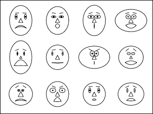
Source: Weisstein, Eric W. Chernoff Face. From MathWorld — Wolfram Web Resource. http://mathworld.wolfram.com/ChernoffFace.html.
To convey the messages of epidemiologic findings, you must first select the best illustration method. Tables are commonly used to display numbers, rates, proportions, and cumulative percents. Because tables are intended to communicate information, most tables should have no more than two variables and no more than eight categories (class intervals) for any variable. Printed tables should be properly titled, labeled, and referenced; that is, they should be able to stand alone if separated from the text.
Tables can be used with either nominal or continuous ordinal data. Nominal variables such as sex and state of residence have obvious categories. For continuous variables that do not have obvious categories, class intervals must be created. For some diseases, standard class intervals for age have been adopted. Otherwise a variety of methods are available for establishing reasonable class intervals. These include class intervals with an equal number of people or observations in each; class intervals with a constant width; and class intervals based on the mean and standard deviation.
Graphs can visually communicate data rapidly. Arithmetic-scale line graphs have traditionally been used to show trends in disease rates over time. Semilogarithmic-scale line graphs are preferred when the disease rates vary over two or more orders of magnitude. Histograms and frequency polygons are used to display frequency distributions. A special type of histogram known as an epidemic curve shows the number of cases by time of onset of illness or time of diagnosis during an epidemic period. The cases may be represented by squares that are stacked to form the columns of the histogram; the squares may be shaded to distinguish important characteristics of cases, such as fatal outcome.
Simple bar charts and pie charts are used to display the frequency distribution of a single variable. Grouped and stacked bar charts can display two or even three variables.
Spot maps pinpoint the location of each case or event. An area map uses shading or coloring to show different levels of disease numbers or rates in different areas.
The final pages of this lesson provide guidance in the selection of illustration methods and construction of tables and graphs. When using each of these methods, it is important to remember their purpose: to summarize and to communicate. Even the best method must be constructed properly or the message will be lost. Glitzy and colorful are not necessarily better; sometimes less is more!
Guide to Selecting a Graph or Chart to Illustrate Epidemiologic Data
| Type of Graph or Chart | When to Use |
|---|---|
| Arithmetic scale line graph | Show trends in numbers or rates over time |
| Semilogarithmic scale line graph | Display rate of change over time; appropriate for values ranging over more than 2 orders of magnitude |
| Histogram | Show frequency distribution of continuous variable; for example, number of cases during epidemic (epidemic curve) or over longer period of time |
| Frequency polygon | Show frequency distribution of continuous variable, especially to show components |
| Cumulative frequency | Display cumulative frequency for continuous variables |
| Scatter diagram | Plot association between two variables |
| Simple bar chart | Compare size or frequency of different categories of a single variable |
| Grouped bar chart | Compare size or frequency of different categories of 2 4 series of data |
| Stacked bar chart | Compare totals and illustrate component parts of the total among different groups |
| Deviation bar chart | Illustrate differences, both positive and negative, from baseline |
| 100% component bar chart | Compare how components contribute to the whole in different groups |
| Pie chart | Show components of a whole |
| Spot map | Show location of cases or events |
| Area map | Display events or rates geographically |
| Box plot | Visualize statistical characteristics (median, range, asymmetry) of a variable's distribution |
Guide to Selecting a Method of Illustrating Epidemiologic Data
| If data are: | And these conditions apply: | Then use: | |||
|---|---|---|---|---|---|
| Numbers or rates over time | Numbers |
| Histogram | ||
| Frequency polygon | ||||
| Rates |
| Arithmetic-scale line graph | |||
| Semilogarithmic-scale line graph | ||||
| Continuous data other than time series | Frequency distribution | Histogram or frequency polygon | |||
| Data with discrete categories | Bar chart or pie chart | ||||
| Place data | Numbers | Not readily identifiable on map | Bar chart or pie chart | ||
| Readily identifiable on map |
| Spot map | |||
| Area map | ||||
| Rates | Area map | ||||
Checklist for Constructing Printed Tables
- Title
- Does the table have a title?
- Does the title describe the objective of the data display and its content, including subject, person, place, and time?
- Is the title preceded by the designation “Table #''? (“Table'' is used for typed text; “Figure'' is used for graphs, maps, and illustrations. Separate numerical sequences are used for tables and figures in the same document (e.g., Table 4.1, Table 4.2; Figure 4.1, Figure 4.2).
- Rows and Columns
- Is each row and column labeled clearly and concisely?
- Are the specific units of measurement shown? (e.g., years, mg/dl, rate per 100,000).
- Are the categories appropriate for the data?
- Are the row and column totals provided?
- Footnotes
- Are all codes, abbreviations, or symbols explained?
- Are all exclusions noted?
- If the data are not original, is the source provided?
- If source is from website, is complete address specified; and is current, active, and reference date cited?
Checklist for Constructing Printed Graphs
- Title
- Does the graph or chart have a title?
- Does the title describe the content, including subject, person, place, and time?
- Is the title preceded by the designation “Figure #''? (“Table'' is used for typed text; “Figure'' is used for graphs, charts, maps, and illustrations. Separate numerical sequences are used for tables and figures in the same document (e.g., Table 1, Table 2; Figure 1, Figure 2).
- Axes
- Is each axis labeled clearly and concisely?
- Are the specific units of measurement included as part of the label? (e.g., years, mg/dl, rate per 100,000)
- Are the scale divisions on the axes clearly indicated?
- Are the scales for each axis appropriate for the data?
- Does the y axis start at zero?
- If a scale break is used with an arithmetic-scale line graph, is it clearly identified?
- Has a scale break been used with a histogram, frequency polygon, or bar chart? (Answer should be NO!)
- Are the axes drawn heavier than the other coordinate lines?
- If two or more graphs are to be compared directly, are the scales identical?
- Grid Lines
- Does the figure include only as many grid lines as are necessary to guide the eye? (Often, these are unnecessary.)
- Data plots
- Does the table have a title?
- Are the plots drawn clearly?
- Are the data lines drawn more heavily than the grid lines?
- If more than one series of data or components is shown, are they clearly distinguishable on the graph?
- Is each series or component labeled on the graph, or in a legend or key?
- If color or shading is used on an area map, does an increase in color or shading correspond to an increase in the variable being shown?
- Is the main point of the graph obvious, and is it the point you wish to make?
- Footnotes
- Are all codes, abbreviations, or symbols explained?
- Are all exclusions noted?
- If the data are not original, is the source provided?
- Visual Display
- Does the figure include any information that is not necessary?
- Is the figure positioned on the page for optimal readability?
- Do font sizes and colors improve readability?
Guide to Preparing Projected Slides
- Legibility (make sure your audience can easily read your visuals)
- When projected, can your visuals be read from the farthest parts of the room?
- Simplicity (keep the message simple)
- Have you used plain words?
- Is the information presented in the language of the audience?
- Have you used only key words?
- Have you omitted conjunctions, prepositions, etc.?
- Is each slide limited to only one major idea/concept/theme?
- Is the text on each slide limited to 2 or 3 colors (e.g., 1 color for title, another for text)?
- Are there no more than 6–8 lines of text and 6–8 words per line?
- Color
- Colors have an impact on the effect of your visuals. Use warm/hot colors to emphasize, to highlight, to focus, or to reinforce key concepts. Use cool/cold colors for background or to separate items. The following table describes the effect of different colors.
Hot Warm Cool Cold Colors: Red
Bright orange
Bright yellow
Bright goldLight orange
Light yellow
Light gold
BrownsLight blue
Light green
Light purple
Light grayDark blue
Dark green
Dark purple
Dark grayEffect: Exciting Mild Subdued Somber - Are you using the best color combinations? The most important item should be in the text color that has the greatest contrast with its background. The most legible color combinations are:
- Black on yellow
- Black on white
- Dark Green on white
- Dark Blue on white
- White on dark blue (yellow titles and white text on a dark blue background is a favorite choice among epidemiologists)
- Restrict use of red except as an accent.
- Colors have an impact on the effect of your visuals. Use warm/hot colors to emphasize, to highlight, to focus, or to reinforce key concepts. Use cool/cold colors for background or to separate items. The following table describes the effect of different colors.
- Accuracy
- Slides are distracting when mistakes are spotted. Have someone who has not seen the slide before check for typos, inaccuracies, and errors in general.
References
- Koschat MA. A case for simple tables. The American Statistician 2005;59:31–40.
- Centers for Disease Control and Prevention. Sexually Transmitted Disease Surveillance, 2002. Atlanta, GA: U.S. Department of Health and Human Services, Centers for Disease Control and Prevention, September 2003.
- Pierchala C. The choice of age groupings may affect the quality of tabular presentations. ASA Proceedings of the Joint Statistical Meetings; 2002; Alexandria, VA: American Statistical Association; 2002:2697–702.
- Daley RW, Smith A, Paz-Argandona E, Mallilay J, McGeehin M. An outbreak of carbon monoxide poisoning after a major ice storm in Maine. J Emerg Med 2000;18:87–93.
- Kalluri P, Crowe C, Reller M, Gaul L, Hayslett J, Barth S, Eliasberg S, Ferreira J, Holt K, Bengston S, Hendricks K, Sobel J. An outbreak of foodborne botulism associated with food sold at a salvage store in Texas. Clin Infect Dis 2003;37:1490–5.
- Stevens JA, Powell KE, Smith SM, Wingo PA, Sattin RW. Physical activity, functional limitations, and the risk of fall-related fractures in community-dwelling elderly. Ann Epidemiol 1997;7:54–61.
- Ahluwalia IB, Mack K, Murphy W, Mokdad AH, Bales VH. State-specific prevalence of selected chronic disease-related characteristics–Behavioral Risk Factor Surveillance System, 2001. In: Surveillance Summaries, August 22, 2003. MMWR 2003;52(No. SS-08):1–80.
- Langlois JA, Kegler SR, Butler JA, Gotsch KE, Johnson RL, Reichard AA, et al. Traumatic brain injury-related hospital discharges: results from a 14-state surveillance system. In: Surveillance Summaries, June 27, 2003. MMWR 2003;52(No. SS-04):1–18.
- Chang J, Elam-Evans LD, Berg CJ, Herndon J, Flowers L, Seed KA, Syverson CJ. Pregnancy-related mortality surveillance–United States, 1991-1999. In: Surveillance Summaries, February 22, 2003. MMWR 2003;52(No. SS-02):1–8.
- Centers for Disease Control and Prevention. HIV/AIDS Surveillance Report, 2003 (Vol. 15). Atlanta, Georgia: US Department of Health and Human Services;2004:1–46.
- Zhou W, Pool V, Iskander JK, English-Bullard R, Ball R, Wise RP, et al. Surveillance for safety after immunization: Vaccine Adverse Event Reporting System (VAERS)–1991-2001. In: Surveillance Summaries, January 24, 2003. MMWR 2003;52(No. SS-01):1–24.
- Schmid CF, Schmid SE. Handbook of graphic presentation. New York: John Wiley & Sons, 1954.
- Cleveland WS. The elements of graphing data. Summit, NJ: Hobart Press, 1994.
- Brookmeyer R, Curriero FC. Survival curve estimation with partial non-random exposure information. Statistics in Medicine 2002;21:2671–83.
- Korn EL, Graubard BI. Scatterplots with survey data. The American Statistician 1998;52,58–69.
- Souvaine DL, Van Wyk CJ. How hard can it be to draw a pie chart? Mathematics Magazine 1990;63:165–72.
- Luby SP, Agboatwalla M, Painter J, Altaf A, Billhimer WL, Hoekstra RM. Effect of intensive handwashing promotion on childhood diarrhea in high-risk communities in Pakistan: a randomized controlled trial. JAMA 2004; 291(21):2547–54.
- Kafadar K. John Tkey and robustness. Statistical Science 2003:18:319–31.
- Urbank S. Exploring statistical forests. ASA Proceedings of the Join Statistical Meetings; 2002; Alexandria, VA: American Statistical Association, 2002: 3535–40.
- Amon J, Devasia R, Guoliang X, Vaughan G, Gabel J, MacDonald P, et al. Multiple hepatitis A outbreaks associated with green onions among restaurant patrons–Tennessee, Georgia, and North Carolina, 2003. Presented at 53rd Annual Epidemic Intelligence Service Conference, April 19-23, 2004, Atlanta, Georgia.
- Haddix AC, Teutsch SM, Corso PS. Prevention effectiveness: a guide to decision analysis and economic evaluation. 2nd ed. New York, New York: Oxford University Press; October 2002.
- Croner CM. Public health GIS and the internet. Annu Rev Public Health 2003;24:57–82.
- Hilbe JM. Statistical computing software reviews. The American Statistician 2004;58:92.
- Devlin SJ. Statistical graphs in customer survey research. ASA Proceedings of the Joint Statistical Meetings 2003:1212–16.
- Taub GE. A review of {\it ActivStats for SPSS\/}: Integrating SPSS instruction and multimedia in an introductory statistics course. Journal of Educational and Behavioral Statistics 2003;28:291–3.
- Hilbe J. Computing and software: editor's notes. Health Services & Outcomes Research Methodology 2000;1:75–9.
- Oster RA. An examination of five statistical software packages for epidemiology. The American Statistician 1998;52:267–80.
- Morgan WT. A review of eight statistics software packages for general use. The American Statistician 1998;52:70–82.
- Anderson-Cook CM. Data analysis and graphics using R: an example-based approach. Journal of the American Statistical Association 2004;99:901–2.
- Tufte ER. The visual display of quantitative information. Cheshire CT: Graphics Press, LLC; 2002.
- Tufte ER. The visual display of quantitative information. Cheshire, CT: Graphics Press; 1983.
- Olsen J. 2002. Using color in statistical graphs and maps. ASA Proceedings of the Joint Statistical Meetings; 2002; Alexandria, VA: American Statistical Association; 2002: 2524-9.
- Wainer H, Velleman PF. Statistical Graphics: mapping the pathways of science. Annual Review of Psychology 2001;52:305–35.
- Benedetto DD. Faces and the others: interactive expressions for observations. ASA Proceedings of the Joint Statistical Meetings; 2003; Alexandria, VA: American Statistical Association; 2003:520–7.
- Weisstein EW. [Internet] MathWorld–A Wolfram Web Resource [updated 2006]. Chernoff Face. Available from: http://mathworld.wolfram.com/ChernoffFace.html.
Websites
| For more information on: | Visit the following websites: |
|---|---|
| Age categorization used by CDC's National Center for Health Statistics | http://www.cdc.gov/nchs |
| Age groupings used by the United States Census Bureau | http://www.census.gov |
| CDC's Morbidity and Mortality Weekly Report | http://www.cdc.gov/mmwr |
| Epi Info and EpiMap | http://www.cdc.gov/epiinfo |
| GIS | http://wwww.atsdr.cdc.gov/GIS |
| R | http://www.r-project.org |
| Selecting color schemes for graphics | http://www.colorbrewer.org |
Previous Page Next Page: Excercise Answers
- Page last reviewed: May 18, 2012
- Page last updated: May 18, 2012
- Content source: