

Lesson 4: Displaying Public Health Data
 ShareCompartir
Section 5: Using Computer Technology
Many computer software packages are available to create tables and graphs. Most of these packages are quite useful, particularly in allowing the user to redraw a graph with only a few keystrokes. With these packages, you can now quickly and easily draw a number of graphs of different types and see for yourself which one best illustrates the point you wish to make when you present your data.(23–28)
On the other hand, these packages tend to have default values that differ from standard epidemiologic practice. Do not let the software package dictate the appearance of the graph. Remember the adage: let the computer do the work, but you still must do the thinking. Keep in mind the primary purpose of the graph — to communicate information to others. For example, many packages can draw bar charts and pie charts that appear three-dimensional. Will a three-dimensional chart communicate the information better than a two-dimensional one?
Compare and contrast the effectiveness of Figure 4.37a and 4.37b in communicating information.
Figure 4.37a Past Month Marijuana Use Among Youths Aged 12–17, by Geographic Region — United States, 2003 and 2004
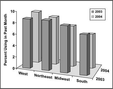
Data Source: Substance Abuse and Mental Health Services Administration. (2005). Results from the 2004 National Survey on Drug Use and Health: National Findings (Office of Applied Studies, NSDUH Series H-28, DHHS Publication No. SMA 05-4062). Rockville, MD.
Figure 4.37b Past Month Marijuana Use Among Youths Aged 12–17, by Geographic Region — United States, 2003 and 2004
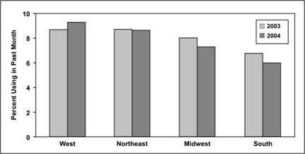
Data Source: Substance Abuse and Mental Health Services Administration. (2005). Results from the 2004 National Survey on Drug Use and Health: National Findings (Office of Applied Studies, NSDUH Series H-28, DHHS Publication No. SMA 05-4062). Rockville, MD.
“The problem with presenting information is simple — the world is high-dimensional, but our displays are not. To address this basic problem, answer 5 questions:
- Quantitative thinking comes down to one question: Compared to what?
- Try very hard to show cause and effect.
- Don't break up evidence by accidents of means of production.
- The world is multivariant, so the display should be high-dimensional.
- The presentation stands and falls on the quality, relevance, and integrity of the content.”(30)
— ER Tufte
Most observers and analysts would agree that the three-dimensional graph does not communicate the information as effectively as the two-dimensional graph. For example, can you tell by a glance at the three-dimensional graph that marijuana use declined slightly in the Northeast in 2004? These differences are more distinct in the two-dimensional graph.
Similarly, does the three-dimensional pie chart in Figure 4.38a provide any more information than the two-dimensional chart in Figure 4.38b? The relative sizes of the components may be difficult to judge because of the tilting in the three-dimensional version. From Figure 4.38a, can you tell whether the wedge for heart disease is larger, smaller, or about the same as the wedge for malignant neoplasms? Now look at Figure 4.38b. The wedge for malignant neoplasms is larger.
Remember that communicating the names and relative sizes of the components (wedges) is the primary purpose of a pie chart. Keep the number of dimensions as small as possible to clearly convey the important points, and avoid using gimmicks that do not add information.
More About Using Color in Graphs
Many people misuse technology in selecting color, particularly for slides that accompany oral presentations.(32) If you use colors, follow these recommendations.
- Select colors so that all components of the graph — title, axes, data plots, and legends — stand out clearly from the background and each plotted series of data can be distinguished from the others.
- Avoid contrasting red and green, because up to 10% of males in the audience may have some degree of color blindness.
- Use colors or shades to communicate information, particularly with area maps. For example, for an area map in which states are divided into four groups according to their rates for a particular disease, use a light color or shade for the states with the lowest rates and use progressively darker colors or shades for the groups with progressively higher rates. In this way, the colors or shades contribute directly to the impression you want the viewer to have about the data.
Figure 4.38a Leading Causes of Death in 25–34 Year Olds — United States, 2003
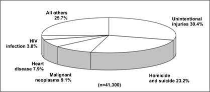
Data Source: Web-based Injury Statistics Query and Reporting System (WISQARS) [online database] Atlanta; National Center for Injury Prevention and Control. [cited 2006 Feb 15]. Available from: http://www.cdc.gov/injury/wisqars/.
Figure 4.38b Leading Causes of Death in 25–34 Year Olds — United States, 2003
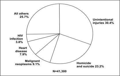
Data Source: Web-based Injury Statistics Query and Reporting System (WISQARS) [online database] Atlanta; National Center for Injury Prevention and Control. [cited 2006 Feb 15]. Available from: http://www.cdc.gov/injury/wisqars/.
References (This Section)
- Hilbe JM. Statistical computing software reviews. The American Statistician 2004;58:92.
- Devlin SJ. Statistical graphs in customer survey research. ASA Proceedings of the Joint Statistical Meetings 2003:1212–16.
- Taub GE. A review of {\it ActivStats for SPSS\/}: Integrating SPSS instruction and multimedia in an introductory statistics course. Journal of Educational and Behavioral Statistics 2003;28:291–3.
- Hilbe J. Computing and software: editor's notes. Health Services & Outcomes Research Methodology 2000;1:75–9.
- Oster RA. An examination of five statistical software packages for epidemiology. The American Statistician 1998;52:267–80.
- Morgan WT. A review of eight statistics software packages for general use. The American Statistician 1998;52:70–82.
- Anderson-Cook CM. Data analysis and graphics using R: an example-based approach. Journal of the American Statistical Association 2004;99:901–2.
- Tufte ER. The visual display of quantitative information. Cheshire CT: Graphics Press, LLC; 2002.
Previous Page Next Page: Summary
Image Description
Figure 4.37a
Description: Bar graph showing two sets of data for different years. The chart is tilted to give it a 3-D appearance making qualitative and quantitative comparisons difficult Return to text.
Figure 4.37b
Description: A grouped bar chart showing the same data as Figure 4.37a. The bars for years are side-by side. Comparisons by year and region are easily seen. Return to text.
Figure 4.38a
Description: A pie chart showing same data as Figure 4.26. Except the chart is tilted to give it a 3-D appearance. This makes visual comparisons of each slice difficult. Return to text.
Figure 4.38b
Description: A 2-D pie chart showing the same data as Figure 4.38a. Thee circle is perfectly round making visual comparisons of each slice easy. Return to text.
- Page last reviewed: May 18, 2012
- Page last updated: May 18, 2012
- Content source: