

Lesson 4: Displaying Public Health Data
 ShareCompartir
Section 3: Graphs
“Charts…should fulfill certain basic objectives: they should be: (1) accurate representations of the facts, (2) clear, easily read, and understood, and (3) so designed and constructed as to attract and hold attention.”(12)
— CF Schmid and SE Schmid
A graph (used here interchangeably with chart) displays numeric data in visual form. It can display patterns, trends, aberrations, similarities, and differences in the data that may not be evident in tables. As such, a graph can be an essential tool for analyzing and trying to make sense of data. In addition, a graph is often an effective way to present data to others less familiar with the data.
When designing graphs, the guidelines for categorizing data for tables also apply. In addition, some best practices for graphics include:
- Ensure that a graphic can stand alone by clear labeling of title, source, axes, scales, and legends;
- Clearly identify variables portrayed (legends or keys), including units of measure;
- Minimize number of lines on a graph;
- Generally, portray frequency on the vertical scale, starting at zero, and classification variable on horizontal scale;
- Ensure that scales for each axis are appropriate for data presented;
- Define any abbreviations or symbols; and
- Specify any data excluded.
“Make the data stand out. Avoid superfluity.”(13)
— WS Cleveland
In constructing a useful graph, the guidelines for categorizing data for tables by types of data also apply. For example, the number of reported measles cases by year of report is technically a nominal variable, but because of the large number of cases when aggregated over the United States, we can treat this variable as a continuous one. As such, a line graph is appropriate to display these data.
Try It: Plotting a Graph
Scenario: Table 4.14 shows the number of measles cases by year of report from 1950 to 2003. The number of measles cases in years 1950 through 1954 has been plotted in Figure 4.1, below. The independent variable, years, is shown on the horizontal axis. The dependent variable, number of cases, is shown on the vertical axis. A grid is included in Figure 4.1 to illustrate how points are plotted. For example, to plot the point on the graph for the number of cases in 1953, draw a line up from 1953, and then draw a line from 449 cases to the right. The point where these lines intersect is the point for 1953 on the graph.
Your Turn: Use the data in Table 4.14 to plot the points for 1955 to 1959 and complete the graph in Figure 4.1.
Figure 4.1 Partial Graph of Measles by Year of Report — United States, 1950–1959
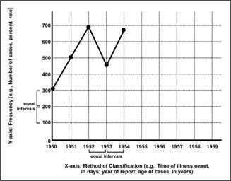
Table 4.14 Number of Reported Measles Cases, by Year of Report — United States, 1950–2003
| Year | Cases |
|---|---|
| 1950 | 319,000 |
| 1951 | 530,000 |
| 1952 | 683,000 |
| 1953 | 449,000 |
| 1954 | 683,000 |
| 1955 | 555,000 |
| 1956 | 612,000 |
| 1957 | 487,000 |
| 1958 | 763,000 |
| 1959 | 406,000 |
| 1960 | 442,000 |
| 1961 | 424,000 |
| 1962 | 482,000 |
| 1963 | 385,000 |
| 1964 | 458,000 |
| 1965 | 262,000 |
| 1966 | 204,000 |
| 1967 | 62,705 |
| 1968 | 22,231 |
| 1969 | 25,826 |
| Year | Cases |
|---|---|
| 1970 | 47,351 |
| 1971 | 75,290 |
| 1972 | 32,275 |
| 1973 | 26,690 |
| 1974 | 22,094 |
| 1975 | 24,374 |
| 1976 | 41,126 |
| 1977 | 57,345 |
| 1978 | 26,871 |
| 1979 | 13,597 |
| 1980 | 13,506 |
| 1981 | 3,124 |
| 1982 | 1,714 |
| 1983 | 1,497 |
| 1984 | 2,587 |
| 1985 | 2,822 |
| 1986 | 6,282 |
| 1987 | 3,655 |
| 1988 | 3,396 |
| 1989 | 18,193 |
| Year | Cases |
|---|---|
| 1990 | 27,786 |
| 1991 | 9,643 |
| 1992 | 2,237 |
| 1993 | 312 |
| 1994 | 963 |
| 1995 | 309 |
| 1996 | 508 |
| 1997 | 138 |
| 1998 | 100 |
| 1999 | 100 |
| 2000 | 86 |
| 2001 | 116 |
| 2002 | 44 |
| 2003 | 56 |
Data Sources: Centers for Disease Control and Prevention. Summary of notifiable diseases–United States, 1989. MMWR 1989;38(No. 54).
Centers for Disease Control and Prevention. Summary of notifiable diseases–United States, 2002. MMWR 2002;51(No. 53)
Centers for Disease Control and Prevention. Summary of notifiable diseases–United States, 2003. MMWR 2005;52(No. 54)
Arithmetic-scale line graphs
An arithmetic-scale line graph (such as Figure 4.1) shows patterns or trends over some variable, often time. In epidemiology, this type of graph is used to show long series of data and to compare several series. It is the method of choice for plotting rates over time.
In an arithmetic-scale line graph, a set distance along any axis represents the same quantity anywhere on that axis. In Figure 4.2, for example, the space between tick marks along the y-axis (vertical axis) represents an increase of 10,000 (10 × 1,000) cases anywhere along the axis — a continuous variable.
Furthermore, the distance between any two tick marks on the x-axis (horizontal axis) represents a period of time of one year. This represents an example of a discrete variable. Thus an arithmetic-scale line graph is one in which equal distances along either the x- or y- axis portray equal values.
Arithmetic-scale line graphs can display numbers, rates, proportions, or other quantitative measures on the y-axis. Generally, the x-axis for these graphs is used to portray the time period of data occurrence, collection, or reporting (e.g., days, weeks, months, or years). Thus, these graphs are primarily used to portray an overall trend over time, rather than an analysis of particular observations (single data points). For example, Figure 4.2 shows prevalence (of neural tube defects) per 100,000 births.
Figure 4.2 Trends in Neural Tube Defects (Anencephaly and Spina Bifida) Among All Births, 45 States and District of Columbia, 1990–1999
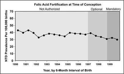
Source: Honein MA, Paulozzi LJ, Mathews TJ, Erickson JD, Wong L-Y. Impact of folic acid fortification of the US food supply on the occurrence of neural tube defects. JAMA 2001;285:2981–6.
Figure 4.3 shows another example of an arithmetic-scale line graph. Here the y-axis is a calculated variable, median age at death of people born with Down's syndrome from 1983–1997. Here also, we see the value of showing two data series on one graph; we can compare the mortality risk for males and females.
Figure 4.3 Median Age at Death of People with Down's Syndrome by Sex — United States, 1983–1997
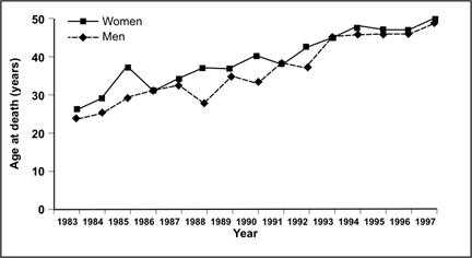
Source: Yang Q, Rasmussen A, Friedman JM. Mortality associated with Down's syndrome in the USA from 1983 to 1997: a population-based study. Lancet 2002;359:1019–25.
More About the X-axis and the Y-axis
When you create an arithmetic-scale line graph, you need to select a scale for the x- and y-axes. The scale should reflect both the data and the point of the graph. For example, if you use the data in Table 4.14 to graph the number of cases of measles cases by year from 1990 to 2002, then the scale of the x-axis will most likely be year of report, because that is how the data are available. Consider, however, if you had line-listed data with the actual dates of onset or report that spanned several years. You might prefer to plot these data by week, month, quarter, or even year, depending on the point you wish to make.
The following steps are recommended for creating a scale for the y-axis.
- Make the length of the y-axis shorter than the x-axis so that your graph is horizontal or “landscape.” A 5:3 ratio is often recommended for the length of the x-axis to y-axis.
- Always start the y-axis with 0. While this recommendation is not followed in all fields, it is the standard practice in epidemiology.
- Determine the range of values you need to show on the y-axis by identifying the largest value you need to graph on the y-axis and rounding that figure off to a slightly larger number. For example, the largest y-value in Figure 4.3 is 49 years in 1997, so the scale on the y-axis goes up to 50. If median age continues to increase and exceeds 50 in future years, a future graph will have to extend the scale on the y-axis to 60 years.
- Space the tick marks and their labels to describe the data in sufficient detail for your purposes. In Figure 4.3, five intervals of 10 years each were considered adequate to give the reader a good sense of the data points and pattern.
 Exercise 4.3
Using the data on measles rates (per 100,000) from 1955 to 2002 in Table 4.15:
- Construct an arithmetic-scale line graph of rate by year. Use intervals on the y-axis that are appropriate for the range of data you are graphing.
- Construct a separate arithmetic-scale line graph of the measles rates from 1985 to 2002. Use intervals on the y-axis that are appropriate for the range of data you are graphing.
Graph paper is provided at the end of this lesson.
Table 4.15 Rate (per 100,000 Population) of Reported Measles Cases by Year of Report — United States, 1955–2002
| Year | Rate per 100,000 |
|---|---|
| 1955 | 336.3 |
| 1956 | 364.1 |
| 1957 | 283.4 |
| 1958 | 438.2 |
| 1959 | 229.3 |
| 1960 | 246.3 |
| 1961 | 231.6 |
| 1962 | 259.0 |
| 1963 | 204.2 |
| 1964 | 239.4 |
| 1965 | 135.1 |
| 1966 | 104.2 |
| 1967 | 31.7 |
| 1968 | 11.1 |
| 1969 | 12.8 |
| 1970 | 23.2 |
| Year | Rate per 100,000 |
|---|---|
| 1971 | 36.5 |
| 1972 | 15.5 |
| 1973 | 12.7 |
| 1974 | 10.5 |
| 1975 | 11.4 |
| 1976 | 19.2 |
| 1977 | 26.5 |
| 1978 | 12.3 |
| 1979 | 6.2 |
| 1980 | 6.0 |
| 1981 | 1.4 |
| 1982 | 0.7 |
| 1983 | 0.6 |
| 1984 | 1.1 |
| 1985 | 1.2 |
| 1986 | 2.6 |
| Year | Rate per 100,000 |
|---|---|
| 1987 | 1.5 |
| 1988 | 1.4 |
| 1989 | 7.3 |
| 1990 | 11.2 |
| 1991 | 3.8 |
| 1992 | 0.9 |
| 1993 | 0.1 |
| 1994 | 0.4 |
| 1995 | 0.1 |
| 1996 | 0.2 |
| 1997 | 0.06 |
| 1998 | 0.04 |
| 1999 | 0.04 |
| 2000 | 0.03 |
| 2001 | 0.04 |
| 2002 | 0.02 |
Data Sources: Centers for Disease Control. Summary of notifiable diseases–United States, 1989. MMWR 1989;38(No. 54).
Centers for Disease Control and Prevention. Summary of notifiable diseases–United States, 2002. Published April 30, 2004 for MMWR 2002;51(No. 53).
Semilogarithmic-scale line graphs
In some cases, the range of data observed may be so large that proper construction of an arithmetic-scale graph is problematic. For example, in the United States, vaccination policies have greatly reduced the incidence of mumps; however, outbreaks can still occur in unvaccinated populations. To portray these competing forces, an arithmetic graph is insufficient without an inset amplifying the problem years (Figure 4.4).
Figure 4.4 Mumps by Year — United States, 1978–2003
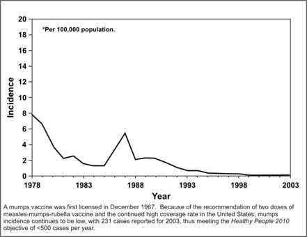
Source: Centers for Disease Control and Prevention. Summary of notifiable diseases–United States, 2003. Published April 22, 2005, for MMWR 2003;52(No. 54):54.
An alternative approach to this problem of incompatible scales is to use a logarithmic transformation for the y-axis. Termed a “semi-log” graph, this technique is useful for displaying a variable with a wide range of values (as illustrated in Figure 4.5). The x-axis uses the usual arithmetic-scale, but the y-axis is measured on a logarithmic rather than an arithmetic scale. As a result, the distance from 1 to 10 on the y- axis is the same as the distance from 10 to 100 or 100 to 1,000.
Cycle = order of magnitude
That is, from 1 to 10 is one cycle; from 10 to 100 is another cycle.Another use for the semi-log graph is when you are interested in portraying the relative rate of change of several series, rather than the absolute value. Figure 4.5 shows this application. Note several aspects of this graph:
- The y-axis includes four cycles of the order of magnitude, each a multiple of ten (e.g., 0.1 to 1, 1 to 10, etc.) — each a constant multiple.
- Within a cycle, the ten tick-marks are spaced so that spaces become smaller as the value increases. Notice that the absolute distance from 1.0 to 2.0 is wider than the distance from 2.0 to 3.0, which is, in turn, wider than the distance from 8.0 to 9.0. This results from the fact that we are graphing the logarithmic transformation of numbers, which, in fact, shrinks them as they become larger. We can still compare series, however, since the shrinking process preserves the relative change between series.
Figure 4.5 Age-adjusted Death Rates for 5 of the 15 Leading Causes of Death — United States, 1958–2002
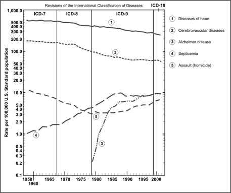
Adapted from: Kochanek KD, Murphy SL, Anderson RN, Scott C. Deaths: final data for 2002. National vital statistics report; vol 53, no 5. Hyattsville, Maryland: National Center for Health Statistics, 2004. p. 9.
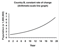
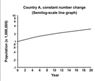
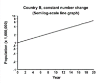
Consider the data shown in Table 4.16. Two hypothetical countries begin with a population of 1,000,000. The population of Country A grows by 100,000 persons each year. The population of Country B grows by 10% each year. Figure 4.6 displays data from Country A on the left, and Country B on the right. Arithmetic-scale line graphs are above semilog-scale line graphs of the same data. Look at the left side of the figure. Because the population of Country A grows by a constant number of persons each year, the data on the arithmetic-scale line graph fall on a straight line. However, because the percentage growth in Country A declines each year, the curve on the semilog-scale line graph flattens. On the right side of the figure the population of Country B curves upward on the arithmetic-scale line graph but is a straight line on the semilog graph. In summary, a straight line on an arithmetic-scale line graph represents a constant change in the number or amount. A straight line on a semilog-scale line graph represents a constant percent change from a constant rate.
Table 4.16 Hypothetical Population Growth in Two Countries
| COUNTRY A (Constant Growth by 100,000) |
COUNTRY B (Constant Growth by 10%) |
|||
|---|---|---|---|---|
| Year | Population | Growth Rate | Population | Growth Rate |
| 0 | 1,000,000 | 1,000,000 | ||
| 1 | 1,100,000 | 10.0% | 1,100,000 | 10.0% |
| 2 | 1,200,000 | 9.1% | 1,210,000 | 10.0% |
| 3 | 1,300,000 | 8.3% | 1,331,000 | 10.0% |
| 4 | 1,400,000 | 7.7% | 1,464,100 | 10.0% |
| 5 | 1,500,000 | 7.1% | 1,610,510 | 10.0% |
| 6 | 1,600,000 | 6.7% | 1,771,561 | 10.0% |
| 7 | 1,700,000 | 6.3% | 1,948,717 | 10.0% |
| 8 | 1,800,000 | 5.9% | 2,143,589 | 10.0% |
| 9 | 1,900,000 | 5.6% | 2,357,948 | 10.0% |
| 10 | 2,000,000 | 5.3% | 2,593,742 | 10.0% |
| 11 | 2,100,000 | 5.0% | 2,853,117 | 10.0% |
| 12 | 2,200,000 | 4.8% | 3,138,428 | 10.0% |
| 13 | 2,300,000 | 4.4% | 3,452,271 | 10.0% |
| 14 | 2,400,000 | 4.3% | 3,797,498 | 10.0% |
| 15 | 2,500,000 | 4.2% | 4,177,248 | 10.0% |
| 16 | 2,600,000 | 4.0% | 4,594,973 | 10.0% |
| 17 | 2,700,000 | 3.8% | 5,054,470 | 10.0% |
| 18 | 2,800,000 | 3.7% | 5,559,917 | 10.0% |
| 19 | 2,900,000 | 3.6% | 6,115,909 | 10.0% |
| 20 | 3,000,000 | 3.4% | 6,727,500 | 10.0% |
To create a semilogarithmic graph from a data set in Analysis Module:
To calculate data for plotting, you must define a new variable. For example, if you want a semilog plot for annual measles surveillance data in a variable called MEASLES, under the VARIABLES section of the Analysis commands:
- Select Define.
- Type logmeasles into the Variable Name box.
- Since your new variable is not used by other programs, the Scope should be Standard.
- Click on OK to define the new variable. Note that logmeasles now appears in the pull-down list of Variables.
- Under the Variables section of the Analysis commands, select Assign.
Types of variables and class intervals are discussed in Lesson 2.
Figure 4.6 Comparison of Arithmetic-scale Line Graph and Semilogarithmic-scale Line Graph for Hypothetical Country A (Constant Increase in Number of People) and Country B (Constant Increase in Rate of Growth)
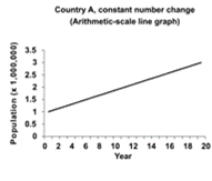
Consequently, a semilog-scale line graph has the following features:
- The slope of the line indicates the rate of increase or decrease.
- A straight line indicates a constant rate (not amount) of increase or decrease in the values.
- A horizontal line indicates no change.
- Two or more lines following parallel paths show identical rates of change.
Semilog graph paper is available commercially, and most include at least three cycles.
Histograms
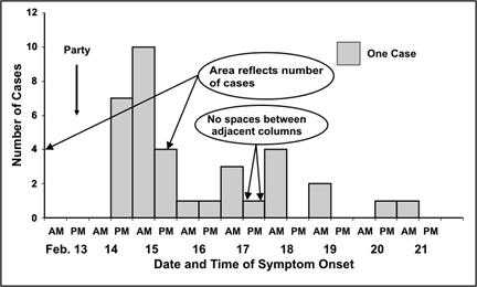
A histogram is a graph of the frequency distribution of a continuous variable, based on class intervals. It uses adjoining columns to represent the number of observations for each class interval in the distribution. The area of each column is proportional to the number of observations in that interval. Figures 4.7a and 4.7b show two versions of a histogram of frequency distributions with equal class intervals. Since all class intervals are equal in this histogram, the eight of each column is in proportion to the number of observations it depicts.
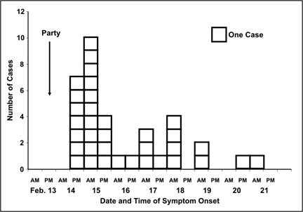
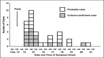
Figures 4.7a, 4.7b, and 4.7c are examples of a particular type of histogram that is commonly used in field epidemiology — the epidemic curve. An epidemic curve is a histogram that displays the number of cases of disease during an outbreak or epidemic by times of onset. The y-axis represents the number of cases; the x-axis represents date and/or time of onset of illness. Figure 4.7a is a perfectly acceptable epidemic curve, but some epidemiologists prefer drawing the histogram as stacks of squares, with each square representing one case (Figure 4.7b). Additional information may be added to the histogram. The rendition of the epidemic curve shown in Figure 4.7c shades the individual boxes in each time period to denote which cases have been confirmed with culture results. Other information such as gender or presence of a related risk factor could be portrayed in this fashion.
Conventionally, the numbers on the x-axis are centered between the tick marks of the appropriate interval. The interval of time should be appropriate for the disease in question, the duration of the outbreak, and the purpose of the graph. If the purpose is to show the temporal relationship between time of exposure and onset of disease, then a widely accepted rule of thumb is to use intervals approximately one-fourth (or between one-eighth and one-third) of the incubation period of the disease shown. The incubation period for salmonellosis is usually 12–36 hours, so the x-axis of this epidemic curve has 12-hour intervals.
Figure 4.7a Number of Cases of Salmonella Enteriditis Among Party Attendees by Date and Time of Onset — Chicago, Illinois, February 2000
Source: Cortese M, Gerber S, Jones E, Fernandez J. A Salmonella Enteriditis outbreak in Chicago. Presented at the Eastern Regional Epidemic Intelligence Service Conference, March 23, 2000, Boston, Massachusetts.
Figure 4.7b Number of Cases of Salmonella Enteriditis Among Party Attendees by Date and Time of Onset — Chicago, Illinois, February 2000
Source: Cortese M, Gerber S, Jones E, Fernandez J. A Salmonella Enteriditis outbreak in Chicago. Presented at the Eastern Regional Epidemic Intelligence Service Conference, March 23, 2000, Boston, Massachusetts.
The most common choice for the x-axis variable in field epidemiology is calendar time, as shown in Figures 4.7a–c. However, age, cholesterol level or another continuous-scale variable may be used on the x-axis of an epidemic curve.
Figure 4.7c Number of Cases of Salmonella Enteriditis Among Party Attendees by Date and Time of Onset — Chicago, Illinois, February 2000
Source: Cortese M, Gerber S, Jones E, Fernandez J. A Salmonella Enteriditis outbreak in Chicago. Presented at the Eastern Regional Epidemic Intelligence Service Conference, March 23, 2000, Boston, Massachusetts.
In Figure 4.8, which shows a frequency distribution of adults with diagnosed diabetes in the United States, the x-axis displays a measure of body mass — weight (in kilograms) divided by height (in meters) squared. The choice of variable for the x-axis of an epidemic curve is clearly dependent on the point of the display. Figures 4.7a, 4.7b, or 4.7c are constructed to show the natural course of the epidemic over time; Figure 4.8 conveys the burden of the problem of overweight and obesity.
Six bars are captioned from under-weight to extreme obese. Percentages of population decrease after the overweight category to the extremely obese.
Figure 4.8 Distribution of Body Mass Index Among Adults with Diagnosed Diabetes — United States, 1999–2002
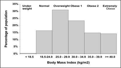
Data Source: Centers for Disease Control and Prevention. Prevalence of overweight and obesity among adults with diagnosed diabetes–United States, 1988-1994 and 1999-2002. MMWR 2004;53:1066–8.
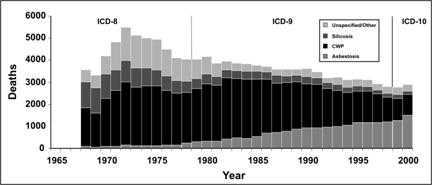
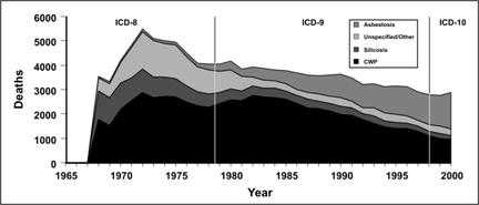
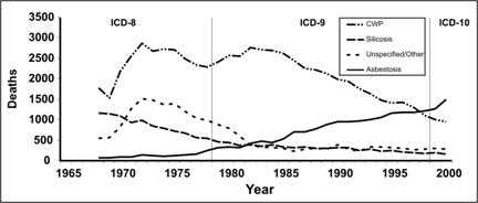
The component of most interest should always be put at the bottom because the upper component usually has a jagged baseline that may make comparison difficult. Consider the data on pneumoconiosis in Figure 4.9a. The graph clearly displays a gradual decline in deaths from all pneumoconiosis between 1972 and 1999. It appears that deaths from asbestosis (top subgroup in Figure 4.9a) went against the overall trend, by increasing over the same period. However, Figure 4.9b makes this point more clearly by placing asbestosis along the baseline.
Figure 4.9a Number of Deaths with Any Death Certificate Mention of Asbestosis, Coal Worker's Pneumoconiosis (CWP), Silicosis, and Unspecified/Other Pneumoconiosis Among Persons Aged ≥ 15 Years, by Year — United States, 1968–2000
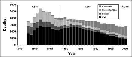
Adapted from: Centers for Disease Control and Prevention. Changing patterns of pneumoconiosis mortality–United States, 1968-2000. MMWR 2004;53:627–31.
This graph is similar to the one above except the variables in the stacks are arranged in a different order. It dramatizes the increase of asbestosis deaths over time.
Figure 4.9b Number of Deaths with Any Death Certificate Mention of Asbestosis, Coal Worker's Pneumoconiosis (CWP), Silicosis, and Unspecified/Other Pneumoconiosis Among Persons Aged ≥ 15 Years, by Year — United States, 1968–2000
Data Source: Centers for Disease Control and Prevention. Changing patterns of pneumoconiosis mortality–United States, 1968-2000. MMWR 2004;53:627–31.
Some histograms, particularly those that are drawn as stacks of squares, include a box that indicates how many cases are represented by each square. While a square usually represents one case in a relatively small outbreak, a square may represent five or ten cases in a relatively large outbreak.
Exercise 4.4
Using the botulism data presented in Exercise 4.1, draw an epidemic curve. Then use this epidemic curve to describe this outbreak as if you were speaking over the telephone to someone who cannot see the graph. Graph paper is provided at the end of this lesson.
Population pyramid
A population pyramid displays the count or percentage of a population by age and sex. It does so by using two histograms — most often one for females and one for males, each by age group — turned sideways so the bars are horizontal, and placed base to base (Figures 4.10 and 4.11). Notice the overall pyramidal shape of the population distribution of a developing country with many births, relatively high infant mortality, and relatively low life expectancy (Figure 4.10). Compare that with the shape of the population distribution of a more developed country with fewer births, lower infant mortality, and higher life expectancy (Figure 4.11).
Figure 4.10 Population Distribution of Zambia by Age and Sex, 2000
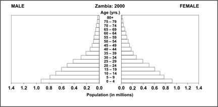
Source: U.S. Census Bureau [Internet]. Washington, DC: IDB Population Pyramids [cited 2004 Sep 10]. Available from: http://www.census.gov/ipc/www/idb/.
Figure 4.11 Population Distribution of Sweden by Age and Sex, 1997
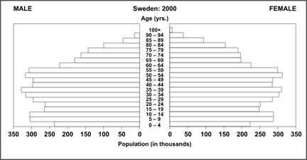
Source: U.S. Census Bureau [Internet]. Washington, DC: IDB Population Pyramids [cited 2004 Sep 10]. Available from: http://www.census.gov/ipc/www/idbpyr.html.
While population pyramids are used most often to display the distribution of a national population, they can also be used to display other data such as disease or a health characteristic by age and sex. For example, smoking prevalence by age and sex is shown in Figure 4.12. This pyramid clearly shows that, at every age, females are less likely to be current smokers than males.
Figure 4.12 Percentage of Persons ≥18 Years Who Were Current Smokers,* by Age and Sex — United States, 2002
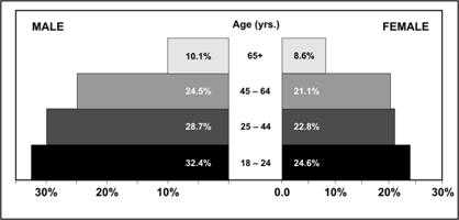
* Answer “yes” to both questions: “Do you now smoke cigarettes everyday or some days?” and “Have you smoked at least 100 cigarettes in your entire life?”
Data Source: Centers for Disease Control and Prevention. Cigarette smoking among adults– United States, 2002. MMWR 2004;53:427–31.
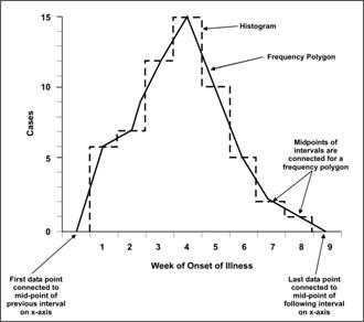
Frequency polygons
A frequency polygon, like a histogram, is the graph of a frequency distribution. In a frequency polygon, the number of observations within an interval is marked with a single point placed at the midpoint of the interval. Each point is then connected to the next with a straight line. Figure 4.13 shows an example of a frequency polygon over the outline of a histogram for the same data. This graph makes it easy to identify the peak of the epidemic (4 weeks).
A frequency polygon contains the same area under the line as does a histogram of the same data. Indeed, the data that were displayed as a histogram in Figure 4.9a are displayed as a frequency polygon in Figure 4.14.
Figure 4.14 Number of Deaths with Any Death Certificate Mention of Asbestosis, Coal Worker's Pneumoconiosis (CWP), Silicosis, and Unspecified/Other Pneumoconiosis Among Persons Aged ≥ 15 Years, by Year — United States, 1968–2000
Data Source: Centers for Disease Control and Prevention. Changing patterns of pneumoconiosis mortality–United States, 1968-2000. MMWR 2004;53:627–31.
A frequency polygon differs from an arithmetic-scale line graph in several ways. A frequency polygon (or histogram) is used to display the entire frequency distribution (counts) of a continuous variable. An arithmetic-scale line graph is used to plot a series of observed data points (counts or rates), usually over time. A frequency polygon must be closed at both ends because the area under the curve is representative of the data; an arithmetic-scale line graph simply plots the data points. Compare the pneumoconiosis mortality data displayed as a frequency polygon in Figure 4.14 and as a line graph in Figure 4.15.
Figure 4.15 Number of Deaths with Any Death Certificate Mention of Asbestosis, Coal Worker's Pneumoconiosis (CWP), Silicosis, and Unspecified/Other Pneumoconiosis Among Persons Aged ≥ 15 Years, by Year — United States, 1968–2000
Data Source: Centers for Disease Control and Prevention. Changing patterns of pneumoconiosis mortality–United States, 1968-2000. MMWR 2004;53:627–31.
Exercise 4.5
Consider the epidemic curve constructed for Exercise 4.4. Prepare a frequency polygon for these same data. Compare the interpretations of the two graphs.
Cumulative frequency and survival curves
As its name implies, a cumulative frequency curve plots the cumulative frequency rather than the actual frequency distribution of a variable. This type of graph is useful for identifying medians, quartiles, and other percentiles. The x-axis records the class intervals, while the y-axis shows the cumulative frequency either on an absolute scale (e.g., number of cases) or, more commonly, as percentages from 0% to 100%. The median (50% or half-way point) can be found by drawing a horizontal line from the 50% tick mark on the y-axis to the cumulative frequency curve, then drawing a vertical line from that spot down to the x-axis. Figure 4.16 is a cumulative frequency graph showing the number of days until smallpox vaccination scab separation among persons who had never received smallpox vaccination previously (primary vaccinees) and among persons who had been previously vaccinated (revaccinees). The median number of days until scab separation was 19 days among revaccinees, and 22 days among primary vaccinees.
Figure 4.16 Days to Smallpox Vaccination Scab Separation Among Primary Vaccinees (n=29) and Revaccinees (n=328) — West Virginia, 2003
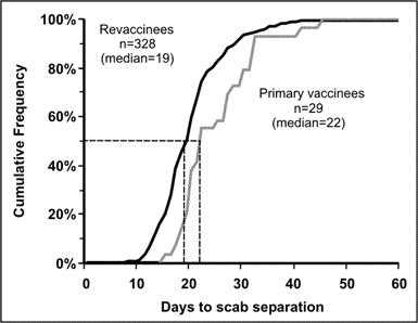
Source: Kaydos-Daniels S, Bixler D, Colsher P, Haddy L. Symptoms following smallpox vaccination–West Virginia, 2003. Presented at 53rd Annual Epidemic Intelligence Service Conference, April 19-23, 2004, Atlanta, Georgia.
A survival curve can be used with follow-up studies to display the proportion of one or more groups still alive at different time periods. Similar to the axes of the cumulative frequency curve, the x-axis records the time periods, and the y-axis shows percentages, from 0% to 100%, still alive.
The most striking difference is in the plotted curves themselves. While a cumulative frequency starts at zero in the lower left corner of the graph and approaches 100% in the upper right corner, a survival curve begins at 100% in the upper left corner and proceeds toward the lower right corner as members of the group die. The survival curve in Figure 4.17 shows the difference in survival in the early 1900s, mid-1900s, and late 1900s. The survival curve for 1900–1902 shows a rapid decline in survival during the first few years of life, followed by a relatively steady decline. In contrast, the curve for 1949–1951 is shifted right, showing substantially better survival among the young. The curve for 1997 shows improved survival among the older population.
Figure 4.17 Percent Surviving by Age in Death-registration States, 1900–1902 and United States, 1949–1951 and 1997
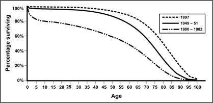
Source: Anderson RN. United States life tables, 1997. National vital statistics reports; vol 47, no. 28. Hyattsville, Maryland: National Center for Health Statistics, 1999.
Note that the smallpox scab separation data plotted as a cumulative frequency graph in Figure 4.16 can be plotted as a smallpox scab survival curve, as shown in Figure 4.18.
Figure 4.18 “Survival” of Smallpox Vaccination Scabs Among Primary Vaccines (n=29) and Revaccinees (n=328) — West Virginia, 2003
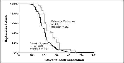
Source: Kaydos-Daniels S, Bixler D, Colsher P, Haddy L. Symptoms following smallpox vaccination–West Virginia, 2003. Presented at 53rd Annual Epidemic Intelligence Service Conference, April 19-23, 2004, Atlanta, Georgia.
References (This Section)
- Schmid CF, Schmid SE. Handbook of graphic presentation. New York: John Wiley & Sons, 1954.
- Cleveland WS. The elements of graphing data. Summit, NJ: Hobart Press, 1994.
- Brookmeyer R, Curriero FC. Survival curve estimation with partial non-random exposure information. Statistics in Medicine 2002;21:2671–83.
Previous Page Next Page: Section 4
Image Description
Figure 4.1
Description: The Y-axis shows equal intervals of frequency (e.g. number of cases, percent, rate). The X-axis shows equal intervals of method of classification (e.g., time of illness onset, in days; year of report; age of cases, in years). Data are marked with a dot at the intersection of the X and Y axes. A straight line connects the dots. The line shows an increase and decrease of reported measles cases by year Return to text.
Figure 4.2
Description: Line graph showing the prevalence of neural tube defects over time. There is a slight decrease when folic acid fortification was optional, and a continuing decrease when folic acid was mandatory. Return to text.
Figure 4.3
Description: Line graph shows age at death on the Y-axis and year on the X-axis. Data for men is displayed with diamond data points and a dashed line. Data for women are displayed with a square data point and a solid line. The data for men and women can be easily compared. Return to text.
Figure 4.4
Description: A mumps vaccine was first licensed in December 1967. Because of the recommendation of two doses of measles-mumps-rubella vaccine and the continued high coverage rate in the United States, mumps incidence continues to be low, with 231 cases reported for 2003, thus meeting the Healthy People 2010 objective of less than 500 cases per year. In the graph, the Y-axis shows incidence per 100,000 population. The X-axis shows year. An increase between 1995 and 1997 is seen. Return to text.
Figure 4.5
Description: A line graph with the Y-axis showing a semi-logarithmic scale with rates ranging from 0.1 to 1,000. This allows incompatible scales to be used to show diverse data in one graph. Return to text.
Figure 4.7a
Description: A histogram showing number of cases over time after attendance to a party. The height of each column reflects the number of cases. There are no spaces between adjacent columns. Trends by date and time are seen. Return to text.
Figure 4.7b
Description: The same data as in figure 4.7a, with the each column is represented as stacks of squares. Each square represents 1 case. The exact number of cases by date and time is more easily seen. Return to text.
Figure 4.7c
Description: This graph is similar to figure 4.7b however additional information is represented with different colored boxes indicating which cases are probable and which are confirmed. Return to text.
Figure 4.8
Description: Bar graph with six groups of body mass index (from underweight to extremely obese) on the x-axis and percentage of population on the y-axis. The degree of obesity in this population are easily seen. Return to text.
Figure 4.9a
Description: A stacked bar chart. Each column is created by 4 smaller columns stacked on top of each other. Each of the smaller columns represents a different cause of death. The bottom of the column displays CWP data. The top column displays asbestosis data. A distinct trend in asbestosis deaths is difficult to determine. Return to text.
Figure 4.9b
Description: A stacked bar graph displaying the same data as Figure 4.9a. However, the bottom of the column displays asbestosis data so a distinct trend is more obvious. Return to text.
Figure 4.10
Description: A population pyramid. Horizontal bars indicate the population by age. The y-axis is in the middle. Bars indicating data for males is on one side, females on the other. A linear relationship between age and population is seen for both males and females. The overall shape is triangular. Return to text.
Figure 4.11
Description: A population pyramid. The overall shape is not triangular because there is no linear relationship between age and population. Return to text.
Figure 4.12
Description: A population pyramid showing 2 trends: the percentage of smokers (both male and female) increase by age and fewer females at all age groups smoke. Return to text.
Figure 4.13
Description: The same data is shown in 2 different formats. The histogram shows number of cases as columns. The Frequency polygon shows number of cases as data points connected by lines. The midpoints of intervals of the histogram intersect the frequency polygon. For the frequency polygon, the first data point is connected to the midpoint of the previous interval on the X-axis. The last data point is connected the mid-point of the following interval. Return to text.
Figure 4.14
Description: A frequency polygon showing the same data as Figure 4.9a. Instead of columns with 4 different colors to indicate the number of deaths, a series of 4 lines represent the 4 sets data creating a smoother shape. The area under each line is colored to indicate the difference between each set of data. The lines at the beginning and end intersect the X-axis. Return to text.
Figure 4.15
Description: A line graph showing the same data as Figure 4.14. Instead of shaded areas, a series of 4 lines representing the 4 sets data creating a smoother shape. Each dataset has a different type of line, for example, dashed, dotted, or solid. The lines at the beginning and end do not intersect the X-axis. Return to text.
Figure 4.16
Description: A cumulative frequency graph showing 2 lines, one for revaccinees and 1 for primary vaccines. Both lines start at zero in the lower left corner of the graph and approaches 100% in the upper right corner. The data points at 50% frequency is seen. Return to text.
Figure 4.17
Description: A survival curve with 3 data sets indicated by different lines. All lines start at 100% on the left and decrease to 0% on the right. The graph is counter-intuitive because increased age at death is depicted by a declining curve. Return to text.
Figure 4.18
Description: The same data as figure 4.16 presented as a survival curve with both lines declining from the left to the right. Return to text.
- Page last reviewed: May 18, 2012
- Page last updated: May 18, 2012
- Content source: