

Lesson 4: Displaying Public Health Data
 ShareCompartir
 Exercise Answers
Exercise 4.1
-
Botulism Status by Age Group, Texas Church Supper Outbreak, 2001
Botulism Status Age Group (Years) Yes No Total 15 23 ≤9 2 2 10–19 1 1 20–29 2 2 30–39 0 2 40–49 4 4 50–59 3 4 60–69 1 5 70–79 2 3 ≥80 0 0 -
Botulism Status by Exposure to chicken, * Texas Church Supper Outbreak, 2001
Botulism? Yes No Total Total 12 23 35 Ate chicken? Yes 8 11 19 No 4 12 16 * Excludes 3 botulism case-patients with unknown exposure to chicken -
Botulism Status by Exposure to chili, * Texas Church Supper Outbreak, 2001
Botulism? Yes No Total Total 14 23 37 Ate chili? Yes 14 8 22 No 0 15 15 * Excludes 1 botulism case-patient with unknown exposure to chili -
Ate_leftovers Status by Exposure to chili, * Texas Church Supper Outbreak, 2001* One case with unknown exposure to initial chili consumption
Exercise 4.2
Strategy 1: Divide the data into groups of similar size
-
Divide the list into three equal-sized groups of places:50 states ÷ 3 = 16.67 states per group. Because states can't be cut in thirds, two groups will contain 17 states and one group will contain 16 states.Illinois (#17) could go into either the first or second group, but its rate (80.0) is closer to #16 Maine's rate (80.2) than Texas' rate (79.3), so it makes sense to put Illinois in the first group. Similarly, #34 Vermont could go into either the second or third group.Arbitrarily putting Illinois into the first category and Vermont into the second results in the following groups:
- Kentucky through Illinois (States 1–17)
- Texas through Vermont (States 18–34)
- South Dakota through Utah (States 35–50)
- Identify the rate for the first and last state in each group:
- Kentucky through Illinois 80.0–116.1
- Texas through Vermont 70.2–79.3
- South Dakota through Utah 39.7–68.1
- Adjust the limits of each interval so no gap exists between the end of one class interval and beginning of the next. Deciding how to adjust the limits is somewhat arbitrary — you could split the difference, or use a convenient round number.
- Kentucky through Illinois 80.0–116.1
- Texas through Vermont 70.0–79.9
- South Dakota through Utah 39.7–69.9
Strategy 2: Base intervals on mean and standard deviation
- Create three categories based on the mean (77.1) and standard deviation (16.1) by finding the upper limits of three intervals:
- Upper limit of interval 3 = maximum value = 116.1
- Upper limit of interval 2 = mean 1 standard deviation = 77.1 + 16.1 = 93.2
- Upper limit of interval 1 = mean − 1 standard deviation = 77.1 − 16.1 = 61.0
- Lower limit of interval 1 = minimum value = 39.7
- Select the lower limit for each upper limit to define three full intervals. Specify the states that fall into each interval. (Note: To place the states with the highest rates first, reverse the order of the intervals):
- North Carolina through Kentucky (8 states) 93.3–116.1
- Arizona through Georgia (35 states) 61.1–93.2
- Utah through Minnesota (7 states) 39.7–61.0
Strategy 3: Divide the range into equal class intervals
- Divide the range from zero (or the minimum value) to the maximum by 3:
(116.1 − 39.7) ⁄ 3 = 76.4 ⁄ 3 = 25.467 - Use multiples of 25.467 to create three categories, starting with 39.7:
39.7 through (39.7 + 1 × 25.467) = 39.7 through 65.2
65.3 through (39.7 + 2 × 25.467) = 65.3 through 90.6
90.7 through (39.7 + 3 × 25.467) = 90.7 through 116.1 - Final categories:
- Indiana through Kentucky (11 states) 90.7–116.1
- Nebraska through Oklahoma (29 states) 65.3–90.6
- Utah through North Dakota (10 states) 39.7–65.2
- Alternatively, since 90.6 is close to 90 and 65.2 is close to 65.0, the categories could be reconfigured with no change in state assignments. For example, the final categories could look like:
Indiana through Kentucky (11 states) 90.1–116.1
Nebraska through Oklahoma (29 states) 65.1–90.0
Utah through North Dakota (10 states) 39.7–65.0
Exercise 4.3
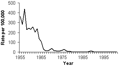
- Highest rate is 438.2 per 100,000 (in 1958), so maximum on y-axis should be 450 or 500 per 100,000.
Rate (per 100,000 Population) of Reported Measles Cases by Year of Report — United States, 1955–2002
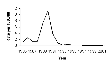
- Highest rate between 1985 and 2002 was 11.2 (per 100,000 in 1990), so maximum on y-axis should be 12 per 100,000.
Rate (per 100,000 Population) of Reported Measles Cases by Year of Report — United States, 1985–2002
Exercise 4.4
Number of Cases of Botulism by Date of Onset of Symptoms, Texas Church Supper Outbreak, 2001
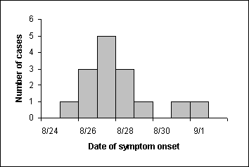
The first case occurs on August 25, rises to a peak two days later on August 27, then declines symmetrically to 1 case on August 29. A late case occurs on August 31 and September 1.
Exercise 4.5
Number of Cases of Botulism by Date of Onset of Symptoms, Texas Church Supper Outbreak, 2001
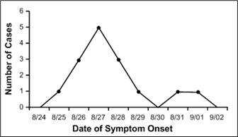
The area under the line in this frequency polygon is the same as the area in the answer to Exercise 4.4. The peak of the epidemic (8/27) is easier to identify.
Exercise 4.6
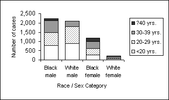
Number of Reported Cases of Primary and Secondary Syphilis, by Age Group, Among Non-Hispanic Black and White Men and Women — United States, 2002 (Stacked Bar Chart)
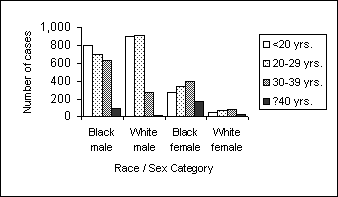
Number of Reported Cases of Primary and Secondary Syphilis,by Age Group, Among Non-Hispanic Black and White Men and Women — United States, 2002 (Grouped Bar Chart)
Percent of Reported Cases of Primary and Secondary Syphilis, by Age Group, Among Non-Hispanic Black and White Men and Women — United States, 2002 (100% Component Bar Chart)
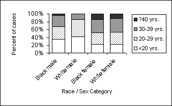
Source: Centers for Disease Control and Prevention. Sexually Transmitted Disease Surveillance 2002. Atlanta, Georgia. U.S. Department of Health and Human Services; 2003.
The stacked bar chart clearly displays the differences in total number of cases, as reflected by the overall height of each column. The number of cases in the lowest category (age <20 years) is also easy to compare across race-sex groups, because it rests on the x-axis. Other categories might be a little harder to compare because they do not have a consistent baseline. If the size of each category in a given column is different enough and the column is tall enough, the categories within a column can be compared.
The grouped bar chart clearly displays the size of each category within a given group. You can also discern different patterns across the groups. Comparing categories across groups takes work.
The 100% component bar chart is best for comparing the percent distribution of categories across groups. You must keep in mind that the distribution represents percentages, so while the 30–39 year category in white females appears larger than the 30–39 year category in the other race-sex groups, the actual numbers are much smaller.
Exercise 4.7
Age-adjusted Lung Cancer Death Rates per 100,000 Population, by State — United States, 2002
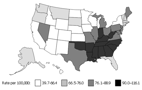
Image Description
Exercise 4.3-1
Figure Description: Arithmetic-scale line graph. The y-axis range is from 0 to 500. The x-axis shows year. Return to text.
Exercise 4.3-2
Figure Description: Arithmetic-scale line graph. The y-axis range is from 0 to 12. The x-axis shows year. Return to text.
Exercise 4.4
Figure Description: A histogram showing the increase and decrease of symptom onset by date. Return to text.
Exercise 4.5
Figure Description: Data from Exercise 4.4 in a frequency polygon. Instead of columns, data points are connected by lines. Return to text.
Exercise 4.6 a
Figure Description: The X-axis shows number of cases. Y-axis lists race/sex category. There is one vertical bar for each category, with different shading to indicate different age groups. The total number of cases for each race/sex category is clearly seen, but comparisons of race/sex and age is difficult. Return to text.
Exercise 4.6 b
Figure Description: The X-axis and Y-axis are the same. There are 4 vertical bars for each category. Bars representing different age groups are shaded. Comparisons of cases for each race/sex category and age category are easily seen. Comparison of the total number of cases for each race/sex category is difficult. Return to text.
Exercise 4.6 c
Figure Description: The X- and Y-axis are the same. 4 vertical bars for each category are shaded to indicate the age groups. Comparisons of cases for each race/sex category and age category are easily seen. Comparison of the total number of cases for each race/sex category is difficult. Return to text.
Exercise 4.7
Figure Description: Shaded map of the U.S. Southeast states have higher cancer rates than midwestern states. Return to text.
- Page last reviewed: May 18, 2012
- Page last updated: May 18, 2012
- Content source: