

Lesson 2: Summarizing Data
 ShareCompartir
Section 4: Properties of Frequency Distributions
The data in a frequency distribution can be graphed. We call this type of graph a histogram. Figure 2.1 is a graph of the number of outbreak-related salmonellosis cases by date of illness onset.
Figure 2.1 Number of Outbreak-Related Salmonellosis Cases by Date of Onset of Illness — United States, June–July 2004
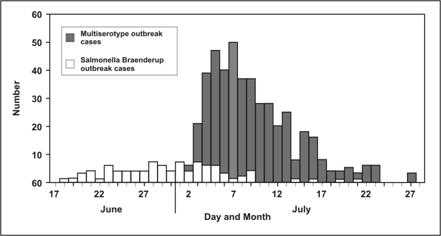
Source: Centers for Disease Control and Prevention. Outbreaks of Salmonella infections associated with eating Roma tomatoes–United States and Canada, 2004. MMWR 54;325–8.
Even a quick look at this graph reveals three features:
- Where the distribution has its peak (central location),
- How widely dispersed it is on both sides of the peak (spread), and
- Whether it is more or less symmetrically distributed on the two sides of the peak
Central location
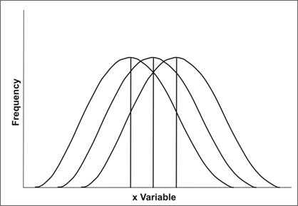
Note that the data in Figure 2.1 seem to cluster around a central value, with progressively fewer persons on either side of this central value. This type of symmetric distribution, as illustrated in Figure 2.2, is the classic bell-shaped curve — also known as a normal distribution. The clustering at a particular value is known as the central location or central tendency of a frequency distribution. The central location of a distribution is one of its most important properties. Sometimes it is cited as a single value that summarizes the entire distribution. Figure 2.3 illustrates the graphs of three frequency distributions identical in shape but with different central locations.
Figure 2.2 Bell-Shaped Curve
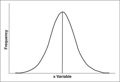
Figure 2.3 Three Identical Curves with Different Central Locations
Three measures of central location are commonly used in epidemiology: arithmetic mean, median, and mode. Two other measures that are used less often are the midrange and geometric mean. All of these measures will be discussed later in this lesson.
Depending on the shape of the frequency distribution, all measures of central location can be identical or different. Additionally, measures of central location can be in the middle or off to one side or the other.
Spread
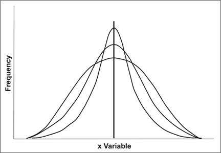
A second property of frequency distribution is spread (also called variation or dispersion). Spread refers to the distribution out from a central value. Two measures of spread commonly used in epidemiology are range and standard deviation. For most distributions seen in epidemiology, the spread of a frequency distribution is independent of its central location. Figure 2.4 illustrates three theoretical frequency distributions that have the same central location but different amounts of spread. Measures of spread will be discussed later in this lesson.
Shape
A third property of a frequency distribution is its shape. The graphs of the three theoretical frequency distributions in Figure 2.4 were completely symmetrical. Frequency distributions of some characteristics of human populations tend to be symmetrical. On the other hand, the data on parity in Figure 2.5 are asymmetrical or more commonly referred to as skewed.
Figure 2.5 Distribution of Case-Subjects by Parity, Ovarian Cancer Study, CDC
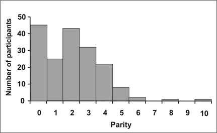
Data Sources: Lee NC, Wingo PA, Gwinn ML, Rubin GL, Kendrick JS, Webster LA, Ory HW. The reduction in risk of ovarian cancer associated with oral contraceptive use. N Engl J Med 1987;316: 650–5.
Centers for Disease Control Cancer and Steroid Hormone Study. Oral contraceptive use and the risk of ovarian cancer. JAMA 1983;249:1596–9.
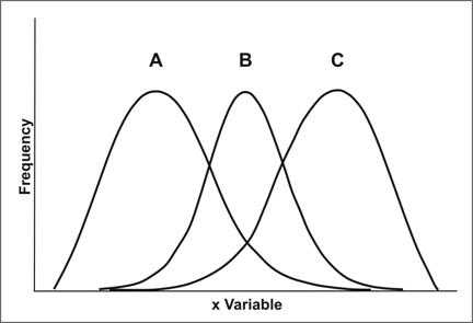
A distribution that has a central location to the left and a tail off to the right is said to be positively skewed or skewed to the right. In Figure 2.6, distribution A is skewed to the right. A distribution that has a central location to the right and a tail to the left is said to be negatively skewed or skewed to the left. In Figure 2.6, distribution C is skewed to the left.
Question: How would you describe the parity data in Figure 2.5?
Answer: Figure 2.5 is skewed to the right. Skewing to the right is common in distributions that begin with zero, such as number of servings consumed, number of sexual partners in the past month, and number of hours spent in vigorous exercise in the past week.
One distribution deserves special mention — the Normal or Gaussian distribution. This is the classic symmetrical bell-shaped curve like the one shown in Figure 2.2. It is defined by a mathematical equation and is very important in statistics. Not only do the mean, median, and mode coincide at the central peak, but the area under the curve helps determine measures of spread such as the standard deviation and confidence interval covered later in this lesson.
Previous Page Next Page: Section 5
Image Description
Figure 2.1
Description: A histogram shows the number of Multiserotype outbreak cases compared to Salmonella braenderup outbreak cases over time. Each outbreak has a different peak, spread, and symmetry. Return to text.
Figure 2.2
Description: The X-axis is the variable. The Y-axis is frequency. A vertical line in the middle shows central tendency. Return to text.
Figure 2.3
Description: Three superimposed bell-shaped curves. The shapes of all three are the same, but the central locations are in different locations on the x-axis. Return to text.
Figure 2.4
Description: Three superimposed symmetrical curves. The central tendencies of all three are the same, but the curves are either tall and narrow or short and wide. Return to text.
Figure 2.5
Description: A histogram showing an asymmetrical distribution in which 2 peaks can be seen along with a gradual decrease as parity increases. Return to text.
Figure 2.6
Description: Three superimposed bell curves. The shapes of all three are different. A is shifted to the left. B is symmetrical. C is shifted to the right. Return to text.
- Page last reviewed: May 18, 2012
- Page last updated: May 18, 2012
- Content source: