

Quick Maps of Heart Disease, Stroke, and Socio-economic Conditions
 ShareCompartir
View and download maps on heart disease and stroke showing national data, health care costs, and social determinants of health data.
Heart Disease and Stroke Maps
View ready-made national heart disease and stroke maps by age and racial or ethnic group. Each map contains a link below it to view, download or print a larger version in PDF format.
To create your own county-level heart disease and stroke map, visit the Interactive Atlas of Heart Disease and Stroke.
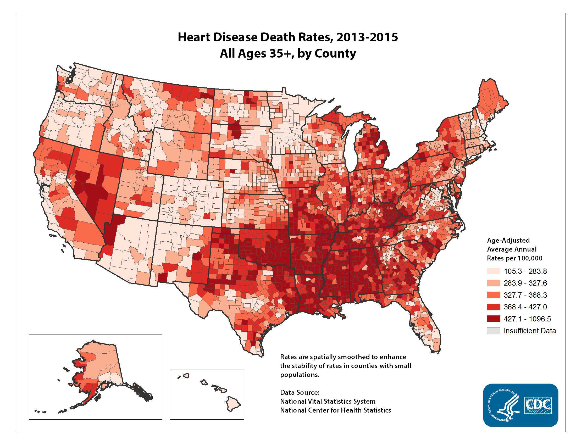
Heart Disease Death Rates—Ages 35+, by County
Heart Disease Death Rates—Ages 65+, by County
Heart Disease Hospitalization Rates—Ages 65+, by County
Stroke Death Rates—Ages 35+, by County
Stroke Death Rates—Ages 65+, by County
Stroke Hospitalization Rates—Ages 65+, by County
National Map Resources
Health Care Costs Data Maps
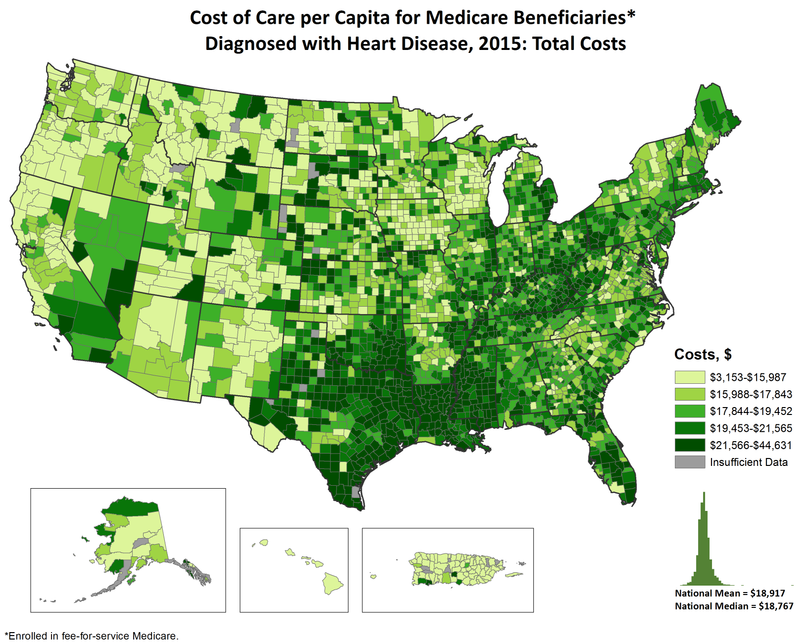
The maps in this section show the costs of care per capita and incremental costs of care per capita for Medicare beneficiaries with heart disease.
To create your own county-level health care cost map, visit the Interactive Atlas of Heart Disease and Stroke.
Costs of Care (per capita)
Costs per capita are the average costs incurred by a Medicare beneficiary with heart disease in a given county.
Incremental Costs (per capita)
Incremental costs are the costs incurred among beneficiaries with heart disease above and beyond the costs incurred among beneficiaries without heart disease.
- Incremental Inpatient Costs
- Incremental Outpatient Costs
- Incremental Post-Acute Care Costs
- Total Incremental Costs
Other
Learn more about the Health Care Costs data.
Social Determinants of Health Maps
Social determinants of health are factors in the social environment that contribute to or detract from the health of individuals and communities. Social determinants of health have been found to directly increase the burden of heart disease and stroke and their risk factors. They also indirectly influence health-promoting behaviors.
Use these selected social determinants of health maps together with other data sources to match heart disease and stroke prevention programs and policies to the needs of local populations.
To create your own county-level health care cost map, visit the Interactive Atlas of Heart Disease and Stroke.
Resources Related to the Social Determinants of Health
- Promoting Health Equity—A Resource to Help Communities Address Social Determinants of Health [PDF-6M] This workbook is for community-based organizations seeking to affect the social determinants of health through community-based participatory approaches and nontraditional partnerships.
- Heart-Healthy and Stroke-Free: A Social Environment Handbook Strategies for public health professionals and community and state leaders to assess the conditions for heart-healthy and stroke-free living in communities.
- Data Set Directory of Social Determinants of Health at the Local Level This directory contains an extensive list of existing data sets that can be used to address the social determinants of health. The data sets are organized according to 12 dimensions, or broad categories, of the social environment. Each dimension is subdivided into various components.
- Closing the Gap in a Generation: Health Equity Through Action on the Social Determinants of Health The Final Report of the World Health Organization’s Commission on Social Determinants of Health sets out key areas of daily living conditions and of the underlying structural drivers that influence them in which action is needed. It provides analysis of social determinants of health and concrete examples of types of action that have proven effective in improving health and health equity in countries at all levels of socioeconomic development.
Other links that point to data, maps, statistics, and information related to the social determinants of health
- American FactFinder—Decennial Census, American Community Survey, Economic Census, Population Estimates (U.S. Census Bureau)
- Atlas of Rural and Small Town America (data) (USDA Economic Research Service)
- Community Health Status Indicators (HHS)
- County Typology Code (for economic dependence and social policy themes) (USDA Economic Research Service)
- Data Products (USDA Economic Research Service)
- DiversityData—Measures of diversity, opportunity, and quality of life by U.S. Metro area (Harvard)
- Food Environment Atlas (USDA Economic Research Service)
- Social Determinants of Health (CDC)
- Page last reviewed: July 19, 2017
- Page last updated: July 19, 2017
- Content source: