Skip directly to search
Skip directly to A to Z list
Skip directly to navigation
Skip directly to page options
Skip directly to site content
Start of Search Controls
Search Form Controls
Search The CDC
Cancel
Submit
Search The CDC
CDC A-Z Index
MENU
CDC A-Z
SEARCH
A
B
C
D
E
F
G
H
I
J
K
L
M
N
O
P
Q
R
S
T
U
V
W
X
Y
Z
#
Start of Search Controls
Search Form Controls
Search The CDC
Cancel
Submit
Search The CDC
Cancer Prevention and Control
Note: Javascript is disabled or is not supported by your browser. For this reason, some items on this page will be unavailable. For more information about this message, please visit this page:
About CDC.gov
.
Cancer Home
Kinds of Cancer
Bladder
Breast
Cervical
Colorectal (Colon)
Head and Neck
Kidney
Leukemia
Liver
Lung
Lymphoma
Myeloma
Ovarian
Prostate
Skin
Thyroid
Uterine
Vaginal and Vulvar
How to Prevent Cancer or Find It Early
Screening Tests
Vaccines (Shots)
Healthy Choices
Data and Statistics
For Different Kinds of Cancer
Cancer Rates by U.S. State
Cancer Rates by Race/Ethnicity and Sex
Cancer Trends by Race/Ethnicity and Sex
Incidence Trends Among Men
Mortality Trends Among Men
Incidence Trends Among Women
Mortality Trends Among Women
Cancer Facts for Demographic Groups
Cancer Among Men
Cancer Among Women
Cancer Among Children
Racial or Ethnic Variations
Geographic Variations
Tools
Other Cancer Data Sources
Research
Article Summaries
2017
Race, Sex, and Age Can Make a Difference in Surviving HPV-Associated Cancers
Cost of Cancer-Related Neutropenia or Fever Hospitalizations
Some Older Women Are Not Getting Recommended Cervical Cancer Screenings
Most Schools Can Do More to Help Students Stay Sun Safe
Parents and Friends Can Influence Teens’ Decisions About Starting Indoor Tanning
Deaths from Colorectal Cancer in U.S. Counties with Lower Education Levels
Money Worries Affect How Some Cancer Patients Take Prescribed Medicines
Annual Report to the Nation on the Status of Cancer, 1975–2014
Cancer Screening Prevalence Among Adults with Disabilities
Economic Evaluation of CDC’s Colorectal Cancer Control Program
2016
State of the Science on Melanoma Prevention and Screening
Developing a Cost Data Collection Tool for Cancer Registry Planning
Anxiety and Depression Medicine Use Among Cancer Survivors
Breast Cancer Rates Among Black Women and White Women
Schools Can Help Prevent Skin Cancer
Lung Cancer Survivors May Feel Blame
Women’s Perceived and Actual Risk of Getting Cancer
Colorectal Cancer Screening Capacity in the United States
The Economics of Breast Cancer in Younger Women in the U.S.
New Cases of Melanoma Among Hispanics in the United States
Annual Report to the Nation on the Status of Cancer, 1975–2012
Infographic
Providers’ Knowledge, Attitudes, and Practices Related to Colorectal Cancer in Brazil
2015
2 of 3 People Are Living At Least Five Years After Cancer Diagnosis
Health Behaviors and Follow-Up Care Among Colorectal Cancer Survivors
Cancer Survivorship Supplement
Gallbladder Cancer Incidence and Death Rates
Indoor Tanning Among Adults in the U.S.
Sunscreen Use Among Adults in the U.S.
CDC’s Cervical Cancer Study
Expected New Cancer Cases and Deaths in 2020
Actual and Projected Cancer Incidence Rates, United States, 1975 to 2020
Actual and Projected Cancer Death Rates, United States, 1975 to 2020
Assessment of HPV Types in Cancers
Use of the Persuasive Health Message Framework in a Mammography Promotion Campaign
African American Women and Mass Media Campaign Evaluation
Cancer Survival: The Start of Global Surveillance
2012–2014
Barriers to HPV Vaccination Among Adolescents in the United States
AMIGAS: A Cervical Cancer Prevention Trial Among Mexican-American Women
Preventing Skin Cancer by Reducing Indoor Tanning
Cervical Cancer Rates Among Young Women in the U.S.
Increased Risk of Rare Cancer as DES Daughters Age
Patterns of Colorectal Cancer Test Use
Malignant Melanoma in Non-Hispanic Black Patients
Workers Without Paid Sick Leave May Skip Cancer Screening Tests
Effectiveness of Interventions to Increase Cancer Screening
Adolescent and Young Adult Cancer Survivors
HPV-Associated Cancers
Physicians Who Use Social Media
Skin Cancer Risk Behaviors Among U.S. Adults
Annual Report to the Nation on the Status of Cancer, 1975–2008
Archived
Citation Search Tool
Promoting Cancer Prevention
Preventing Cancer Across a Lifetime
Cancer Prevention During Early Life
Cancer Prevention Among Youth
Cancer Prevention During Early Adulthood
Cancer Prevention During Midlife
Increasing Physical Activity
Physical Activity Guidelines
Physical Activity Among Adults
Physical Activity Among Youth
Physical Activity Among Cancer Survivors
Barriers to Physical Activity
Strategies That Work
What Comprehensive Cancer Control Programs Can Do
References
Reducing Excessive Alcohol Use
What Works to Reduce Excessive Alcohol Use
What Comprehensive Cancer Control Programs Can Do
Potential Partners for Comprehensive Cancer Control Coalitions
References
Reducing Indoor Tanning Among Minors
Reducing Household Radon
What We Know
What States Can Do
Case Study: Reducing Radon in Illinois
What Comprehensive Cancer Control Programs Can Do
Resources
Guide to Promoting Cancer Prevention in Your Community
Special Topics
HPV and Cancer
Tobacco and Cancer
Preventing Infections in Cancer Patients
Cancer, the Flu, and You
Health Disparities
Survivorship
Resources to Share
Videos
Breast Cancer
Colorectal Cancer
Gynecologic Cancers
HPV-Associated Cancers
Skin Cancer
Podcasts
Breast Cancer
Colorectal Cancer
Gynecologic Cancers
HPV-Associated Cancers
Skin Cancer
Print Materials
Infographics
Cancer and Alcohol
Web Features
Breast Cancer Awareness
Breast Cancer in Young Women
Cancer and Men
Cancer and Women
Cancer Prevention in the Workplace
Cancer Prevention Starts in Childhood
Cancer, the Flu, and You
Cervical Cancer Awareness
Colorectal Cancer Awareness
Gynecologic Cancer Awareness
Health Disparities in Cancer
Improving Health and Quality of Life After Cancer
Lung Cancer Awareness
Preventing Infections in Cancer Patients
Prostate Cancer Awareness
Skin Cancer Awareness
Using Science to Prevent Cancer
Shareable Graphics
Twitter
About Us
Leaders
Lisa C. Richardson
Frances Babcock
Vicki Benard
Djenaba A. Joseph
Jacqueline W. Miller
Mona Saraiya
Judith Lee Smith
Sherri L. Stewart
Mary C. White
Debra Younginer
Featured Scientists
Vicki Benard, PhD
Natasha Buchanan Lunsford, PhD
Donatus Ekwueme, PhD
Ingrid J. Hall, PhD, MPH
Donald Haverkamp, MPH
Dawn M. Holman, MPH
Commander Djenaba A. Joseph, MD, MPH
Jun Li, MD, PhD, MPH
Stephanie C. Melkonian, PhD
Captain Jacqueline W. Miller, MD, FACS
Behnoosh Momin, DrPH, MS, MPH
Lucy A. Peipins, PhD
Lori A. Pollack, MD, MPH
Thomas B. Richards, MD
Lisa C. Richardson, MD, MPH
Sun Hee Rim, PhD, MPH
Elizabeth A. Rohan, PhD, MSW
A. Blythe Ryerson, PhD, MPH
Susan Sabatino, MD, MPH
Mona Saraiya, MD, MPH
Simple Singh, MD, MPH
Judith Lee Smith, PhD
Sherri L. Stewart, PhD
Eric Tai, MD, MS
Florence Tangka, PhD, MS
Julie Townsend, MS
Hannah K. Weir, PhD, MSc
Arica White, PhD, MPH
Mary C. White, ScD, MPH
Organization Chart
Foundational Programs
National Breast and Cervical Cancer Early Detection Program
National Comprehensive Cancer Control Program
National Program of Cancer Registries
Colorectal Cancer Control Program
Educational Campaigns
Bring Your Brave
Campaign
Inside Knowledge
Campaign
Screen for Life
Campaign
Initiatives
Participation in Cancer Moonshot
2017 CDC National Cancer Conference
Stay Informed
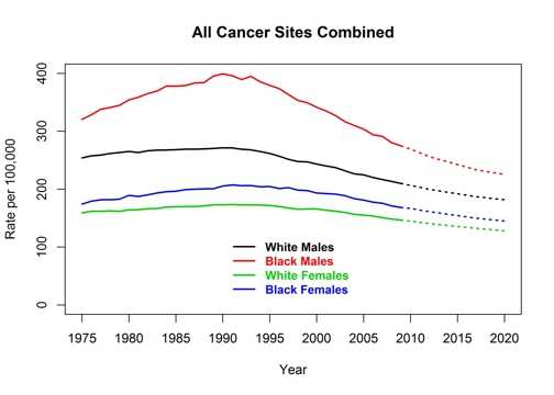
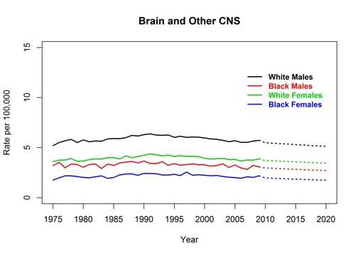
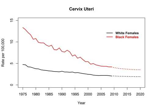
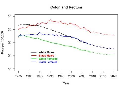
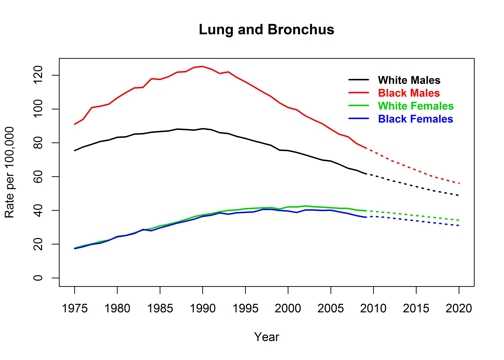
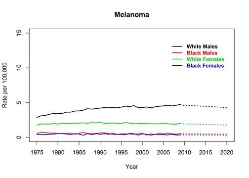
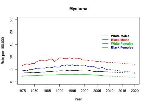
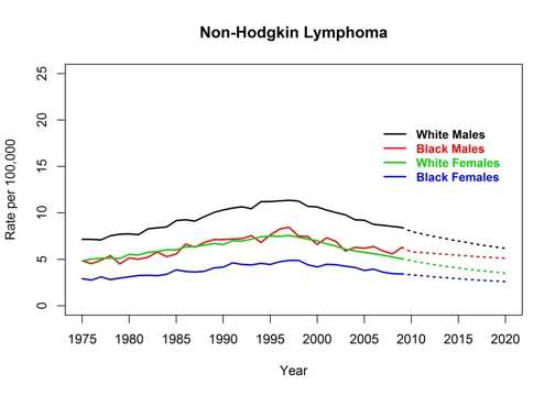
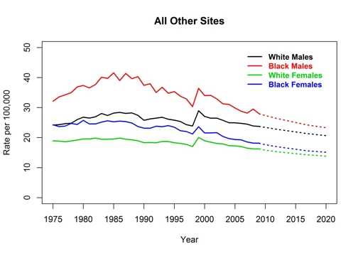
Actual and Projected Cancer Death Rates, United States, 1975 to 2020
Recommend on Facebook
Tweet
Share
Compartir
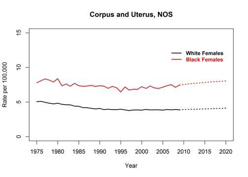
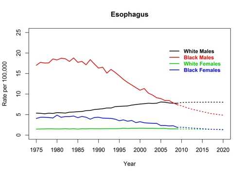
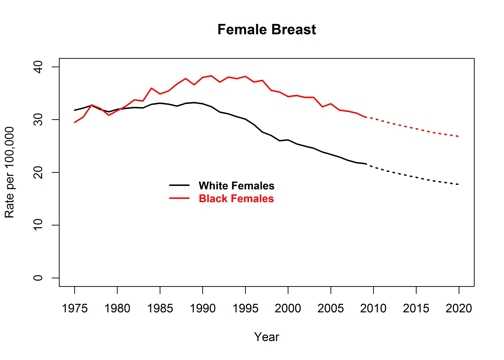
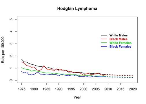
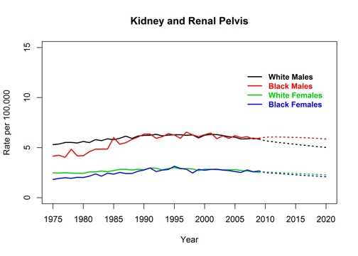
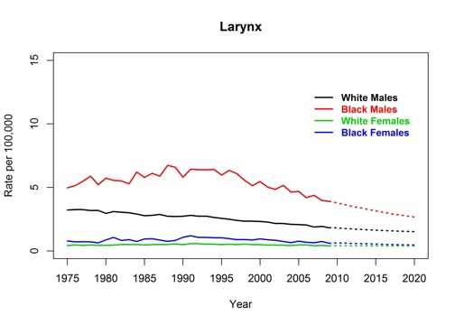
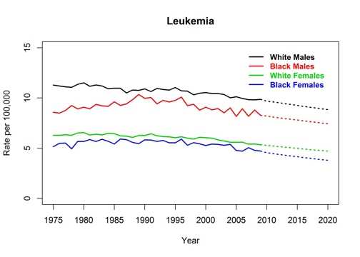
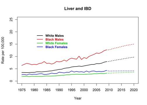
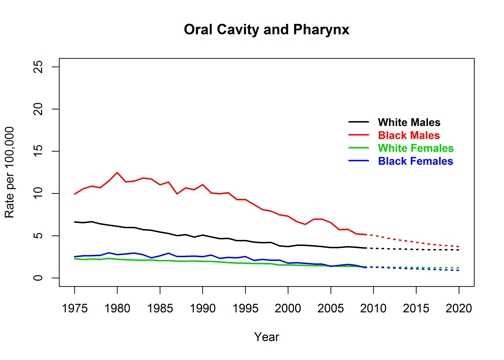
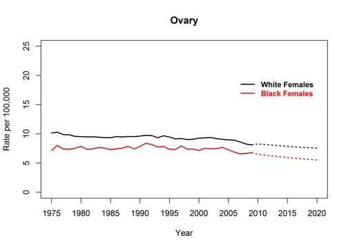
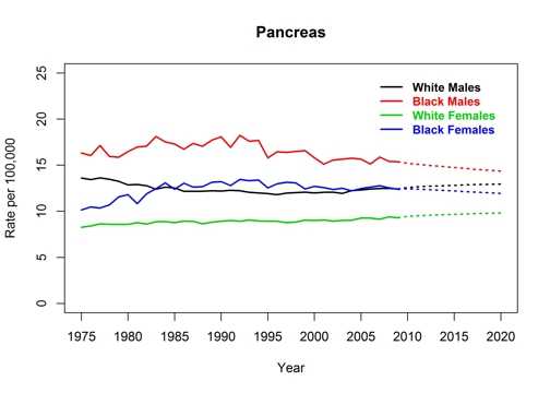
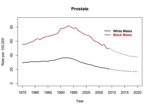
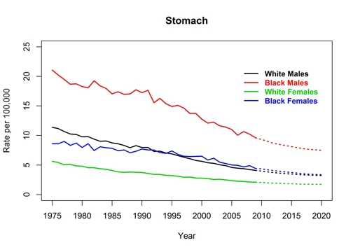
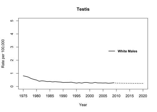
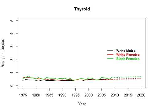
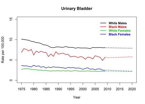
These graphs accompany the article
Expected New Cancer Cases and Deaths in 2020.
Stay Informed
File Formats Help:
How do I view different file formats (PDF, DOC, PPT, MPEG) on this site?
Adobe PDF file
Microsoft PowerPoint file
Microsoft Word file
Microsoft Excel file
Audio/Video file
Apple Quicktime file
RealPlayer file
Text file
Zip Archive file
SAS file
ePub file
RIS file
Page last reviewed:
June 17, 2015
Page last updated:
June 17, 2015
Content source:
Division of Cancer Prevention and Control,
Centers for Disease Control and Prevention
Maintained By:
Centers for Disease Control and Prevention
Top
 ShareCompartir