

Cancer Rates by Race/Ethnicity and Sex
 ShareCompartir
The rate of people getting or dying from cancer varies by race and ethnicity.
Incidence Rates by Race/Ethnicity and Sex
“Incidence rate” means how many people out of a given number get the disease each year. The graph below shows how many people out of 100,000 got cancer each year during the years 1999–2014. The year 2014 is the most recent year for which numbers have been reported. The cancer incidence rate is grouped by race and ethnicity.
The graph below shows that in 2014, among men, black men had the highest rate of getting cancer, followed by white, Hispanic, American Indian/Alaska Native (AI/AN), and Asian/Pacific Islander (A/PI) men. Among women, white women had the highest rate of getting cancer, followed by black, Hispanic, Asian/Pacific Islander, and American Indian/Alaska Native women.
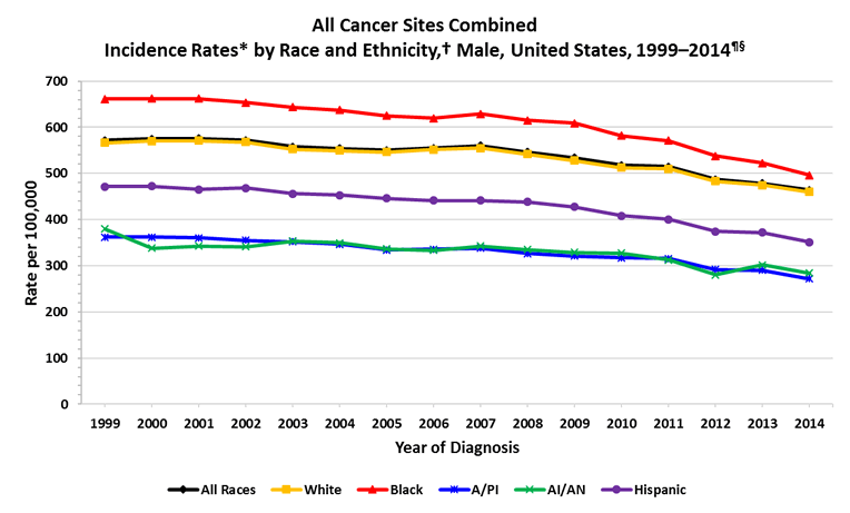
Graph Data
| Year | All Races | White | Black | Asian/Pacific Islander (A/PI) | American Indian/Alaska Native (AI/AN) | Hispanic |
|---|---|---|---|---|---|---|
| 1999 | 571.7 | 566.4 | 661.3 | 362.0 | 379.7 | 471.3 |
| 2000 | 574.6 | 569.9 | 662.3 | 362.2 | 338.4 | 472.6 |
| 2001 | 575.5 | 570.9 | 661.7 | 360.6 | 342.9 | 465.3 |
| 2002 | 571.9 | 567.7 | 653.7 | 355.0 | 341.2 | 468.8 |
| 2003 | 557.6 | 552.3 | 643.9 | 351.7 | 353.5 | 455.9 |
| 2004 | 553.9 | 549.2 | 637.2 | 346.3 | 350.0 | 453.3 |
| 2005 | 550.6 | 546.7 | 625.1 | 334.4 | 336.4 | 445.8 |
| 2006 | 554.8 | 551.6 | 619.4 | 335.6 | 333.3 | 441.7 |
| 2007 | 559.9 | 555.1 | 628.7 | 338.0 | 342.5 | 441.5 |
| 2008 | 546.7 | 542.1 | 615.1 | 326.6 | 334.8 | 438.6 |
| 2009 | 534.0 | 528.1 | 609.1 | 320.9 | 329.2 | 427.5 |
| 2010 | 518.1 | 512.7 | 581.6 | 317.4 | 327.3 | 408.4 |
| 2011 | 514.8 | 509.8 | 571.4 | 315.4 | 312.3 | 400.2 |
| 2012 | 486.7 | 482.8 | 538.0 | 291.5 | 280.5 | 374.1 |
| 2013 | 478.7 | 474.5 | 522.8 | 290.4 | 301.7 | 372.0 |
| 2014 | 463.8 | 459.7 | 496.4 | 272.0 | 283.9 | 351.5 |
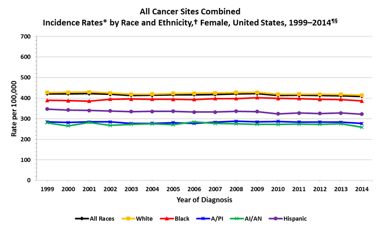
Graph Data
| Year | All Races | White | Black | Asian/Pacific Islander (A/PI) | American Indian/Alaska Native (AI/AN) | Hispanic |
|---|---|---|---|---|---|---|
| 1999 | 420.9 | 427.3 | 389.6 | 284.5 | 281.0 | 347.2 |
| 2000 | 420.9 | 428.0 | 387.7 | 281.5 | 265.1 | 342.3 |
| 2001 | 421.9 | 429.6 | 385.8 | 284.4 | 282.3 | 340.0 |
| 2002 | 419.0 | 425.1 | 394.6 | 284.6 | 267.8 | 338.0 |
| 2003 | 413.4 | 418.8 | 395.5 | 276.6 | 273.3 | 335.1 |
| 2004 | 413.9 | 419.8 | 395.1 | 277.4 | 275.7 | 335.8 |
| 2005 | 416.2 | 422.7 | 394.3 | 280.8 | 270.9 | 336.2 |
| 2006 | 416.6 | 423.5 | 393.5 | 278.0 | 284.8 | 332.4 |
| 2007 | 418.4 | 424.7 | 397.8 | 283.0 | 277.1 | 332.1 |
| 2008 | 421.0 | 427.7 | 398.1 | 287.8 | 275.6 | 336.3 |
| 2009 | 421.8 | 428.3 | 402.9 | 284.6 | 272.7 | 334.7 |
| 2010 | 413.3 | 419.1 | 398.7 | 286.6 | 272.6 | 324.1 |
| 2011 | 414.1 | 420.0 | 398.1 | 283.9 | 273.7 | 328.2 |
| 2012 | 413.0 | 419.0 | 394.4 | 283.9 | 273.4 | 325.7 |
| 2013 | 412.1 | 417.7 | 393.7 | 283.0 | 275.7 | 328.0 |
| 2014 | 408.7 | 414.0 | 386.2 | 277.2 | 258.1 | 322.4 |
Sources: CDC’s National Program of Cancer Registries and National Cancer Institute’s Surveillance, Epidemiology, and End Results program.
*Rates are the number of cases per 100,000 persons and are age-adjusted to the 2000 U.S. standard population (19 age groups – Census P25–1130). For more information, see the USCS technical notes.
†Race categories are not mutually exclusive from Hispanic origin. Rates are not presented for persons of unknown or other race. Data for specified racial or ethnic populations other than white and black should be interpreted with caution. For more information, see the USCS technical notes.
¶ Data are compiled from cancer registries that meet the data quality criteria for all invasive cancer sites combined for all years, 1999–2014 (covering approximately 97% of the U.S. population). See registry-specific data quality information for all years, 1999–2014. Use caution when comparing incidence and death rates because of potential differences in population coverage.
§Invasive cancer excludes basal and squamous cell carcinomas of the skin except when these occur on the skin of the genital organs, and in situ cancers except urinary bladder.
Behavior recode for analysis used for 1999–2014 individual years.
Death Rates by Race/Ethnicity and Sex
From 1999–2014, the rate of people dying from cancer has varied, depending on their race and ethnicity. The graph below shows that in 2014, among men, black men were more likely to die of cancer than any other group, followed by white, Hispanic, American Indian/Alaska Native, and Asian/Pacific Islander men. Among women, black women were more likely to die of cancer than any other group, followed by white, Hispanic, American Indian/Alaska Native, and Asian/Pacific Islander women.
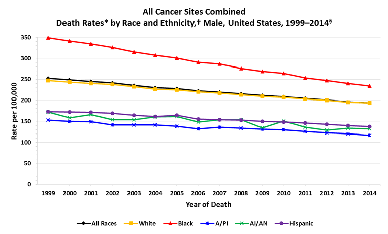
Graph Data
| Year | All Races | White | Black | Asian/Pacific Islander (A/PI) | American Indian/Alaska Native (AI/AN) | Hispanic |
|---|---|---|---|---|---|---|
| 1999 | 252.8 | 247.1 | 349.2 | 152.7 | 171.9 | 173.1 |
| 2000 | 248.5 | 243.4 | 341.2 | 149.6 | 158.6 | 172.1 |
| 2001 | 245.0 | 240.3 | 334.1 | 149.3 | 165.7 | 171.6 |
| 2002 | 241.6 | 237.6 | 325.8 | 141.5 | 153.7 | 169.4 |
| 2003 | 235.8 | 232.2 | 314.6 | 141.7 | 153.5 | 164.9 |
| 2004 | 230.3 | 226.6 | 307.3 | 141.3 | 160.5 | 161.1 |
| 2005 | 228.1 | 224.9 | 300.3 | 138.4 | 161.5 | 164.8 |
| 2006 | 222.6 | 220.0 | 290.2 | 132.5 | 148.3 | 155.5 |
| 2007 | 219.3 | 216.6 | 286.6 | 135.6 | 153.7 | 153.4 |
| 2008 | 215.3 | 213.2 | 275.3 | 133.6 | 153.5 | 153.0 |
| 2009 | 211.2 | 209.3 | 268.9 | 131.4 | 134.8 | 150.0 |
| 2010 | 208.8 | 207.2 | 264.1 | 129.5 | 150.4 | 148.6 |
| 2011 | 204.3 | 203.3 | 253.6 | 125.6 | 136.1 | 146.0 |
| 2012 | 200.5 | 199.9 | 247.2 | 122.6 | 129.2 | 142.8 |
| 2013 | 196.4 | 195.9 | 240.3 | 120.7 | 133.9 | 139.7 |
| 2014 | 193.6 | 193.6 | 234.1 | 116.9 | 132.1 | 137.7 |
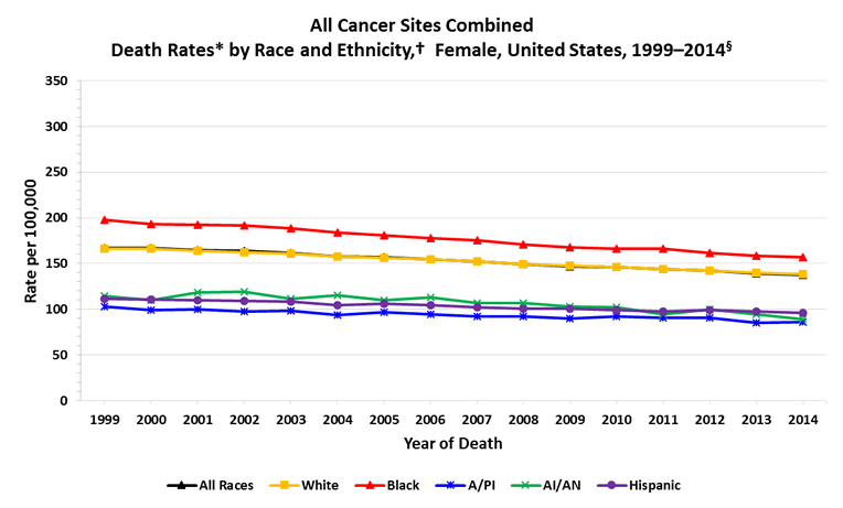
Graph Data
| Year | All Races | White | Black | Asian/Pacific Islander (A/PI) | American Indian/Alaska Native (AI/AN) | Hispanic |
|---|---|---|---|---|---|---|
| 1999 | 167.2 | 165.9 | 197.5 | 102.6 | 114.1 | 111.7 |
| 2000 | 166.7 | 166.0 | 193.2 | 99.3 | 109.4 | 110.2 |
| 2001 | 164.6 | 163.8 | 192.1 | 99.6 | 118.6 | 110.0 |
| 2002 | 163.4 | 162.6 | 191.4 | 97.5 | 119.1 | 109.1 |
| 2003 | 161.2 | 160.4 | 188.8 | 98.4 | 111.4 | 108.6 |
| 2004 | 157.9 | 157.4 | 183.5 | 93.8 | 114.8 | 104.6 |
| 2005 | 156.5 | 156.0 | 180.9 | 96.7 | 110.1 | 105.7 |
| 2006 | 154.6 | 154.5 | 177.3 | 94.6 | 112.9 | 104.6 |
| 2007 | 152.0 | 151.9 | 175.5 | 92.0 | 106.8 | 102.2 |
| 2008 | 149.3 | 149.4 | 170.4 | 92.0 | 106.7 | 100.7 |
| 2009 | 147.1 | 147.5 | 167.4 | 89.8 | 103.1 | 100.2 |
| 2010 | 145.7 | 145.9 | 166.2 | 92.3 | 101.8 | 98.6 |
| 2011 | 143.5 | 143.4 | 166.0 | 90.8 | 94.0 | 97.6 |
| 2012 | 141.8 | 142.0 | 161.7 | 90.3 | 99.7 | 99.2 |
| 2013 | 139.2 | 139.8 | 158.5 | 85.4 | 94.7 | 97.2 |
| 2014 | 137.9 | 138.6 | 157.0 | 86.2 | 89.1 | 96.0 |
*Rates are the number of deaths per 100,000 persons and are age-adjusted to the 2000 U.S. standard population (19 age groups – Census P25–1130). For more information, see the USCS technical notes.
†Race categories are not mutually exclusive from Hispanic origin. Rates are not presented for persons of unknown or other race. Data for specified racial or ethnic populations other than white and black should be interpreted with caution. For more information, see the USCS technical notes.
§Data are from the National Vital Statistics System (NVSS). Data for death rates cover 100% of the U.S. population. Use caution when comparing incidence and death rates because of potential differences in population coverage.
- Page last reviewed: June 16, 2017
- Page last updated: June 16, 2017
- Content source:
- Maintained By: