

New Diagnoses Recommended Queries
 ShareCompartir
Download New diagnoses slideset: pdf version | PowerPoint version
Slide 1
Hepatitis data are 2013; all other data are 2014. All data are classed using quintiles.
In this notes area of the powerpoint, each slide contains the title (with the variables selected), some contextual information, and links to additional data and information on the topic. All of the NCHHSTP Atlas maps are choropleth maps, which use sequential colors (e.g., light blue to dark blue) to display data that progress from low to high values. Typically, one uses light colors for low data values and dark colors for high data values.
Slide 2
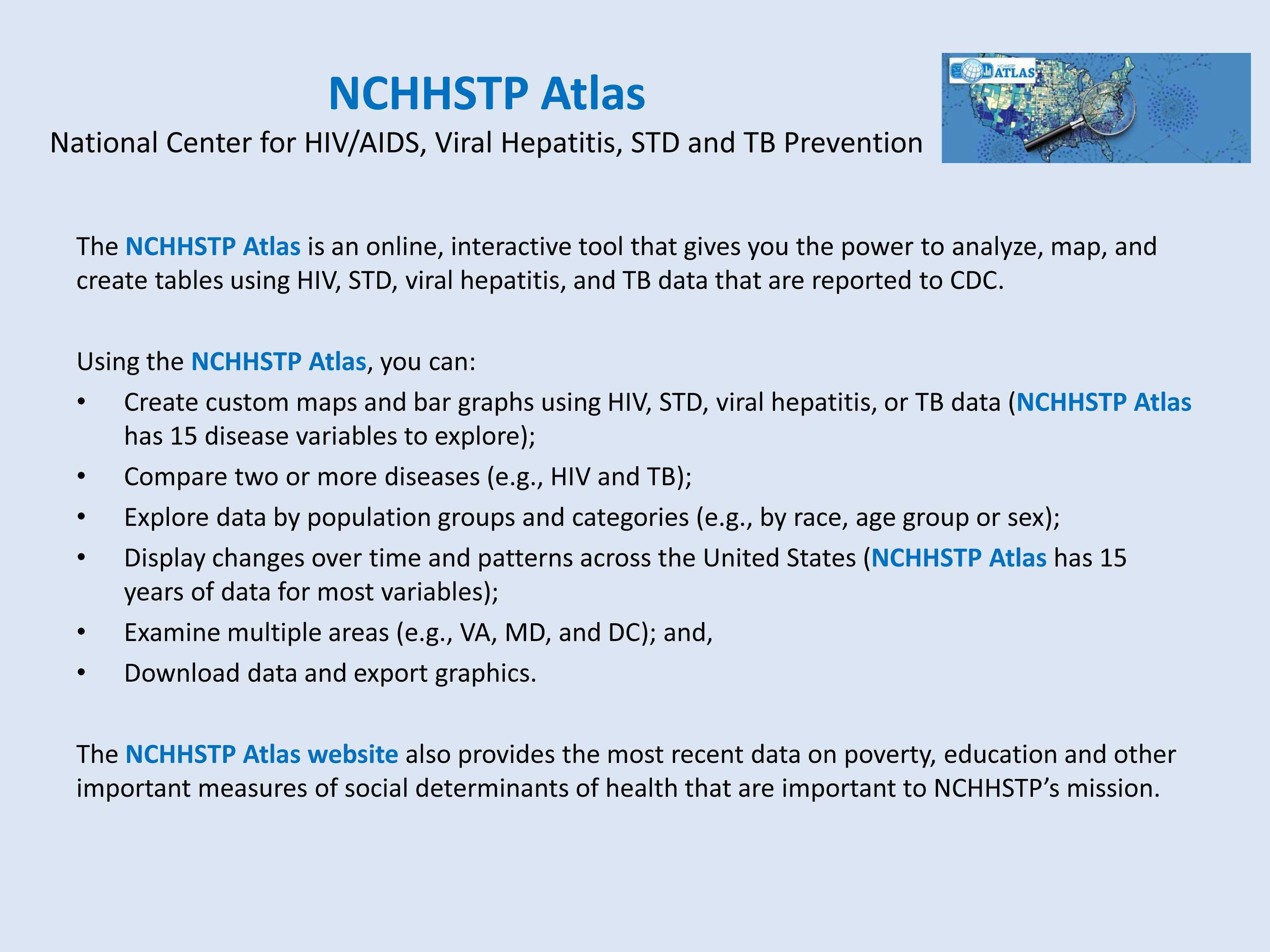
The NCHHSTP Atlas is an online, interactive tool that gives you the power to analyze, map, and create tables using HIV, STD, viral hepatitis, and TB data that are reported to CDC.
Using the NCHHSTP Atlas, you can:
- Create custom maps and bar graphs using HIV, STD, viral hepatitis, or TB data (NCHHSTP Atlas has 15 disease variables to explore);
- Compare two or more diseases (e.g., HIV and TB);
- Explore data by population groups and categories (e.g., by race, age group or sex);
- Display changes over time and patterns across the United States (NCHHSTP Atlas has 15 years of data for most variables);
- Examine multiple areas (e.g., VA, MD, and DC); and,
- Download data and export graphics.
The NCHHSTP Atlas website also provides the most recent data on poverty, education and other important measures of social determinants of health that are important to NCHHSTP’s mission.
Slide 3
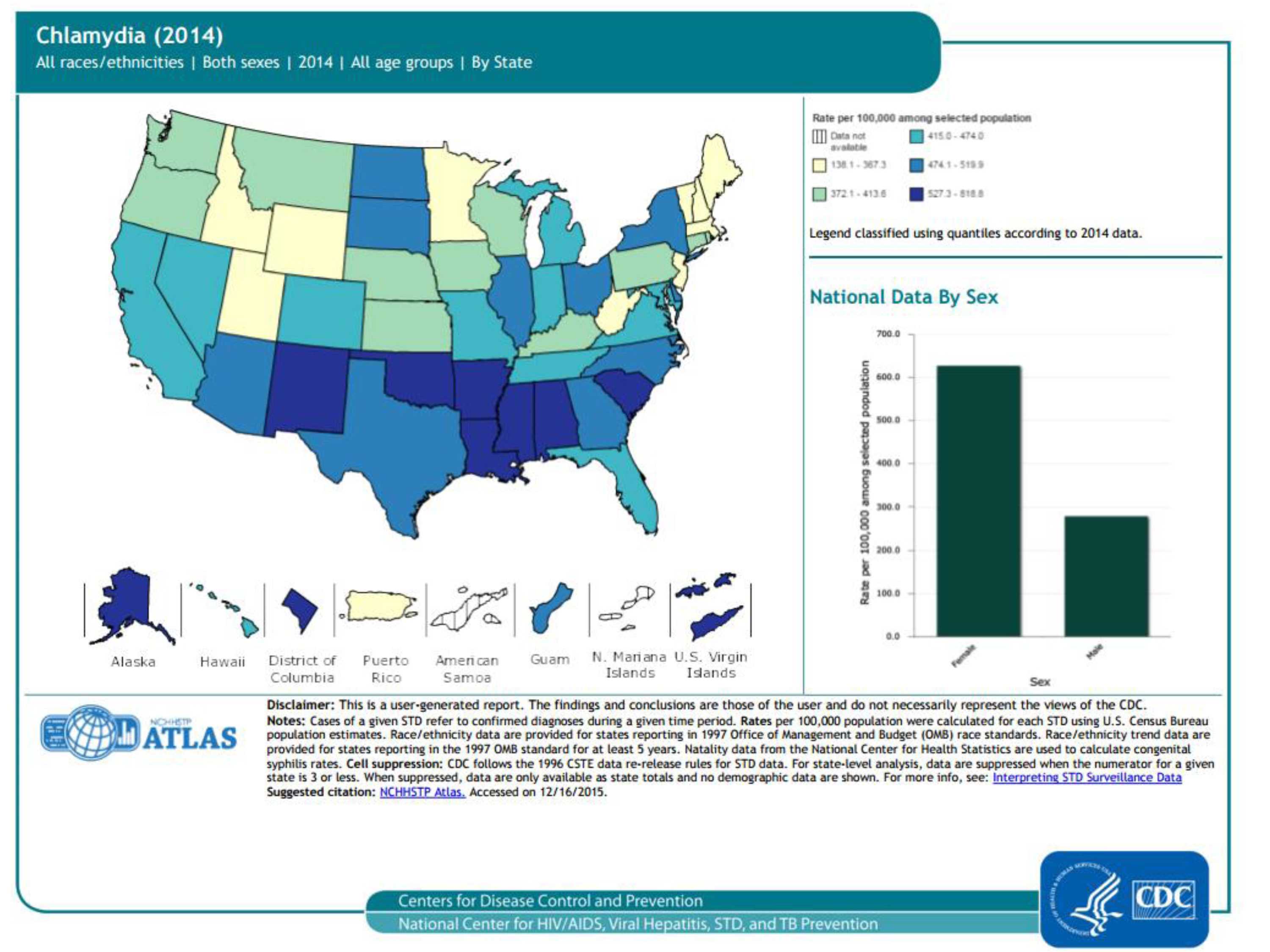
Chlamydia cases (2014), 50 states, DC, and outlying areas, by state/area
Trends in rates of reported cases of chlamydia are influenced by changes in incidence of infection, as well as changes in diagnostic, screening, and reporting practices. As chlamydial infections are usually asymptomatic, the number of infections identified and reported can increase as more people are screened even when incidence is flat or decreasing. As seen in the map, the highest rates of reported chlamydia in 2014 are in the southeast and the southwest. As seen in the bar graph, rates of reported cases are higher in females than males.
For more information: https://www.cdc.gov/std/chlamydia/default.htm
Slide 4
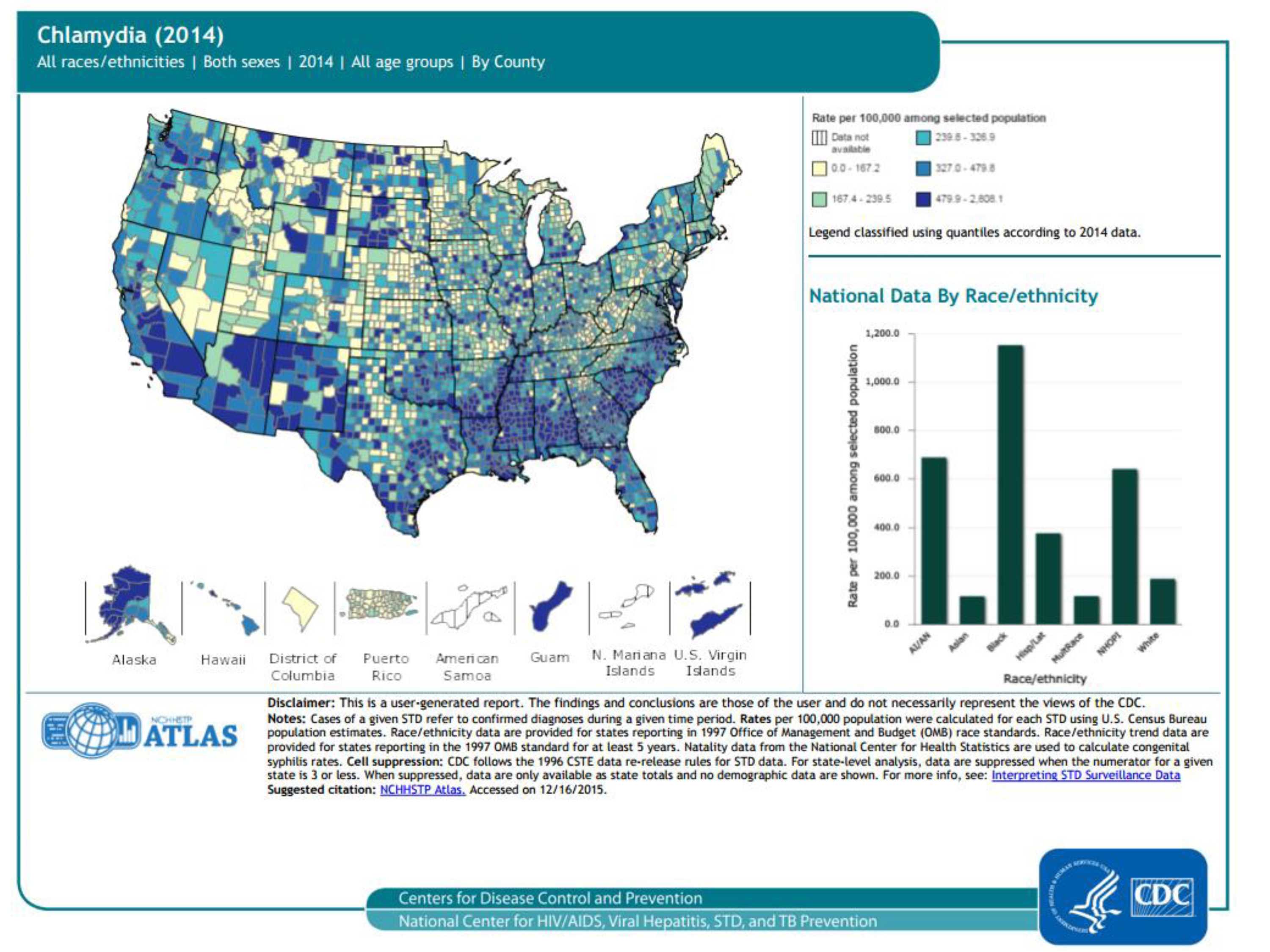
Chlamydia cases (2014), 50 states, DC, and outlying areas, by county
Trends in rates of reported cases of chlamydia are influenced by changes in incidence of infection, as well as changes in diagnostic, screening, and reporting practices. As chlamydial infections are usually asymptomatic, the number of infections identified and reported can increase as more people are screened even when incidence is flat or decreasing. As seen in the map, the highest rates of reported chlamydia in 2014 are in many counties of the United States, as well as Guam and the US Virgin Islands. As seen in the bar graph, rates of reported chlamydia are higher in blacks/African Americans than other races/ethnicities.
For more information: https://www.cdc.gov/std/chlamydia/default.htm
Slide 5
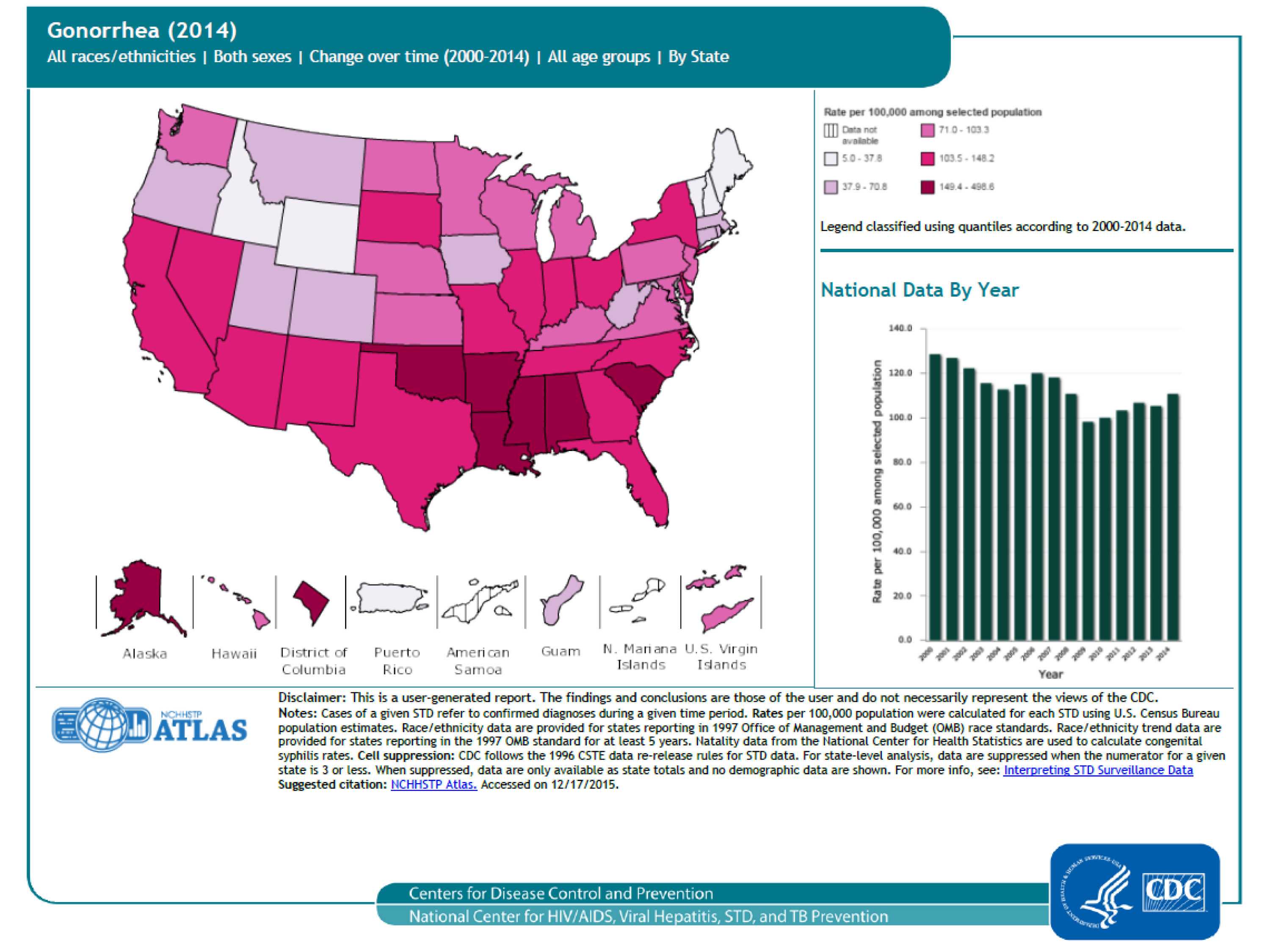
Gonorrhea cases (2014) 50 states, DC, and outlying areas, by state/area
Description: The national gonorrhea rate reached the lowest level ever recorded in 2009, increased each year during 2010–2012, and increased slightly in 2014 (see bar graph). As seen in the map, the highest rates of reported gonorrhea are in the south.
For more information: https://www.cdc.gov/std/gonorrhea/default.htm
Slide 6
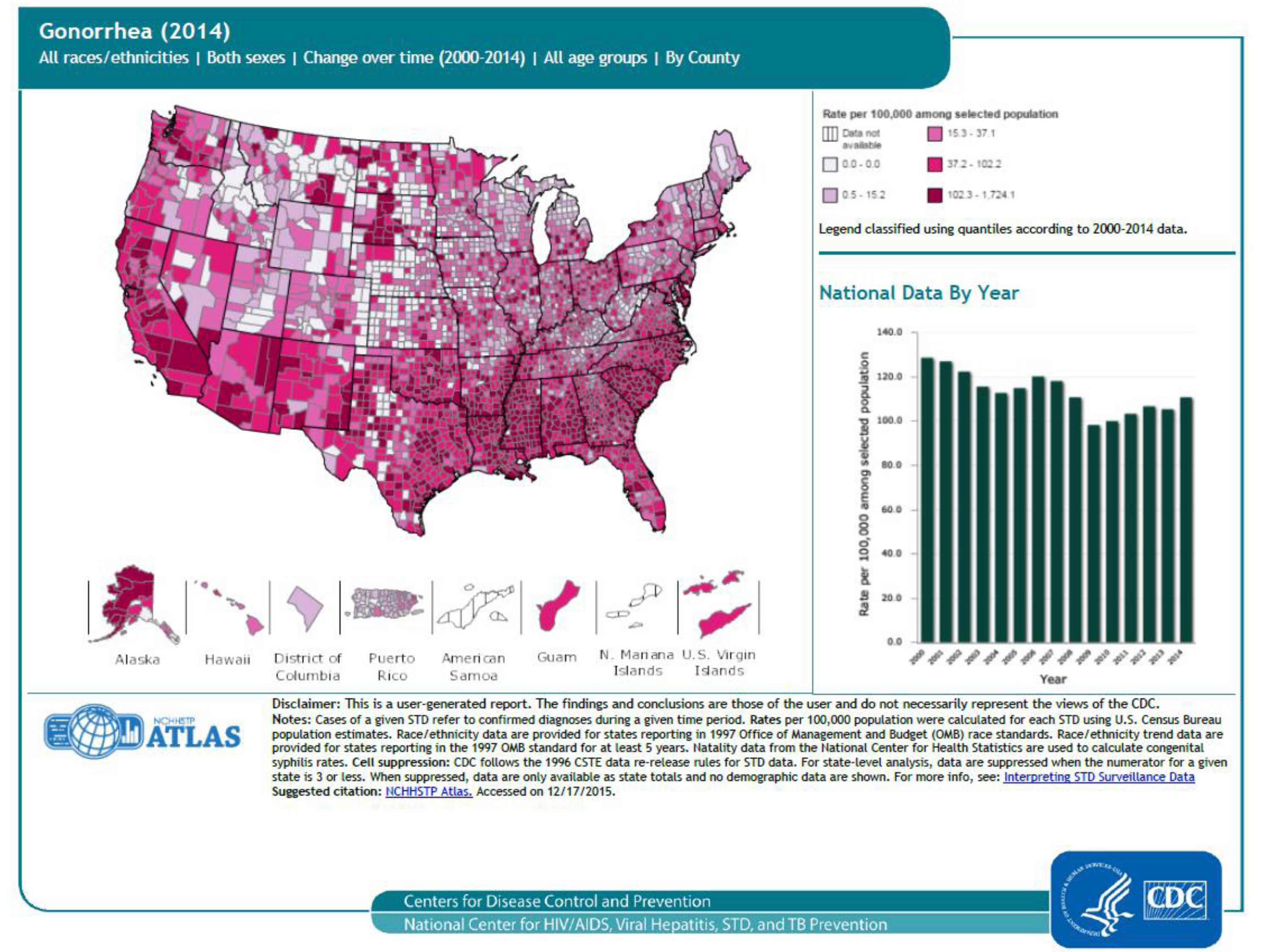
Gonorrhea cases (2014), 50 states, DC, and outlying areas, by county
Description: The national gonorrhea rate reached the lowest level ever recorded in 2009, increased each year during 2010–2012, and increased slightly in 2014 (see bar graph). County-level data can illustrate gonorrhea patterns within states, as well as cross-state patterns and networks affecting public health. As seen in the map, the highest rates of reported gonorrhea are in many counties, Guam and the US Virgin Islands.
For more information: https://www.cdc.gov/std/gonorrhea/default.htm
Slide 7
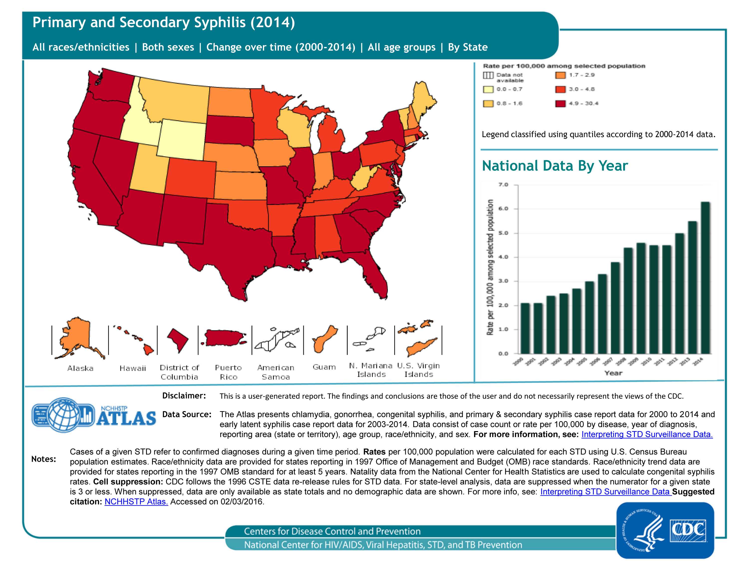
Primary and secondary syphilis cases (2014), 50 states and DC, by state/area
The national primary and secondary syphilis rate has increased from 2.1 cases per 100,000 in 2000 to 6.3 in 2014 (see bar graph). This increase is reflected in the map; although the map itself only displays data for 2014, the legend has the data classed from 2000-2014.
For more information: https://www.cdc.gov/std/syphilis/default.htm
Slide 8
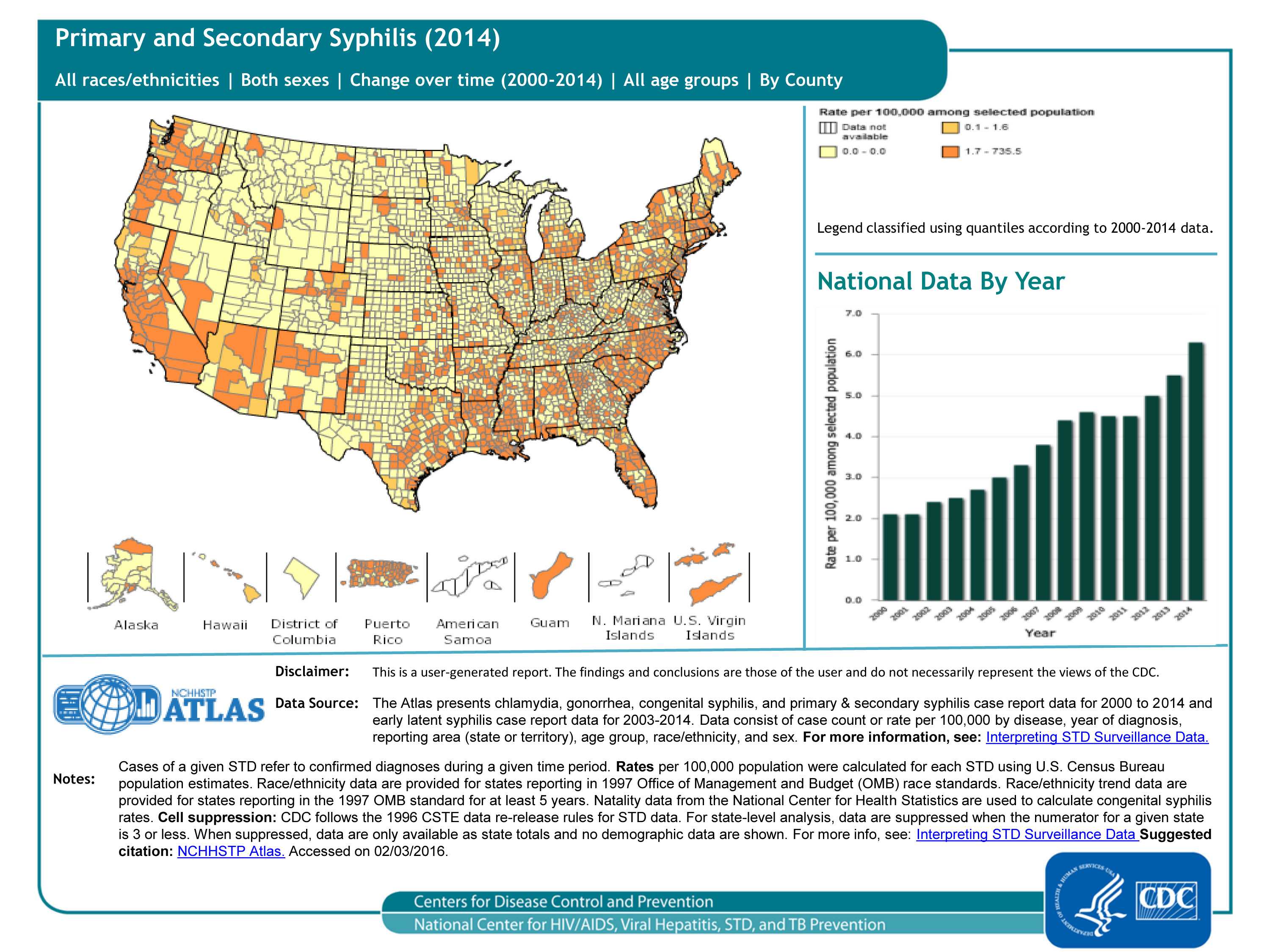
Primary and secondary syphilis cases (2014), 50 states and DC, by county
The national primary and secondary syphilis rate has increased from 2.1 cases per 100,000 in 2000 to 6.3 in 2014 (see bar graph). County-level data can illustrate primary and secondary syphilis patterns within states, as well as cross-state patterns and networks affecting public health. As seen in the map, the highest rates of primary and secondary syphilis in 2014 are in the coastal counties and states.
For more information: https://www.cdc.gov/std/syphilis/default.htm
Slide 9
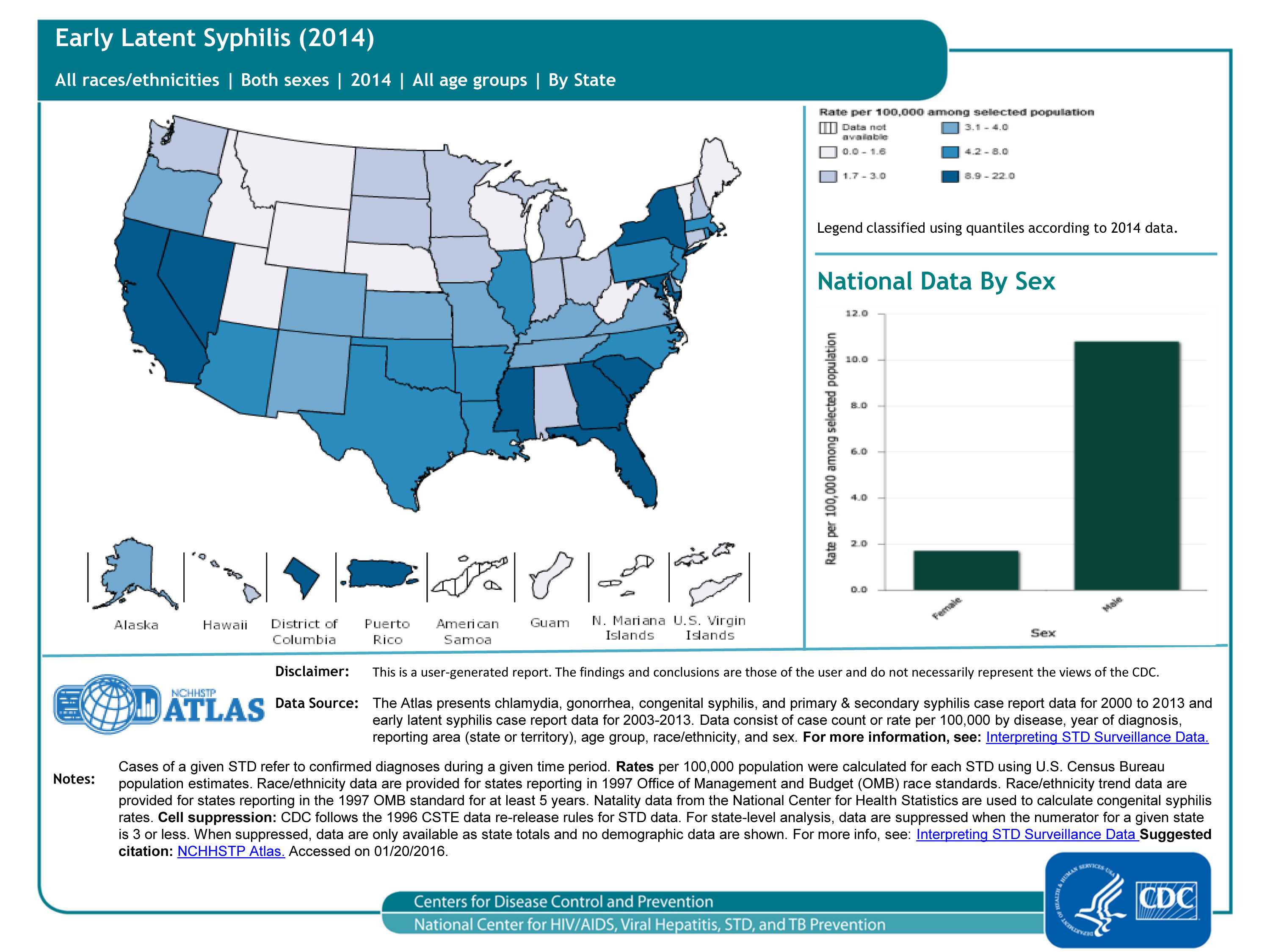
Early latent syphilis cases (2014), 50 states and DC, by state/area
“Latent syphilis” means syphilis infection without any symptoms. Without treatment, the infected person can continue to have syphilis in his/her body even though there are no signs or symptoms. This latent stage can last for years; latent syphilis within the first 12 months of infection is called “early latent syphilis.” As seen in the map, the highest rates of early latent syphilis in 2014 are in the southeast, NY, MD, CA, NV and Puerto Rico. As seen in the bar graph, rates are much higher in males than females.
For more information: https://www.cdc.gov/std/syphilis/default.htm
Slide 10
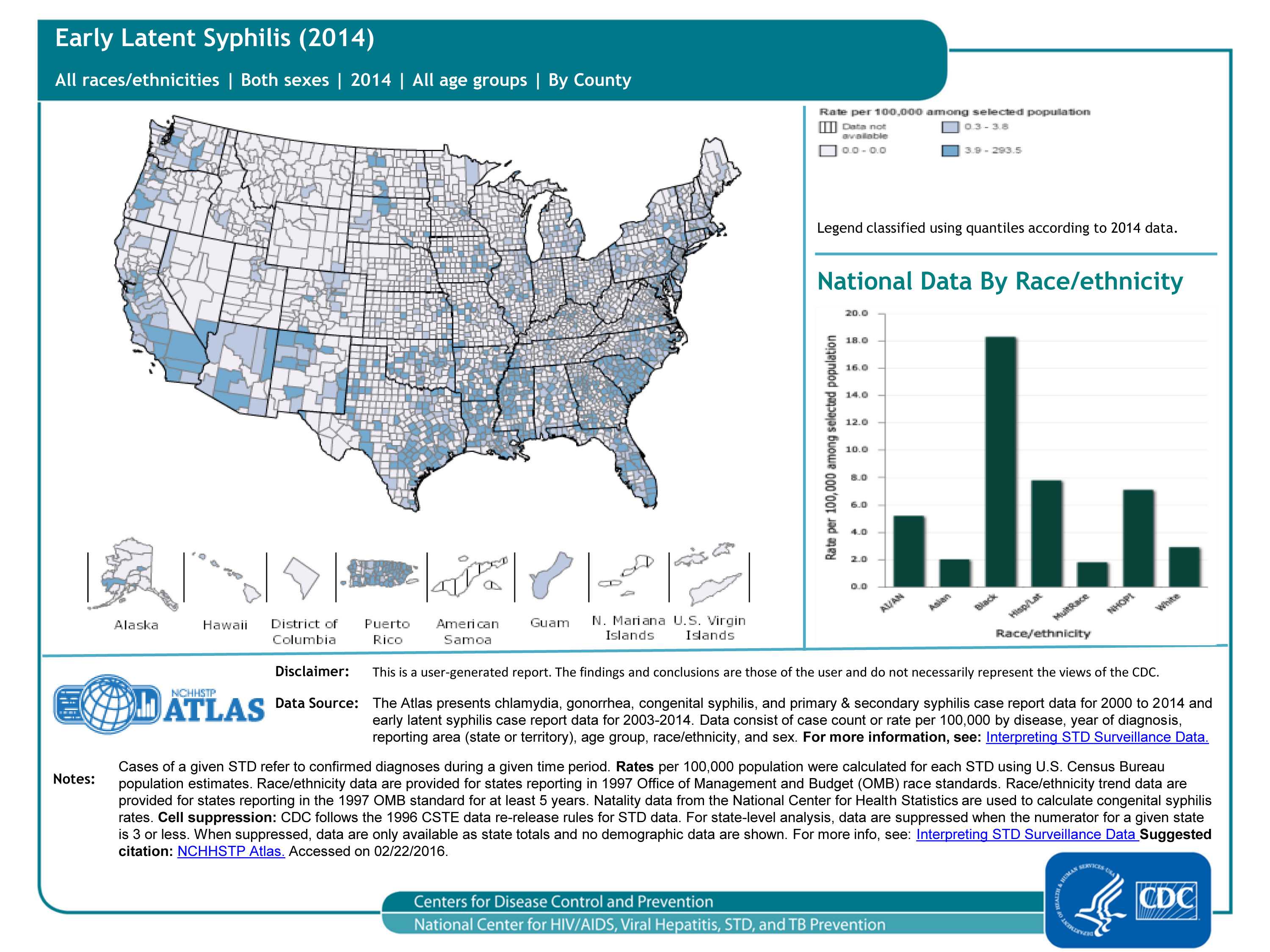
Early latent syphilis cases (2014), 50 states and DC, by county
“Latent syphilis” means syphilis infection without any symptoms. Without treatment, the infected person can continue to have syphilis in his/her body even though there are no signs or symptoms. This latent stage can last for years; latent syphilis within the first 12 months of infection is called “early latent syphilis.” County-level data can illustrate patterns of early latent syphilis within states, as well as cross-state patterns and networks affecting public health. As seen in the map, for the most part, rates of early latent syphilis are relatively low. As seen in the bar graph, rates are highest in blacks/African-Americans, followed by Hispanics/Latinos.
For more information: https://www.cdc.gov/std/syphilis/default.htm
Slide 11
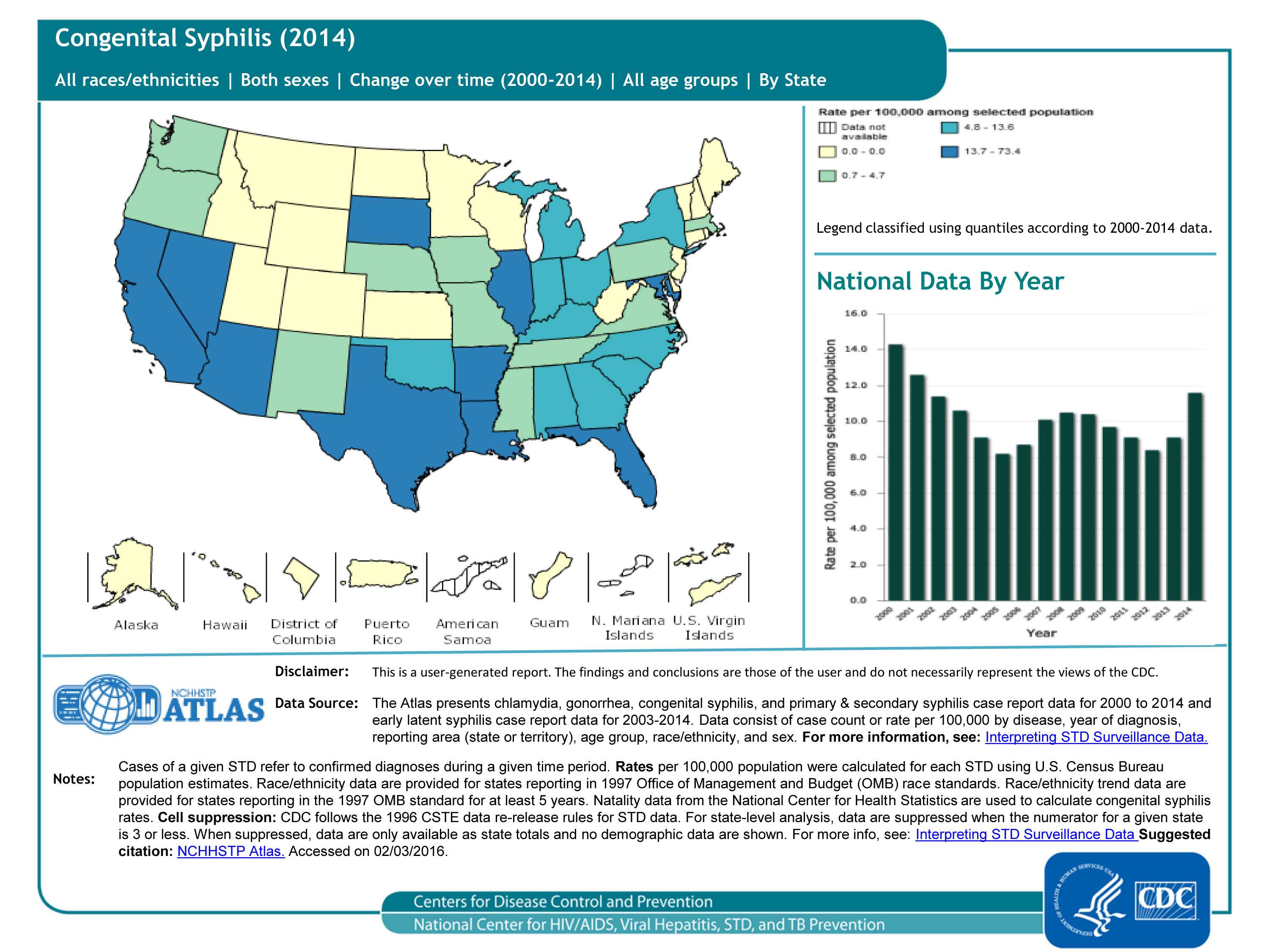
Congenital syphilis cases (2014), 50 states and DC, by state/area
The surveillance case definition of congenital syphilis includes babies born with syphilis (i.e., a mother with syphilis passes the infection on to her baby during pregnancy), stillbirths born to mothers with syphilis, and babies born to mothers with untreated or inadequately treated syphilis. As seen in the map, the highest rates of congenital syphilis in 2014 are in the southeast and southwest. As seen in the bar chart, rates were somewhat stable throughout the past 10 years, but increased in 2013 and 2014.
For more information: https://www.cdc.gov/std/syphilis/default.htm
Slide 12
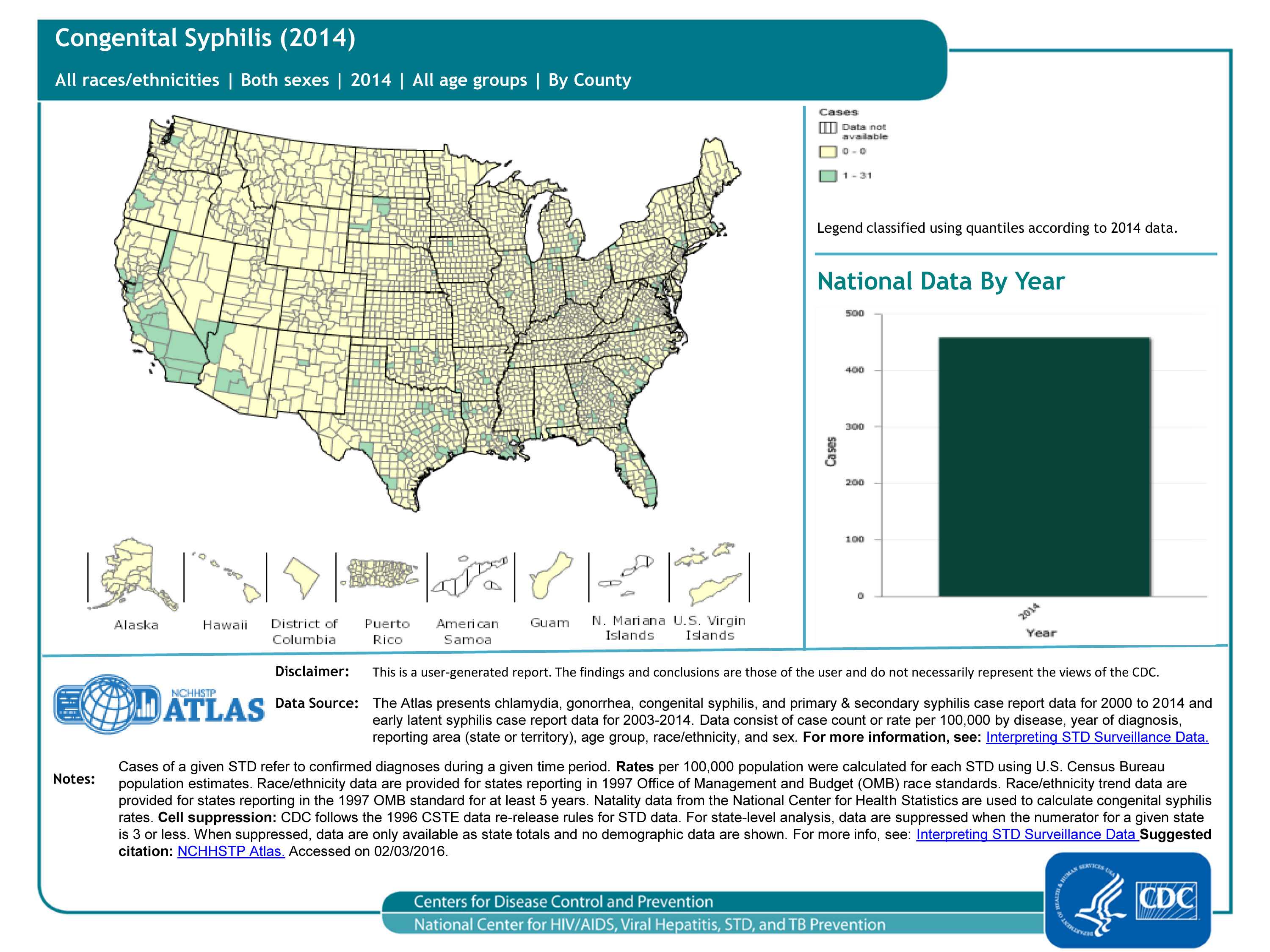
Congenital syphilis cases (2014), 50 states and DC, by county
The surveillance case definition of congenital syphilis includes babies born with syphilis (i.e., a mother with syphilis passes the infection on to her baby during pregnancy), stillbirths born to mothers with syphilis, and babies born to mothers with untreated or inadequately treated syphilis. County-level data can illustrate patterns within states, as well as cross-state patterns and networks affecting public health (compare this map to the previous one!). As seen in the map, most of the counties in the US had 0 cases of congenital syphilis in 2014, and the largest number of cases reported was 31 (Los Angeles County, CA); the total number of congenital syphilis cases in 2014 was 458.
For more information: https://www.cdc.gov/std/syphilis/default.htm
Slide 13
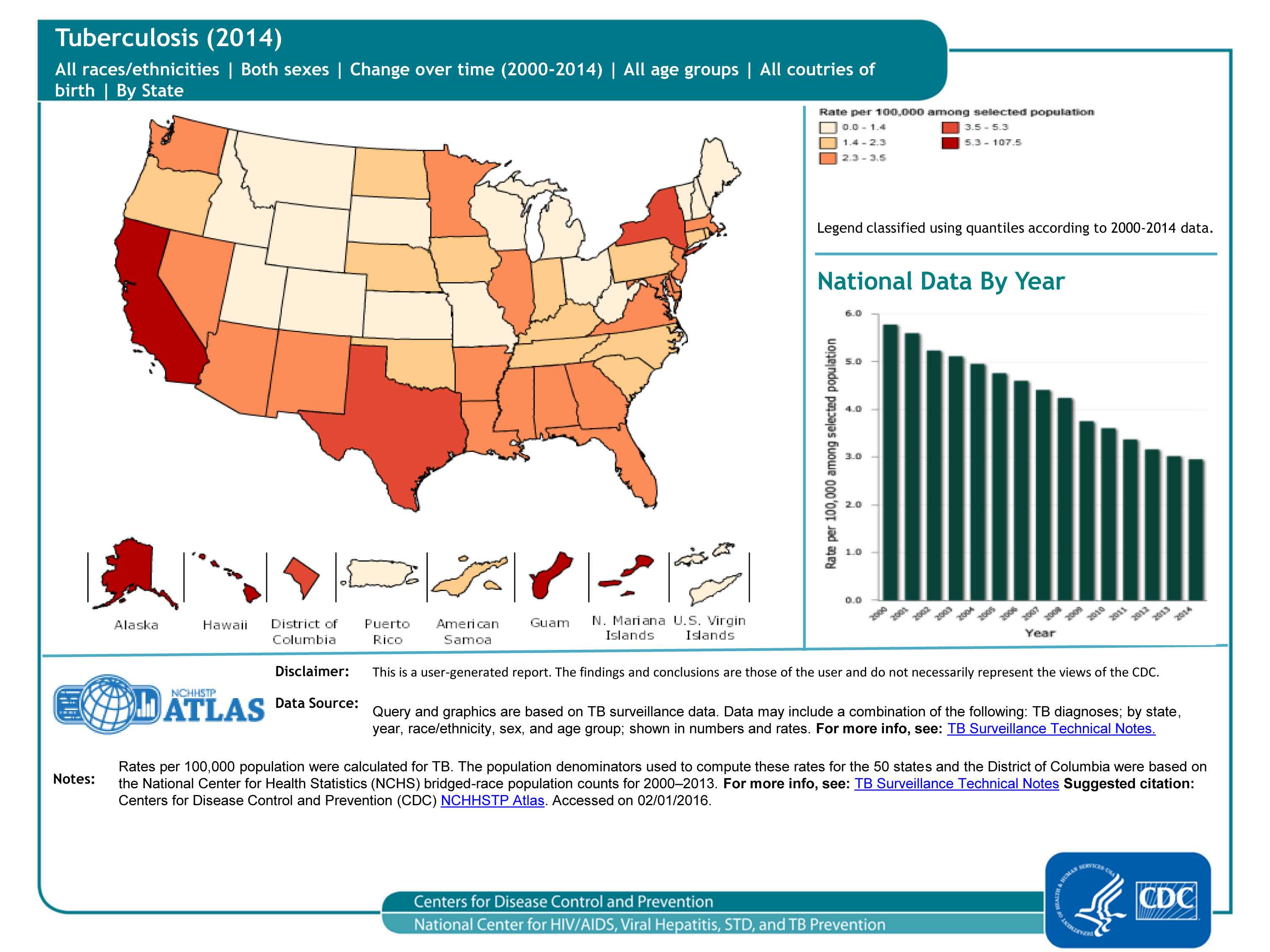
TB cases in 50 states, DC and 5 dependent areas, 2014, by state
Since the 1992 TB resurgence peak in the United States, the number of TB cases have decreased annually through 2014. The number of reported TB cases in 2014 (n = 9,421) was the lowest recorded since national reporting began in 1953.
For more information: https://www.cdc.gov/tb/publications/factsheets/statistics/TBTrends.htm
Slide 14
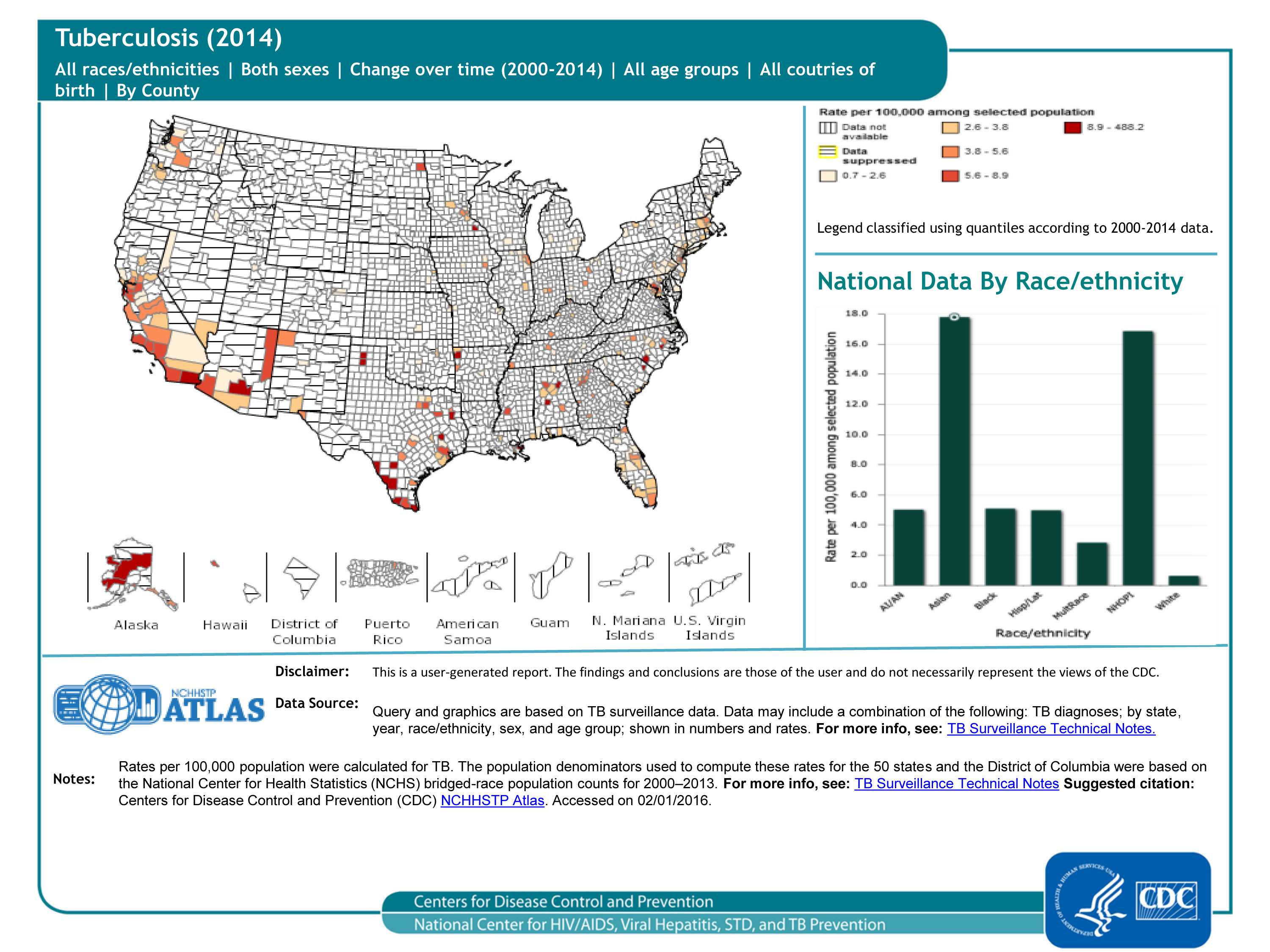
TB cases in 50 states and DC, 2014, by county
County-level data can illustrate patterns of TB cases within states, as well as cross-state patterns and networks affecting public health (compare this map to the previous one). As seen in the map, many counties have suppressed data (meaning that at the county level, the numerator/case count is less than 5), so a pattern is difficult to discern. As seen in the bar graph, rates of TB are highest in Asians and Native Hawaiians/Other Pacific Islanders; however, the rates among the latter group should be interpreted with caution because the population size of this group is relatively small.
For more information: https://www.cdc.gov/tb/publications/factsheets/statistics/TBTrends.htm
Slide 15
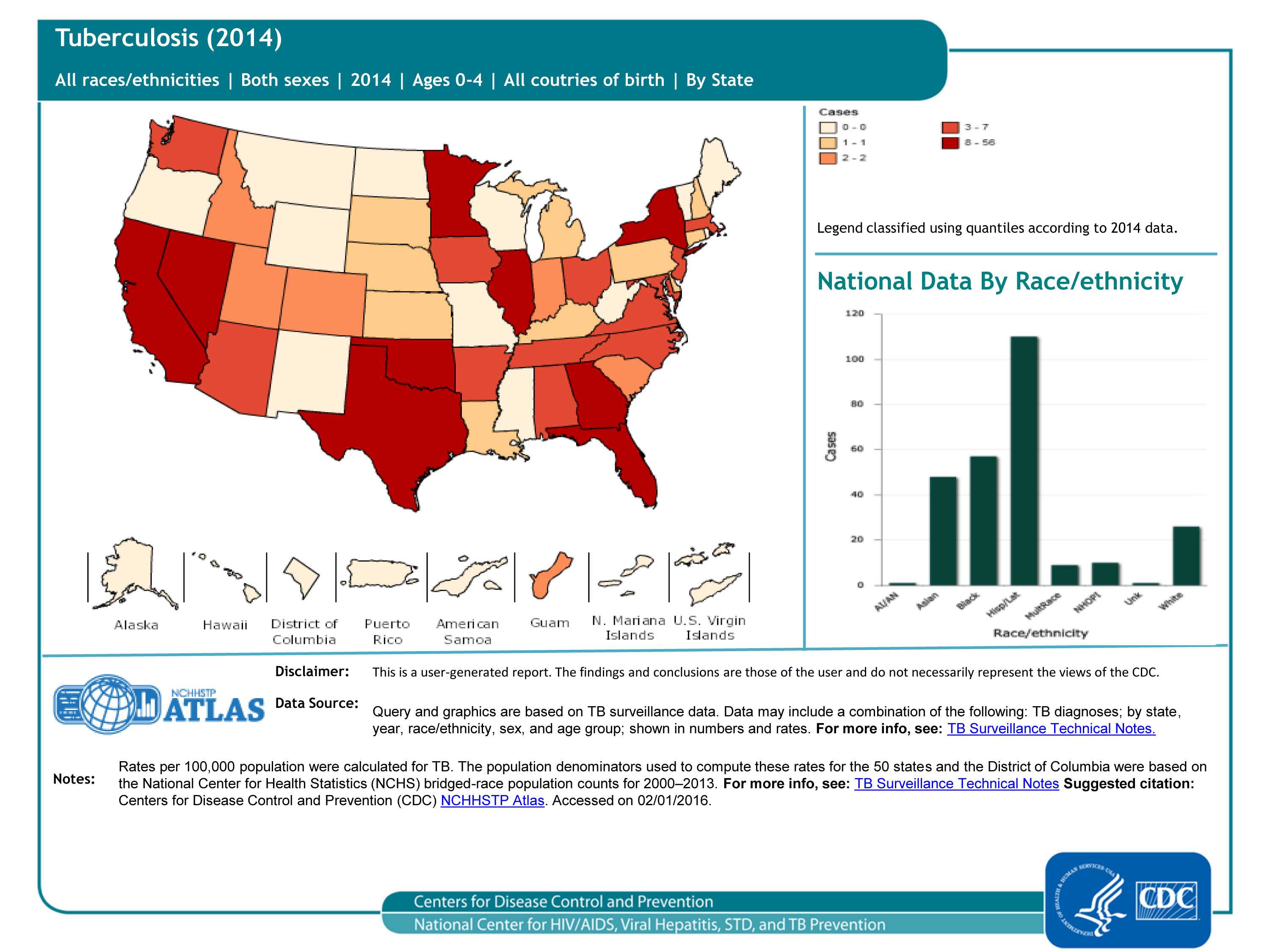
TB pediatric cases (ages 0-4), 50 states and DC, 2014
TB disease in children under 5 years of age (also called pediatric tuberculosis) is a public health problem of special significance because TB in a young child is a marker for recent transmission of TB. The geographic pattern of pediatric TB cases is somewhat random. As seen in the bar graph, the number of pediatric TB cases is highest among Hispanic/Latino children.
For more information: https://www.cdc.gov/tb/topic/populations/TBinChildren/default.htm
Slide 16
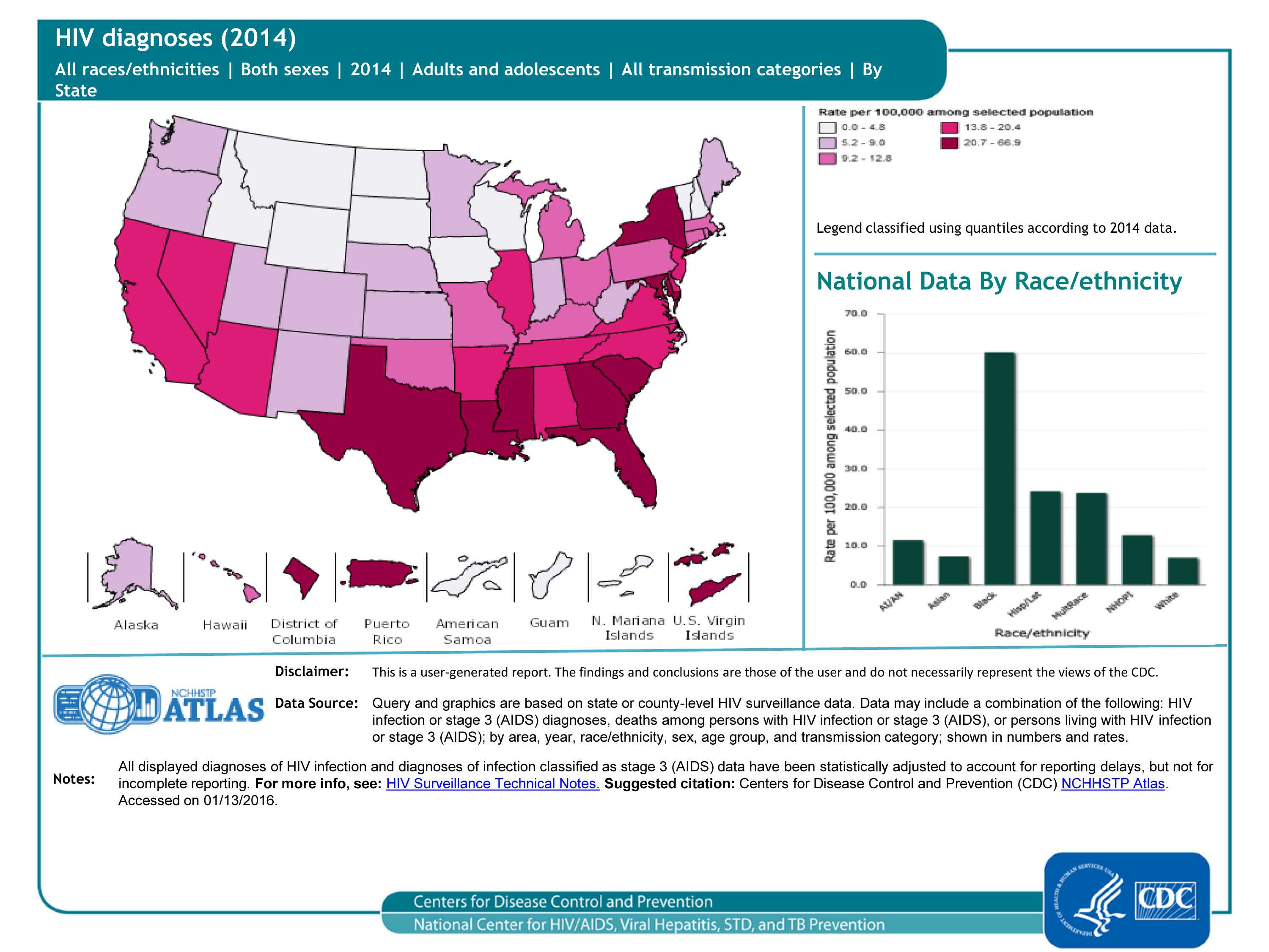
Diagnoses of HIV infection, 2014 — United States and 5 dependent areas, by state/area
From 2008 through 2014, the annual estimated number and rate of diagnoses of HIV infection among adults and adolescents remained stable in the United States; in 2014, an estimated 43,899 persons were diagnosed with HIV infection. As seen in the map, the highest rates were in the southern and northeastern regions of the United States. As seen in the bar graph, rates were highest in blacks/African Americans and lowest in Asians and whites.
For more information: https://www.cdc.gov/hiv/library/reports/surveillance/index.html
Slide 17
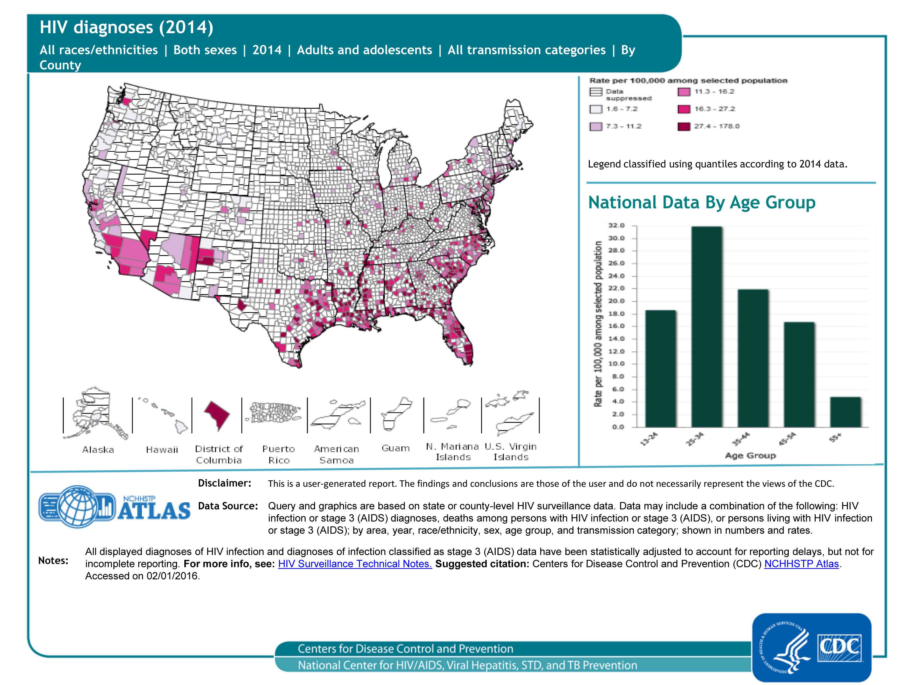
Diagnoses of HIV infection, 2014 — United States, by county
County-level data can illustrate patterns of HIV diagnoses within states, as well as cross-state patterns and networks affecting public health (compare this map to the previous one). As seen in the map, the highest rates were in the southeastern, northeastern and western counties of the United States. (Many counties have suppressed data; meaning that the population denominator is less than 100 or the case count is less than 5.) As seen in the bar graph, rates of HIV diagnoses are highest in 25 to 34 year-olds.
For more information: https://www.cdc.gov/hiv/library/reports/surveillance/index.html
Slide 18
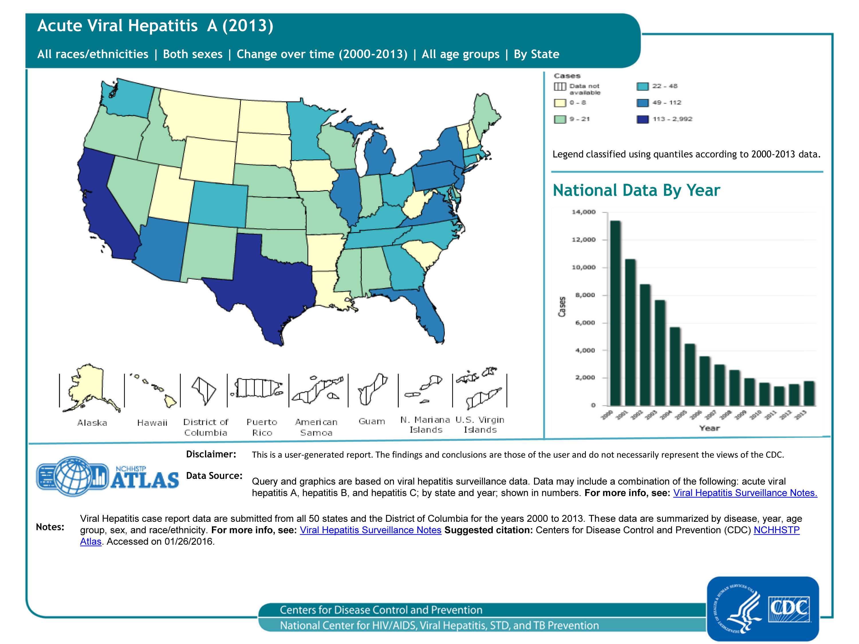
Reported Acute Viral Hepatitis A cases, 50 states and DC
Historically, hepatitis A rates vary cyclically, with nationwide increases every 10-15 years. The last peak was in 1995; since that time, rates of hepatitis A generally declined until 2011. In 2013, a total of 1,781 cases of hepatitis A were reported from 50 states to CDC, a 14% increase from 2012 (see bar graph).
Note: Acute viral hepatitis cases are submitted to CDC primarily via a passive reporting system (except for a few funded “sentinel sites”); therefore, cases reported from health departments may reflect the capacity of health jurisdictions to detect and report cases rather than true disease activity.
For more information, please see https://www.cdc.gov/hepatitis/statistics/2013surveillance/index.htm
Slide 19
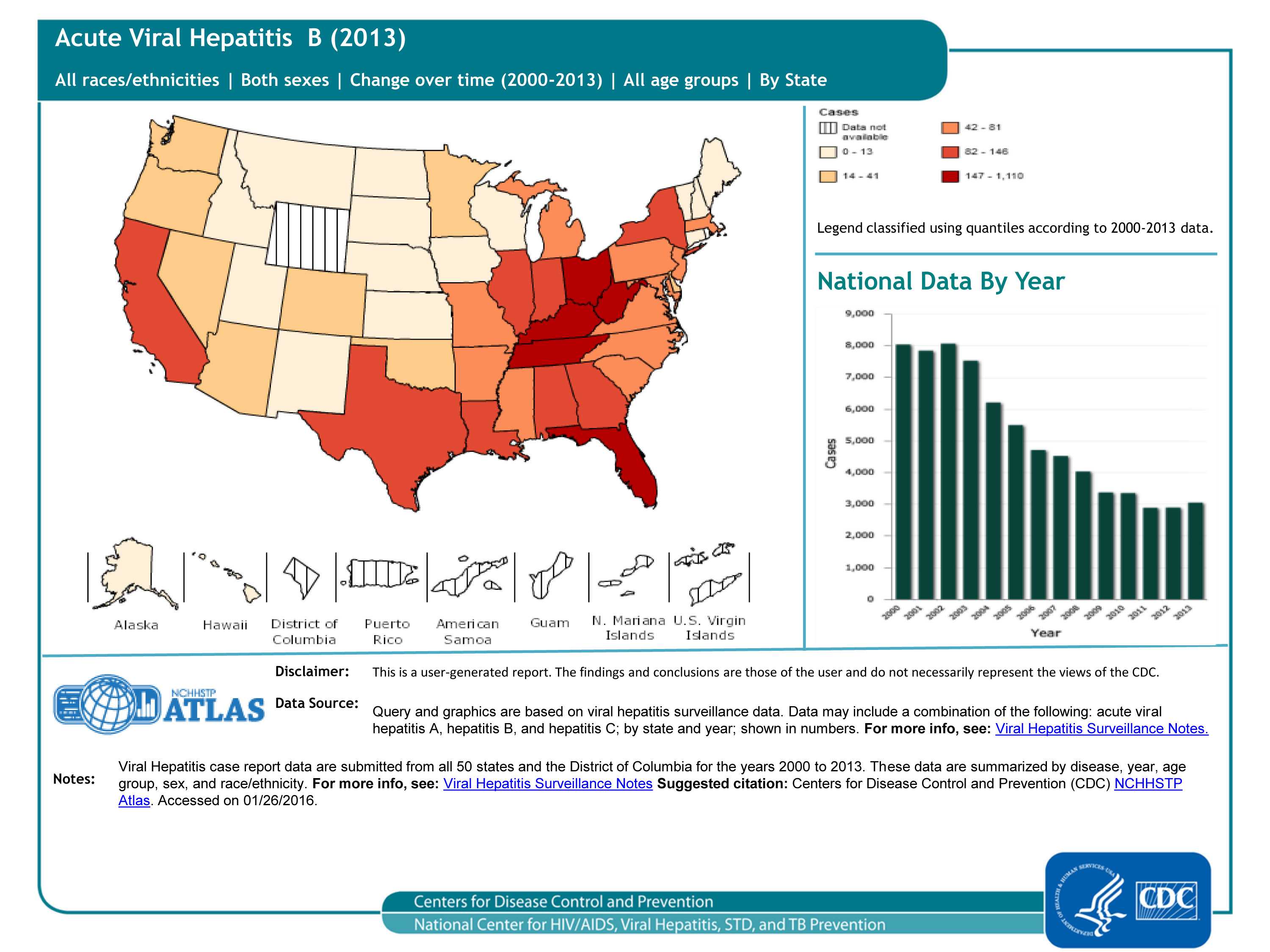
Reported Acute Viral Hepatitis B cases, 50 states and DC
The number of acute cases of hepatitis B decreased by 9.5% during 2009–2013, from 3,371 reported cases to 3,050 reported cases (see graph); increases in Florida, Indiana, Kentucky, Massachusetts, Mississippi, Missouri, Ohio, Tennessee and West Virginia occurred during this time period.
Note: Acute viral hepatitis cases are submitted to CDC primarily via a passive reporting system (except for a few funded “sentinel sites”); therefore, cases reported from health departments may reflect the capacity of health jurisdictions to detect and report cases rather than true disease activity.
For more information, please see https://www.cdc.gov/hepatitis/statistics/2013surveillance/index.htm
Slide 20
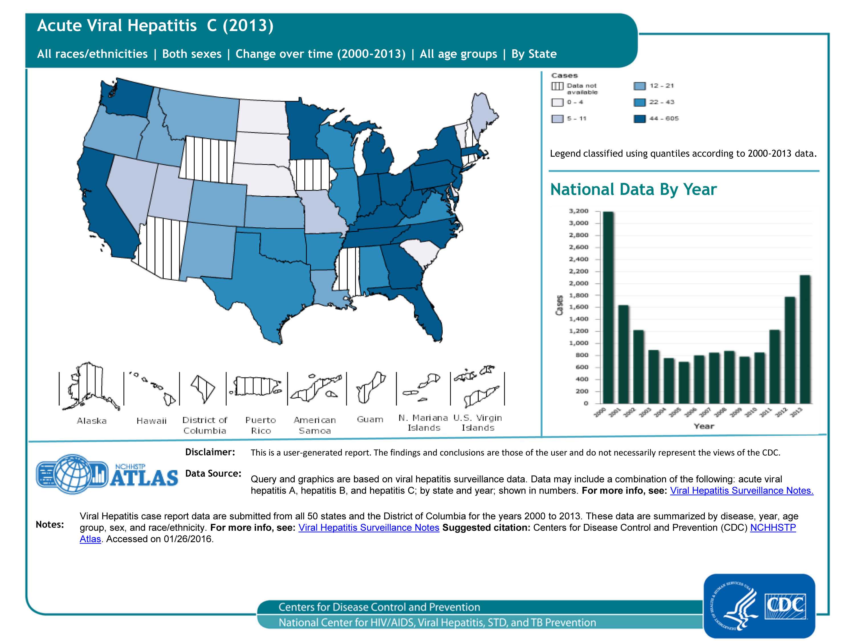
Reported Acute Viral Hepatitis C cases, 50 states and DC
In 2013, a total of 2,138 cases of acute hepatitis C were reported from 41 states to CDC (see graph). The overall incidence rate for 2013 was 0.7 cases per 100,000 population, an increase from 2009-2012. After adjusting for under-ascertainment and under-reporting, an estimated 29,718 acute hepatitis C cases occurred in 2013.
Note: Acute viral hepatitis cases are submitted to CDC primarily via a passive reporting system (except for a few funded “sentinel sites”); therefore, cases reported from health departments may reflect the capacity of health jurisdictions to detect and report cases rather than true disease activity.
For more information, please see https://www.cdc.gov/hepatitis/statistics/2013surveillance/index.htm
Slide 21
To learn more about the diseases:
- HIV
- Chlamydia, Gonorrhea, Syphilis
- Acute Viral Hepatitis A, Acute Viral Hepatitis B, and Acute Viral Hepatitis C
- Tuberculosis (TB)
For data sources:
- Page last reviewed: January 25, 2017
- Page last updated: January 25, 2017
- Content source: