

Using the Interactive Map, Legend, Footnotes, and Notes
 ShareCompartir
The Interactive Map
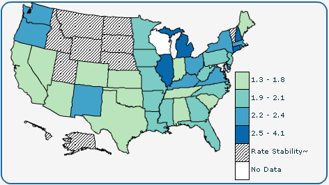
The interactive map displays each state’s data classifications according to the data attributes you selected.
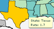 To view data for a specific state, position your mouse cursor above the state. InCA highlights the state in yellow and displays the information for the state. In the example to the left, the user has positioned the mouse cursor above Texas.
Note: The information for a highlighted state is also displayed in the bubble plot and data table simultaneously.
The Legend
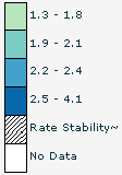
Use the legend to understand the meaning of the colors on the map. The legend explains the classes and other colors displayed on the map. In the example to the left, the user has selected to see five classes. The five classes are displayed in the legend. In the addition to the five classes, InCA also displays the “Rate Stability” and “No Data” classes to describe states that have been suppressed for rate stability and states that have no data.
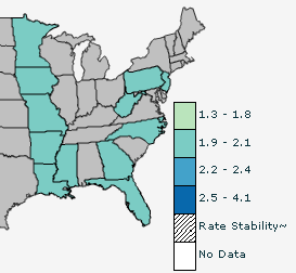
If you position your mouse cursor above a class in the legend, InCA displays only that class in the map. In the graphic to the left, the user is positioning the mouse cursor above 1.9–2.1 so only that class is displayed on the interactive map.
Footnotes and Notes
The Footnotes section at the bottom of the page explains all of the symbols. The Notes section provides more information about the confidence interval (CI), abbreviations, and acronyms.
- Page last reviewed: July 27, 2009
- Page last updated: November 3, 2015
- Content source: