

Comparing Data
 ShareCompartir
To compare data side-by-side in two maps and data tables, complete the following steps.
Note: The trend data player and bubble plot are not available when comparing data.
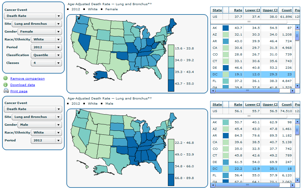
- Click the Make comparison link below the data selection control section. The system displays two data selection controls, interactive maps, and data tables.
- In the upper set of data selection controls, complete the following steps—
- Select the cancer event, for example Death Rate, from the Cancer Event drop-down list.
- Select the cancer site, for example Lung and Bronchus, from the Site drop-down list.
- Select the gender, for example Females, from the Gender drop-down list.
- Select the race or ethnicity, for example White, from the Race/Ethnicity drop-down list.
- Select the time period, for example 2005, from the Period drop-down list.
- Select the classification, for example Quantile, from the Classification drop-down list.
- Select the number of classes, for example 4, from the Classes drop-down list.
- In the lower set of data selection controls, select the data to compare. For example, select all the controls in step 2 above, but for the gender, select Males. This allows you to compare lung and bronchus cancer death rates between white men and women.
Note: The Classification and Classes selection controls in the upper section control both the upper and the lower sections.
InCA displays the data as selected in the two sections. View data by positioning your mouse cursor above the desired state or data table. The two maps and data tables simultaneously display information.
To exit the comparison mode, click the Remove Comparison link below the data selection control section. This link toggles between Make Comparison and Remove Comparison.
- Page last reviewed: July 27, 2009
- Page last updated: November 3, 2015
- Content source: