

Using the Bubble Plot
 ShareCompartir
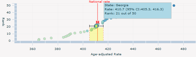
The bubble plot allows you to see conveniently how each state ranks for the data you have selected. Each state is represented by a circle (bubble), with the lowest rates on the left, and the highest rates on the right. A vertical red line identifies the rate for the total U.S. population.
Position your mouse cursor above a bubble to see which state is represented by the bubble. A horizontal line running across the bubble shows the lower and upper confidence intervals for the state. The bubble plot displays the following information for the highlighted state, as shown in the graphic below—
- The state’s name.
- The age-adjusted rate and 95% confidence interval.
- The state’s rank.
In the example below, the user has positioned the mouse cursor above Georgia.
- Page last reviewed: October 26, 2010
- Page last updated: November 3, 2015
- Content source: