Selecting Data to View
Use the data selection controls in the upper left section of the page to select attributes of the data you want to view. InCA displays the data you select in the interactive map, bubble plot, and data table simultaneously. The data selection controls consist of the following seven drop-down lists.
Cancer Event Drop-Down List
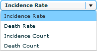 Use the Cancer Event drop-down list to select the data set: incidence rate, death rate, incidence count, or death count.
Site Drop-Down List
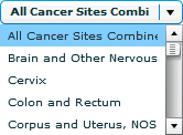 Use the Site drop-down list to select the cancer site or type.
Gender Drop-Down List
 Use the Gender drop-down list to select a gender to view. You can choose to see data for females, males, or both males and females.
Note: If a site applies only to one gender, you cannot select the other gender. For example, if you select the site Cervix Uteri, InCA automatically changes the Gender drop-down list to Females and will not allow you to change the selection until you select another site.
Race/Ethnicity Drop-Down List
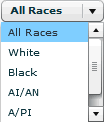
Use the Race/Ethnicity drop-down list to select the race or ethnicity that you want to view.
Period Drop-Down List
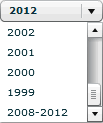 Use the Period drop-down list to select a time period to view. You can select a year between 1999 and 2012 or a range (2008–2012).
Classification Drop-Down List
 Use the Classification drop-down list to specify whether you want each data class to contain—
- An equal or a near-equal number of states (Quantile).
- The same number of values in its subrange (Equal Interval).
Classes Drop-Down List
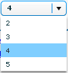 Use the Classes drop-down list to select the number of classes to display on the interactive map.
- Page last reviewed: July 27, 2009
- Page last updated: November 3, 2015
- Content source:


 ShareCompartir