

Maps of Heart Disease and Stroke
 ShareCompartir
How to Make a Map Displaying Heart Disease or Stroke Data
Step 1
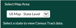
Select the Map Area. Maps can be viewed in three ways, depending on your geographic area of interest:
- A map of the entire United States with state-level data (US Map—State Level).
- A map of the entire United States with county-level data (US Map—County Level).
- A map of a single state with county-level data.
Step 2
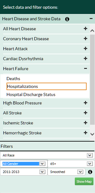
Choose your topic of interest and expand that section in the left navigation bar:
- Heart Disease and Stroke Data (these data can be displayed at the state or county level).
Step 3
Select the heart disease or stroke outcome of interest. There are two selections:
- Select the type of heart disease or stroke (e.g., Heart Failure).
- Select the outcome of interest (e.g., Hospitalizations).
Step 4
Select the sociodemographic and methodological filters.
- Maps can be displayed by race/ethnicity, gender, age range, and/or time period. These options vary depending on the heart disease and stroke data and outcome type that is selected. In addition, you can display data that are spatially smoothed, allowing rates to be shown for counties with small populations (see the Help Section on Spatial Smoothing for more information).
Step 5
Click “Show Map” in the bottom right corner of the left navigation bar to display the map.
Recommended Citation for Maps
This map was created using the Interactive Atlas of Heart Disease and Stroke, a website developed by the Centers for Disease Control and Prevention, Division for Heart Disease and Stroke Prevention. http://nccd.cdc.gov/DHDSPAtlas.
- Page last reviewed: July 19, 2017
- Page last updated: July 19, 2017
- Content source: