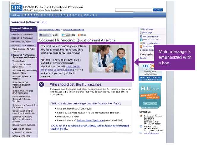
Is the main message emphasized with visual cues?
Main Message and Call to Action
Visual cues draw attention to parts of a material. Use visual cues to draw attention to the main message. People perceive differences in size, shape and color as meaningful. When you draw attention to the main message, people will more easily and quickly recognize it. To make visual cues compatible with web accessibility guidelines, include descriptive alternative text, such as “The main message is…,” for the screen reader.
Examples of visual cues are
- Boldface
- Color
- Shapes
- Lines and arrows
- Font type, size, alignment, and spacing
- Heading, such as “What you need to know”
Example:

This screenshot of a seasonal flu webpage is a good example of drawing attention to the main message with a lightly shaded box.
- Page last reviewed: August 11, 2014
- Page last updated: August 11, 2014
- Content source:
- Centers for Disease Control and Prevention
- Page maintained by: Office of Associate Director of Communication, Division of Public Affairs


 ShareCompartir