

Map Details - Michigan Unemployment Rates by County
 ShareCompartir
Impact Statement
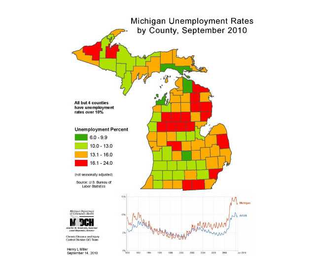
This map displays unemployment rates in Michigan, using a green, yellow, red mix to highlight the dangerously high level of unemployment, reinforced by the time line chart showing Michigan unemployment substantially higher than national, and the highest in years. This map also documents unemployment rates in state by county. You can use this map as part of the social determinants of health risk factors in constructing burden of disease documents and presentations.
Software Used
ArcGIS 9.3
Data Used
U.S. Bureau of Labor Statistics. Chart made using Google online tool.
Methods Used
Use GIS layer for state counties, Google tool for time series chart comparing U.S. to Michigan unemployment.
Contact the Submitter of this Map
Henry L Miller, Departmental Specialist, Michigan Department of Community Health
(517) 335-8779
millerhenry@michigan.gov
How to Cite this Map
Michigan Unemployment Rates by County, September 2010 Miller, Henry; Michigan Department of Community Health, [TODAY’S DATE].
- Page last reviewed: July 7, 2017
- Page last updated: July 7, 2017
- Content source: