

Figure S. Gonorrhea — Rate Ratios* by Race/Ethnicity and Region, United States, 2015
 ShareCompartir
This web page is archived for historical purposes and is no longer being updated. Newer data is available on the STD Data and Statistics page.
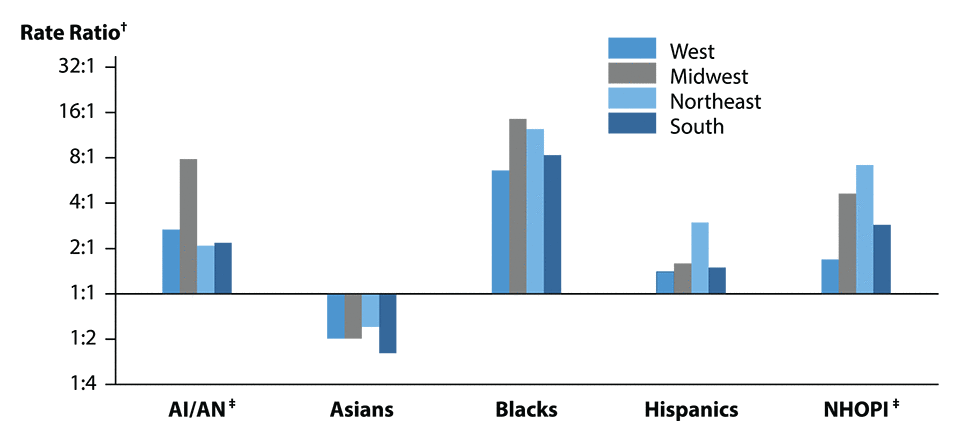
* Rate ratios are calculated as the rate of reported gonorrhea cases per 100,000 population for a given racial or ethnic minority population divided by the rate of reported gonorrhea cases per 100,000 population for Whites. Any population with a lower rate of reported cases of gonorrhea than the White population will have a rate ratio of less than 1:1.
† Y-axis is log scale.
‡ AI/AN = American Indians/Alaska Natives; NHOPI = Native Hawaiians/Other Pacific Islanders.
NOTE: Includes 50 states reporting race/ethnicity data in Office of Management and Budget compliant formats in 2015 (see Section A1.5 in Appendix A).
- Page last reviewed: October 6, 2016 (archived document)
- Content source: