

How do I toggle between types of visualizations?
 ShareCompartir
How do I toggle between types of visualizations?
Each panel may contain up to four visualizations.
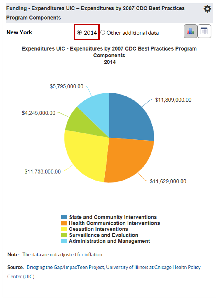
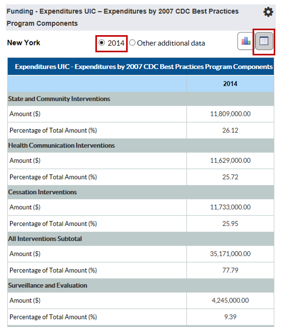
Step 1: By selecting a single year on a panel, you may see a column chart or a pie chart that represents a single year of data.
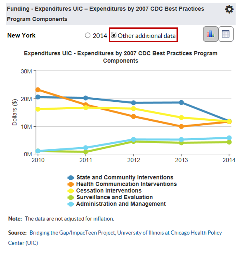
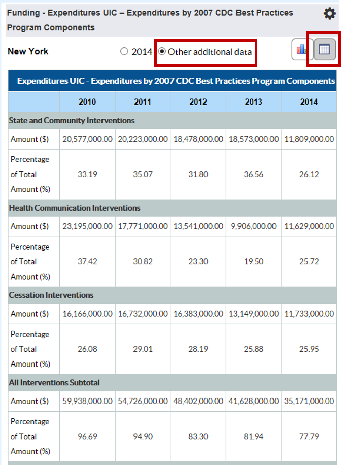
Step 2: By selecting “Multiple Data Points”, you will see a line graph that displays the data over time.
Step 3: To view the corresponding data table, use the table icon in the top right hand corner of the panel. To view the data that was used to create a single year visualization, select the single year the top of the panel and then click the table icon.
Step 4: To view the data that was used to create a multi-year visualization, select “Multiple Data Points” at the top of the panel and then click the table icon.
- Page last reviewed: January 24, 2017
- Page last updated: January 24, 2017
- Content source: