

How can I create a chart from a filtered view?
 ShareCompartir
How can I create a chart from a filtered view?
You can create custom visuals about the data with your chosen dataset.
Step 1: Follow the steps to create a filtered view from “How do I create my own filtered view?”
Step 2: After saving your view, click on the Visualize button
Step 3: Click on the Chart option
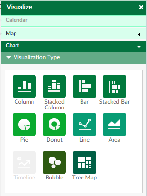
Step 4: Select what type of chart you would like to create
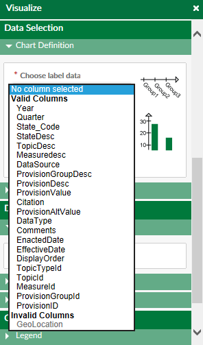
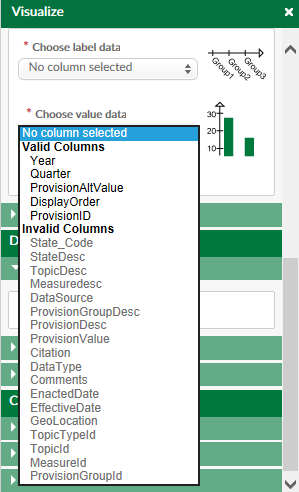
Step 5: Under Data Selection – Chart Definition, you will need select the label data and value data
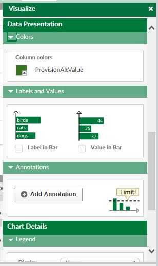
Step 6: Under Data Presentation, you are able to choose the color of your columns/bars, select whether the you would like your labels and/or values shown within the column/bar, and add an annotation, such as a target or national average.
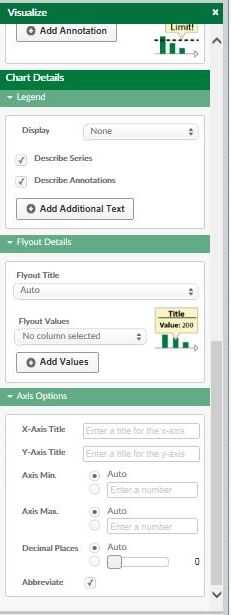
Step 7: Under Chart Details, you are able to make selections for the Legend, Flyout Details, and Axis Options
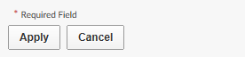
Step 8: When all of your selections have been made, click on the Apply button at the bottom of the page:


- Page last reviewed: January 13, 2015
- Page last updated: January 13, 2015
- Content source: